-
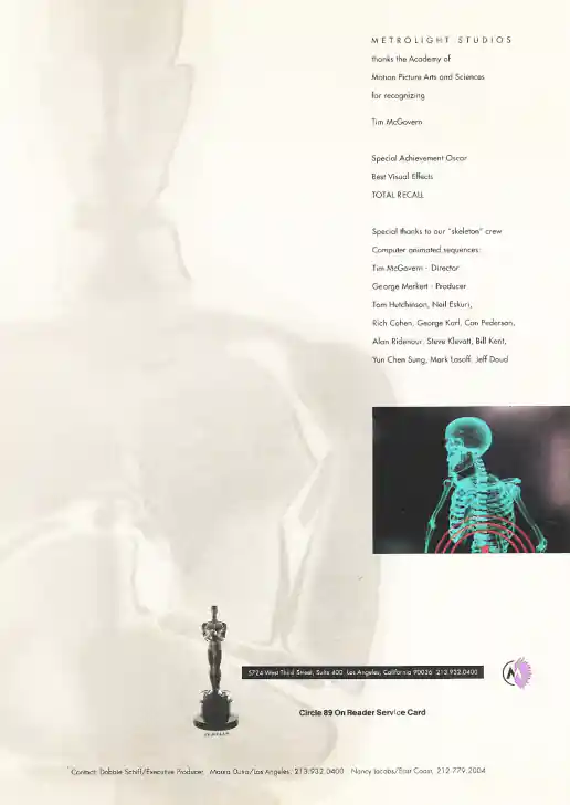
Marilyn Frandsen Design, Metrolight Studios “Total Recall” Magazine Ad
Project Description:
Click for project detail view
-
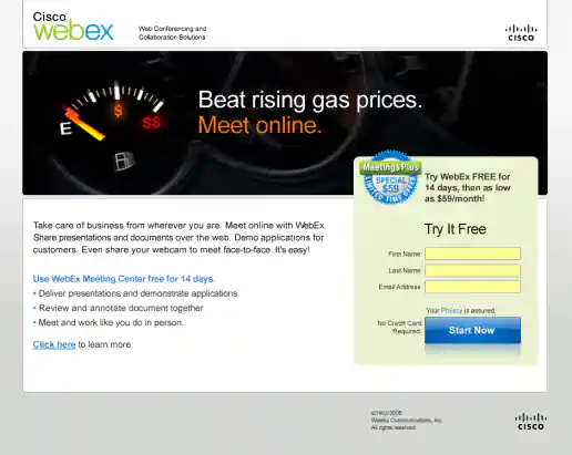
Cisco WebEx Meetings Plus Summer Campaign
Mass Market Landing Page
Project Description:
Click for project detail view
-
MCA Universal Cartoon Studios VHS Jacket for Exosquad: Betrayal and Defying Olympus
Project Description: On this project I was primarily responsible for typesetting, finalizing the layout, and creating printer-ready artwork using QuarkXPress. Some illustrations were "for position only" (FPO) and scanned in seperately by the printer. Art Director: Scott MacPhee
Click for project detail view
-
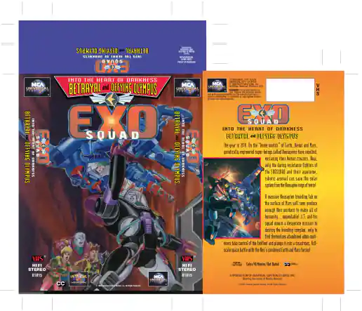
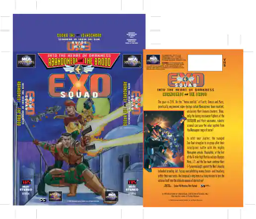
MCA Universal Cartoon Studios VHS Jacket for Exosquad: Into The Heart Of Darkness and The Brood
Project Description: On this project I was primarily responsible for typesetting, finalizing the layout, and creating printer-ready artwork using QuarkXPress. Some illustrations were "for position only" (FPO) and scanned in seperately by the printer. Art Director: Scott MacPhee
Click for project detail view
-
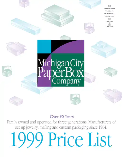
Michigan City Paper Box Company Price List
Project Description: Art Director: Mark Drury.
Click for project detail view
-
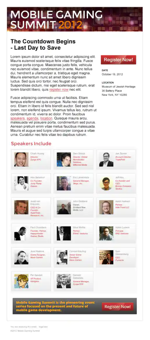
Mobile Gaming Summit (MOGA) “Last Day To Save” Email
Project Description:
Click for project detail view
-
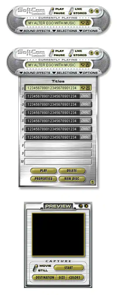
SoftCam Interface Design
Mockups
Project Description:
Click for project detail view
-
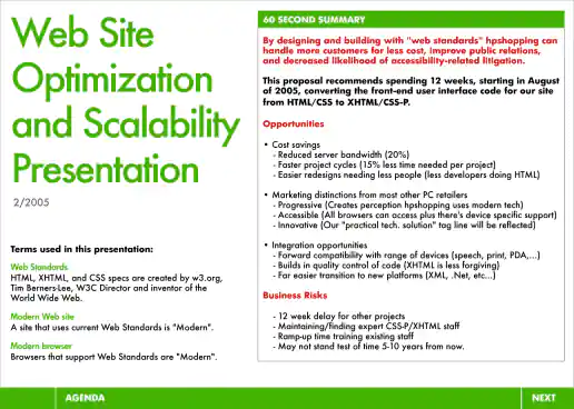
HPShopping.com Website Optimization and Scalability Presentation
Modern Web Design / CSS Pitch
Project Description: Around 2005 as web standards emerged and CSS was becoming the standard for creating and styling web page layouts, I championed the cause within HP in my department. Designers who started in print design were already familiar with using stylesheets and aware of their benefits from using programs such as Quark Express and Adobe PageMaker (similar to Adobe InDesign) when creating brochures, newsletters, catalogs, and magazines, or other types of publication designs. Business stakeholders, managers, and developers were generally less familiar with the concept of stylesheets though and this presentation aimed at informing and educating on the benefits of switching from HTML table based layouts to using CSS (or CSS-P) for positioning elements on web pages. It highlights specific benefits to the user experience (UX) (or customer experience (CX) in this case), benefits to how the brand would be perceived, plus how designers and developers workflow could be organized and optimized to reduce time spent on projects.
Click for project detail view
-
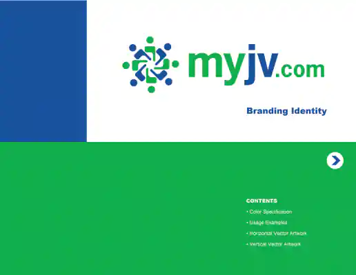
MyJV.com Brand Identity
Project Description: MyJV.com introduces people to jointly fund a business enterprise. It enables financial transactions between and among an unlimited number of business partners to enable joint ventures to be executed. My goal for this project was to create a unique and identifiable graphic image along with other imagery that would form the nucleus of most, if not all of myJV.com outbound marketing efforts.
Click for project detail view

-
MyJV.com Branding Identity Guidelines
Project Description: A brief branding style guide put together to help insure logo and color integrity was maintained. Includes information on the brands color palette, color usage, horizontal logo, and vertical logo details including correct and incorrect usage examples in each section.
Click for project detail view
-
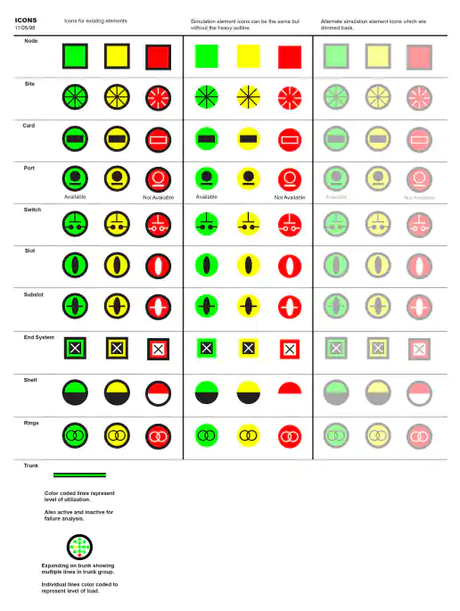
Narus Network Monitoring Icon Organization
Project Description:
Click for project detail view
-
Narus Product Logo Buttons
Project Description:
Click for project detail view
-
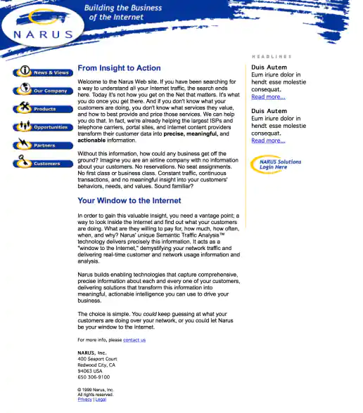
Narus.com Website Design
Project Description:
Click for project detail view
-
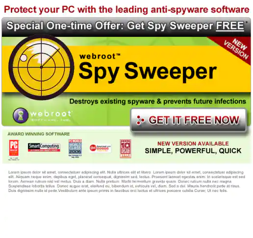
MyOfferPal: WebRoot, Spy Sweeper Campaign
New Prospect HTML Email
Project Description:
Click for project detail view
-
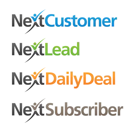
NextCustomer Family of Brands Logo Examples
Project Description: The original LeadsCon logo had a checkmark in a box as the logomark along with the logotype. This redesign for the NextCustomer logo was crowd sourced by my client and I was assigned to create the additional family of logos based on the new direction. Each website already had a distinct color I had developed previously and applied to the various logos. NextSubscriber had not been designed or developed yet so it's color is less thought out.
Click for project detail view
-
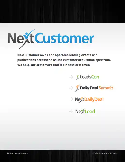
NextCustomer Press Kit Brand Guide
Project Description:
Click for project detail view
-
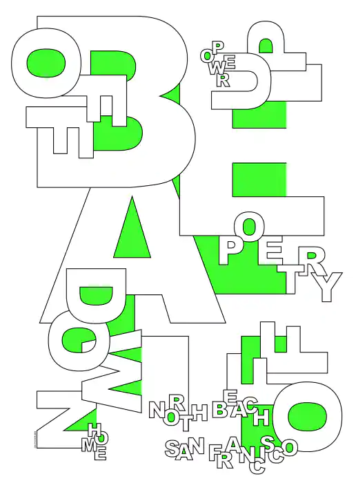
North Beach Beat Typographic Poster
Project Description: Created as part of a CalArts alumni art show I participated in. The show was held in the Presidio Park area of San Francisco while I was living in the North Beach neighborhood just down the street.
Click for project detail view
-
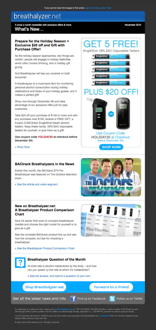
Breathalyzer.net Email Newsletter Template Design
November Issue
Project Description:
Click for project detail view
-
Online Gambling Casino Banner Ads – 3 Examples
Project Description: Hey - I didn’t invent pop-up, pop-over, pop-under ads! But did create a bunch that were pretty good a getting attention and clicks. Sometimes I wonder if I should show examples of this kind of work or even admit I contributed to creating such annoying intrusive marketing pieces. By confessing my participation in such practices perhaps I can move further away from them though. Some were kinda cool looking though.
Click for project detail view

-
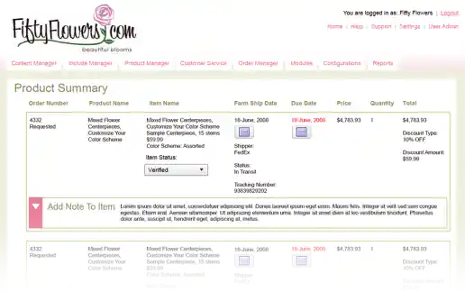
FiftyFlowers.com eCommerce Order Management System Interface Design Proposal Mockups
Order Summary
Project Description: A few quick mockups presented as a proposal for the commerce website administration and order management area of FiftyFlowers.com. By using colors that complimented the logo and improving the over layout of elements, this CMS user interface became immediately recognizable and aesthetically more pleasant to look at (and use) than interacting with the generic geeky look and feel that the engineers had initially developed.
Click for project detail view
-
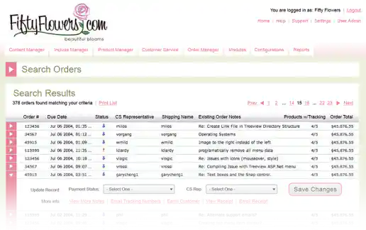
FiftyFlowers.com eCommerce Order Management System Interface Design Proposal Mockups
Orders List
Project Description: A few quick mockups presented as a proposal for the commerce website administration and order management area of FiftyFlowers.com. By using colors that complimented the logo and improving the over layout of elements, this CMS user interface became immediately recognizable and aesthetically more pleasant to look at (and use) than interacting with the generic geeky look and feel that the engineers had initially developed.
Click for project detail view
-
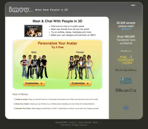
IMVU Landing Page Based On Site Tuners Design
Original Version
Project Description: The original landing page design was received from SiteTuners a couple weeks after a conference call and some minor back and forth discussions. General page design was based on successes previously seen when specifically sending Facebook traffic to game site signups, such as Farmville. Eventually I created the newer redesigned version which was more closely aligned with the IMVU visual language and a dedicated front-end developer optimized my initial prototype code and was able to produce even better conversion.
Click for project detail view
-
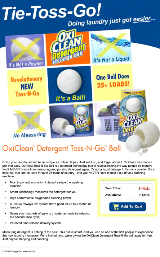
OxiClean Tic-Tac-Toe Theme Landing Page
Project Description:
Click for project detail view
-
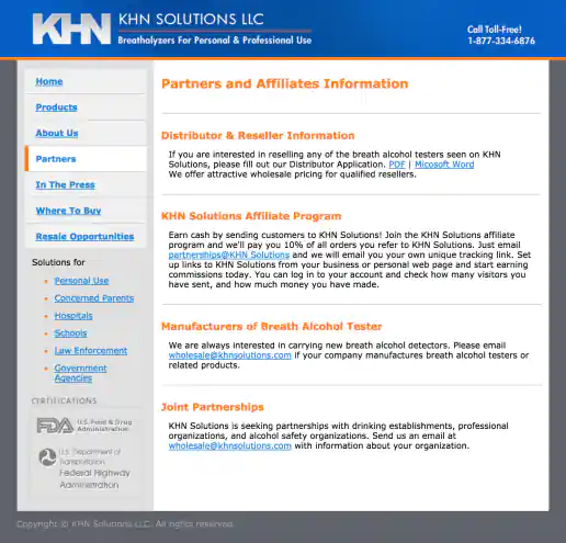
KHN Solutions Website Design
Partners Page
Project Description:
Click for project detail view