-
Insightly.com Responsive Website Design
Blog Article Page Template
Project Description: Initial layouts were created by another designer for the desktop screen width then handed-off for me to develop the alternate layouts for mobile devices. I coded layouts to be flexible so they worked on as many devices as possible. With only a couple exceptions, all pages were coded with four primary target sizes in mind beginning with the "mobile first" methodology. Additional media-query breakpoints were created when content areas within the layouts did not degrade gracefully when being resized. Standard sizes I would test and create media-queries for where 480x320 for iPhone landscape mode, 320x480 for iPhone portrait mode, 768x1024 for iPad portrait mode, and 1024x768 for iPad landscape mode and desktop use cases.
Click for project detail view
-
Insightly.com Responsive Website Design
Careers Page
Project Description: Initial layouts were created by another designer for the desktop screen width then handed-off for me to develop the alternate layouts for mobile devices. I coded layouts to be flexible so they worked on as many devices as possible. With only a couple exceptions, all pages were coded with four primary target sizes in mind beginning with the "mobile first" methodology. Additional media-query breakpoints were created when content areas within the layouts did not degrade gracefully when being resized. Standard sizes I would test and create media-queries for where 480x320 for iPhone landscape mode, 320x480 for iPhone portrait mode, 768x1024 for iPad portrait mode, and 1024x768 for iPad landscape mode and desktop use cases.
Click for project detail view
-
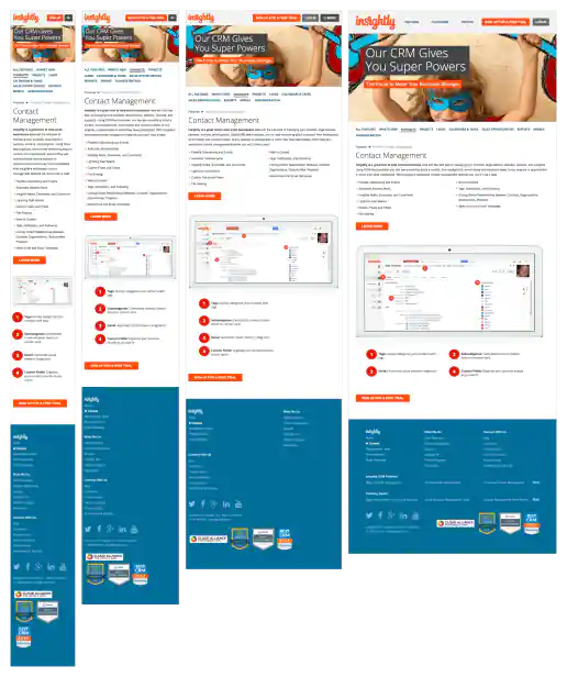
Insightly.com Responsive Website Design
Contact Management Page
Project Description: Initial layouts were created by another designer for the desktop screen width then handed-off for me to develop the alternate layouts for mobile devices. I coded layouts to be flexible so they worked on as many devices as possible. With only a couple exceptions, all pages were coded with four primary target sizes in mind beginning with the "mobile first" methodology. Additional media-query breakpoints were created when content areas within the layouts did not degrade gracefully when being resized. Standard sizes I would test and create media-queries for where 480x320 for iPhone landscape mode, 320x480 for iPhone portrait mode, 768x1024 for iPad portrait mode, and 1024x768 for iPad landscape mode and desktop use cases.
Click for project detail view
-
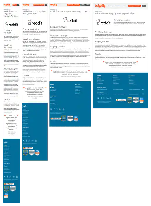
Insightly.com Responsive Website Design
Customer Case Study Page Template
Project Description: Initial layouts were created by another designer for the desktop screen width then handed-off for me to develop the alternate layouts for mobile devices. I coded layouts to be flexible so they worked on as many devices as possible. With only a couple exceptions, all pages were coded with four primary target sizes in mind beginning with the "mobile first" methodology. Additional media-query breakpoints were created when content areas within the layouts did not degrade gracefully when being resized. Standard sizes I would test and create media-queries for where 480x320 for iPhone landscape mode, 320x480 for iPhone portrait mode, 768x1024 for iPad portrait mode, and 1024x768 for iPad landscape mode and desktop use cases.
Click for project detail view
-
Insightly.com Responsive Website Design
Customers Page
Project Description: Initial layouts were created by another designer for the desktop screen width then handed-off for me to develop the alternate layouts for mobile devices. I coded layouts to be flexible so they worked on as many devices as possible. With only a couple exceptions, all pages were coded with four primary target sizes in mind beginning with the "mobile first" methodology. Additional media-query breakpoints were created when content areas within the layouts did not degrade gracefully when being resized. Standard sizes I would test and create media-queries for where 480x320 for iPhone landscape mode, 320x480 for iPhone portrait mode, 768x1024 for iPad portrait mode, and 1024x768 for iPad landscape mode and desktop use cases.
Click for project detail view
-
Insightly.com Responsive Website Design
Features Page
Project Description: Initial layouts were created by another designer for the desktop screen width then handed-off for me to develop the alternate layouts for mobile devices. I coded layouts to be flexible so they worked on as many devices as possible. With only a couple exceptions, all pages were coded with four primary target sizes in mind beginning with the "mobile first" methodology. Additional media-query breakpoints were created when content areas within the layouts did not degrade gracefully when being resized. Standard sizes I would test and create media-queries for where 480x320 for iPhone landscape mode, 320x480 for iPhone portrait mode, 768x1024 for iPad portrait mode, and 1024x768 for iPad landscape mode and desktop use cases.
Click for project detail view
-
Insightly.com Responsive Website Design
Homepage
Project Description: Initial layouts were created by another designer for the desktop screen width then handed-off for me to develop the alternate layouts for mobile devices. I coded layouts to be flexible so they worked on as many devices as possible. With only a couple exceptions, all pages were coded with four primary target sizes in mind beginning with the "mobile first" methodology. Additional media-query breakpoints were created when content areas within the layouts did not degrade gracefully when being resized. Standard sizes I would test and create media-queries for where 480x320 for iPhone landscape mode, 320x480 for iPhone portrait mode, 768x1024 for iPad portrait mode, and 1024x768 for iPad landscape mode and desktop use cases.
Click for project detail view
-
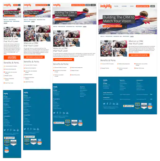
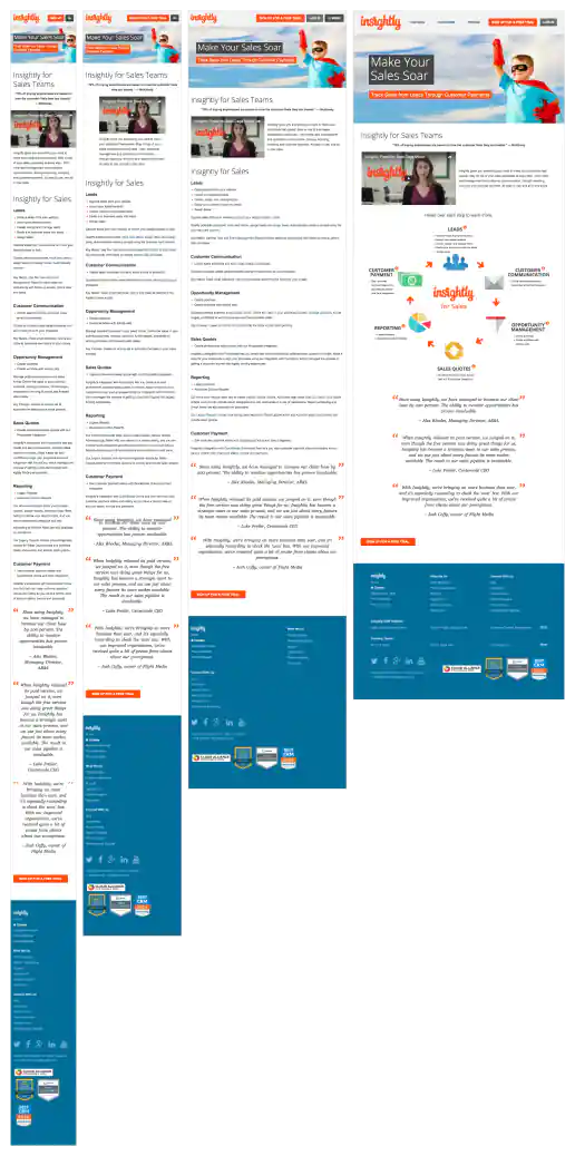
Insightly.com Responsive Website Design
Insightly for Sales Page
Project Description: Initial layouts were created by another designer for the desktop screen width then handed-off for me to develop the alternate layouts for mobile devices. I coded layouts to be flexible so they worked on as many devices as possible. With only a couple exceptions, all pages were coded with four primary target sizes in mind beginning with the "mobile first" methodology. Additional media-query breakpoints were created when content areas within the layouts did not degrade gracefully when being resized. Standard sizes I would test and create media-queries for where 480x320 for iPhone landscape mode, 320x480 for iPhone portrait mode, 768x1024 for iPad portrait mode, and 1024x768 for iPad landscape mode and desktop use cases.
Click for project detail view
-
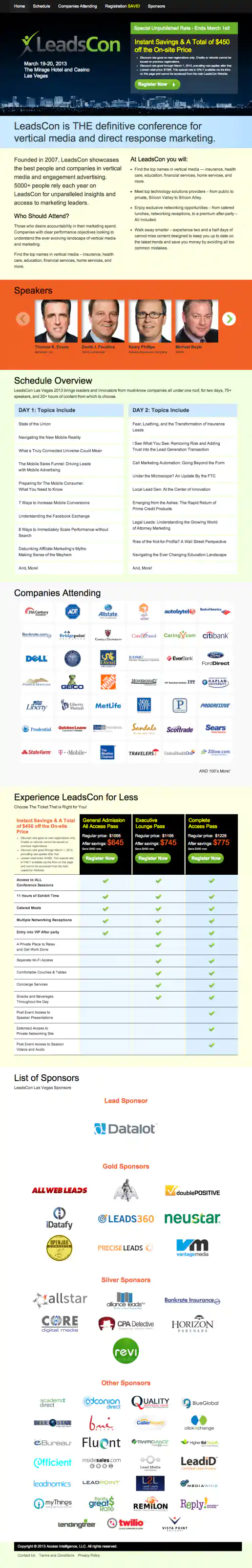
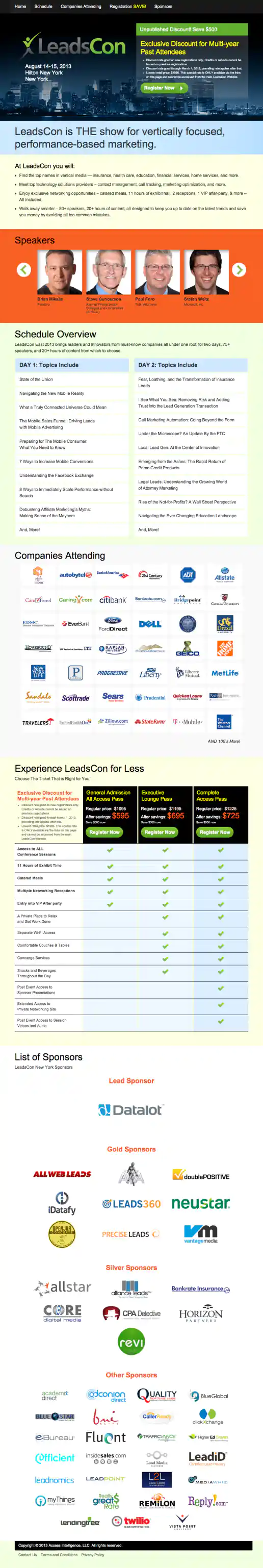
LeadsCon.com Landing Page Creator
Las Vegas Event Example
Project Description: Event organizer needed an easy way to create individual landing pages for several targeted offers geared towards partners, vendors, past attendees, for speaker promotions, trade groups, magazine audiences, and the general public. Each landing page offered special discounts and was only accessible at a special link which potential customers would receive via email campaigns or see in an ad somewhere. By creating templates for the East Coast and West Coast events that could easily be updated on the backend, dozens of landing pages were created by the event manager without needing additional coding or design cycles each time.
Click for project detail view
-
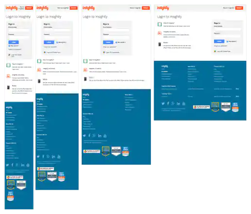
Insightly.com Responsive Website Design
Login Page
Project Description: Initial layouts were created by another designer for the desktop screen width then handed-off for me to develop the alternate layouts for mobile devices. I coded layouts to be flexible so they worked on as many devices as possible. With only a couple exceptions, all pages were coded with four primary target sizes in mind beginning with the "mobile first" methodology. Additional media-query breakpoints were created when content areas within the layouts did not degrade gracefully when being resized. Standard sizes I would test and create media-queries for where 480x320 for iPhone landscape mode, 320x480 for iPhone portrait mode, 768x1024 for iPad portrait mode, and 1024x768 for iPad landscape mode and desktop use cases.
Click for project detail view
-
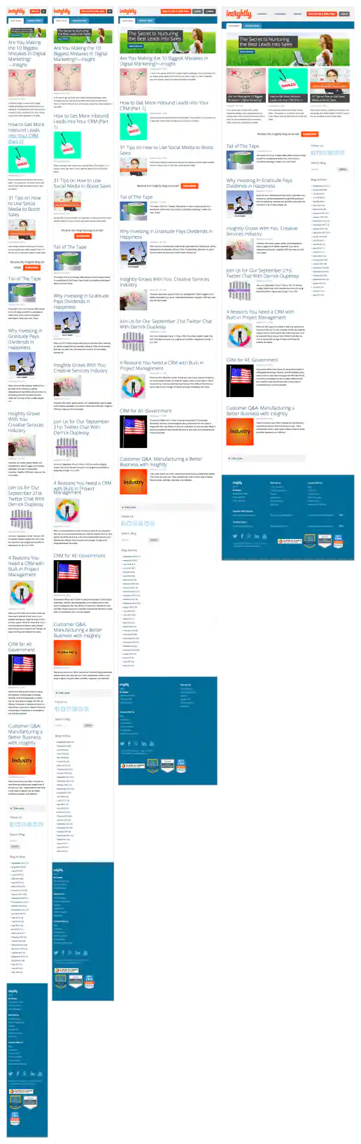
Insightly.com Responsive Website Design
Main Blog Page
Project Description: Initial layouts were created by another designer for the desktop screen width then handed-off for me to develop the alternate layouts for mobile devices. I coded layouts to be flexible so they worked on as many devices as possible. With only a couple exceptions, all pages were coded with four primary target sizes in mind beginning with the "mobile first" methodology. Additional media-query breakpoints were created when content areas within the layouts did not degrade gracefully when being resized. Standard sizes I would test and create media-queries for where 480x320 for iPhone landscape mode, 320x480 for iPhone portrait mode, 768x1024 for iPad portrait mode, and 1024x768 for iPad landscape mode and desktop use cases.
Click for project detail view
-
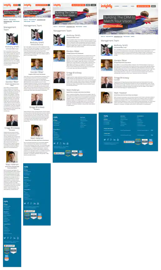
Insightly.com Responsive Website Design
Management Team Page
Project Description: Initial layouts were created by another designer for the desktop screen width then handed-off for me to develop the alternate layouts for mobile devices. I coded layouts to be flexible so they worked on as many devices as possible. With only a couple exceptions, all pages were coded with four primary target sizes in mind beginning with the "mobile first" methodology. Additional media-query breakpoints were created when content areas within the layouts did not degrade gracefully when being resized. Standard sizes I would test and create media-queries for where 480x320 for iPhone landscape mode, 320x480 for iPhone portrait mode, 768x1024 for iPad portrait mode, and 1024x768 for iPad landscape mode and desktop use cases.
Click for project detail view
-
Insightly.com Responsive Website Design
Mobile Only Pricing Page
Project Description: Initial layouts were created by another designer for the desktop screen width then handed-off for me to develop the alternate layouts for mobile devices. I coded layouts to be flexible so they worked on as many devices as possible. With only a couple exceptions, all pages were coded with four primary target sizes in mind beginning with the "mobile first" methodology. Additional media-query breakpoints were created when content areas within the layouts did not degrade gracefully when being resized. Standard sizes I would test and create media-queries for where 480x320 for iPhone landscape mode, 320x480 for iPhone portrait mode, 768x1024 for iPad portrait mode, and 1024x768 for iPad landscape mode and desktop use cases.
Click for project detail view
-
LeadsCon.com Landing Page Creator
New York Event Example
Project Description: Event organizer needed an easy way to create individual landing pages for several targeted offers geared towards partners, vendors, past attendees, for speaker promotions, trade groups, magazine audiences, and the general public. Each landing page offered special discounts and was only accessible at a special link which potential customers would receive via email campaigns or see in an ad somewhere. By creating templates for the East Coast and West Coast events that could easily be updated on the backend, dozens of landing pages were created by the event manager without needing additional coding or design cycles each time.
Click for project detail view
-
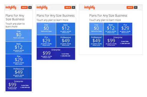
Insightly.com Pricing Page Test Variations
Page Created Specifically for Visitor Traffic Coming From Mobile Phones Only
Project Description: Presented here are several iterations of the Pricing page I coded or co-designed/developed and maintained 3013 through 1016 while working with the Insightly marketing team, internal designers, and external vendors. Variations were tested using Optimizely and services such as Experiment Engine for A/B testing and conversion optimization along with KissMetrics and Google Analytics for click path tracking. Occasionally I contributed to the visual design while staying true to the look and feel of the Insightly brand. Additionally I occasionally contributed test suggestions based on best practices research, reviewing reported successes on other sites and competitive analysis. Several other versions were created as well, such as using different visual treatments for the title area and plan blurbs. etcetera.
Click for project detail view
-
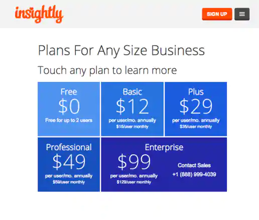
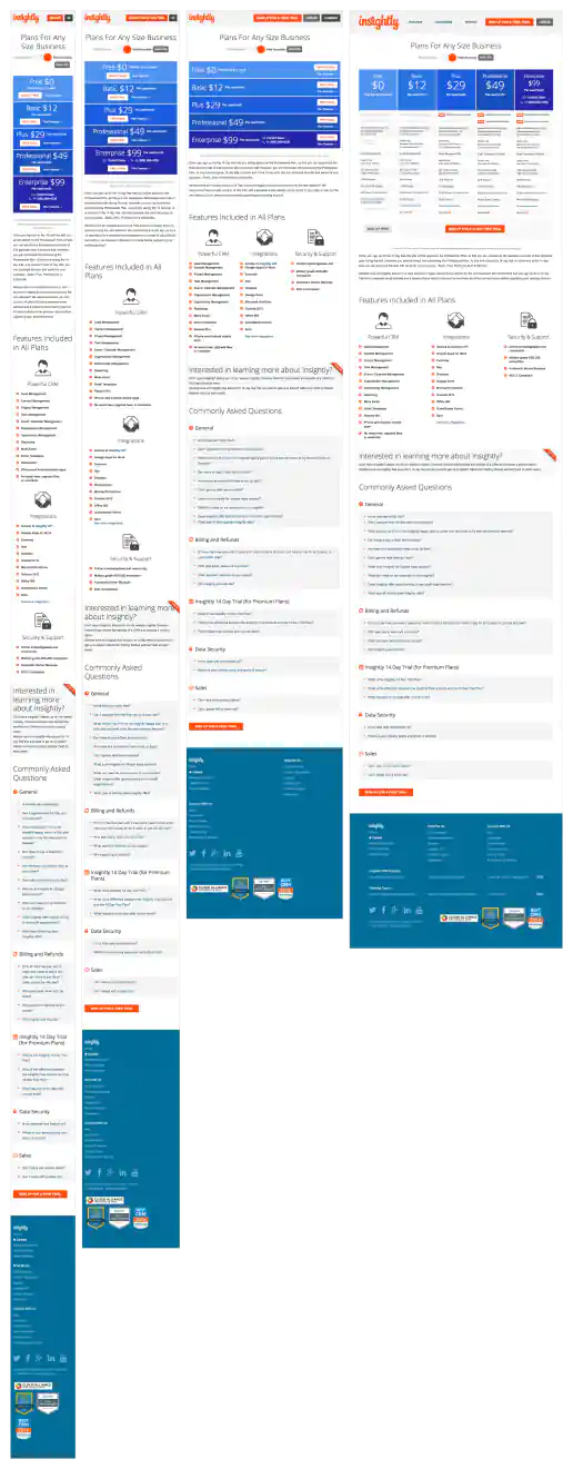
Insightly.com Responsive Website Design
Pricing Page
Project Description: Initial layouts were created by another designer for the desktop screen width then handed-off for me to develop the alternate layouts for mobile devices. I coded layouts to be flexible so they worked on as many devices as possible. With only a couple exceptions, all pages were coded with four primary target sizes in mind beginning with the "mobile first" methodology. Additional media-query breakpoints were created when content areas within the layouts did not degrade gracefully when being resized. Standard sizes I would test and create media-queries for where 480x320 for iPhone landscape mode, 320x480 for iPhone portrait mode, 768x1024 for iPad portrait mode, and 1024x768 for iPad landscape mode and desktop use cases.
Click for project detail view
-
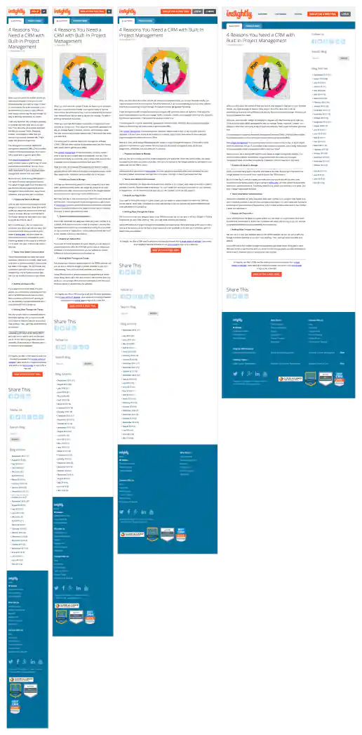
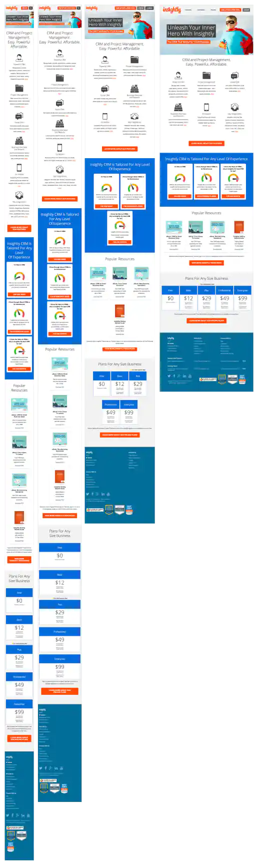
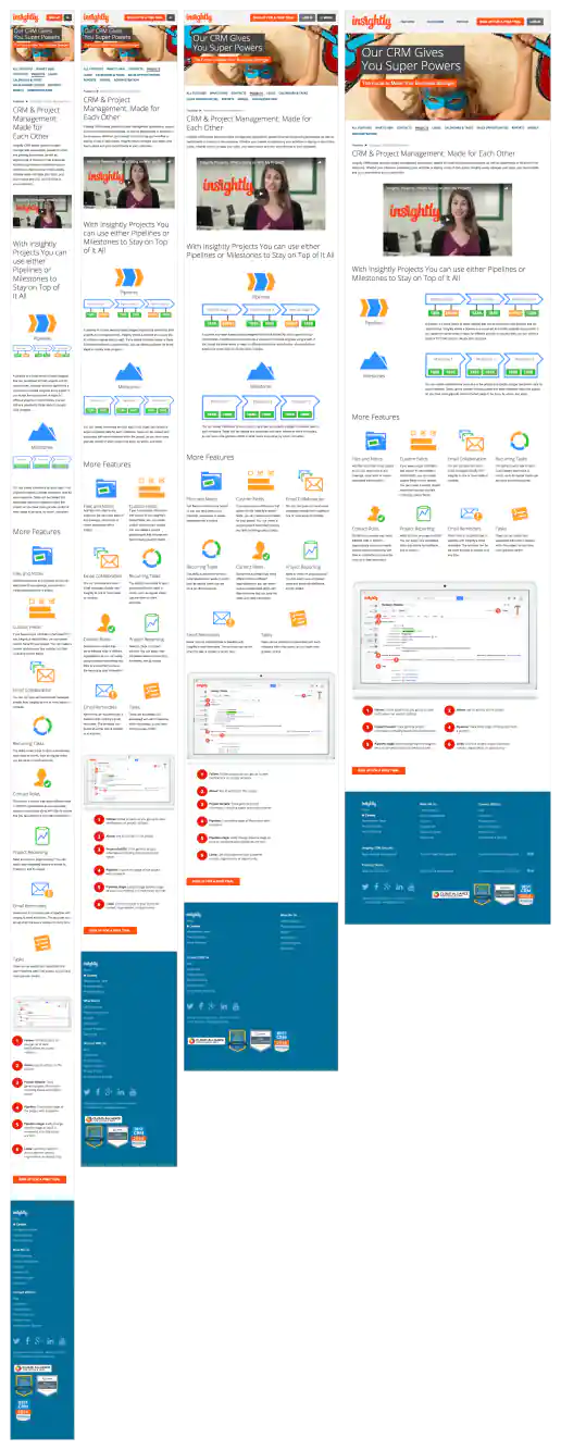
Insightly.com Responsive Website Design
Project Management Page
Project Description: Initial layouts were created by another designer for the desktop screen width then handed-off for me to develop the alternate layouts for mobile devices. I coded layouts to be flexible so they worked on as many devices as possible. With only a couple exceptions, all pages were coded with four primary target sizes in mind beginning with the "mobile first" methodology. Additional media-query breakpoints were created when content areas within the layouts did not degrade gracefully when being resized. Standard sizes I would test and create media-queries for where 480x320 for iPhone landscape mode, 320x480 for iPhone portrait mode, 768x1024 for iPad portrait mode, and 1024x768 for iPad landscape mode and desktop use cases.
Click for project detail view
-
Insightly.com Pricing Page Test Variations
Responsive Redesign For Visitors On Mobile Devices
Project Description: Presented here are several iterations of the Pricing page I coded or co-designed/developed and maintained 3013 through 1016 while working with the Insightly marketing team, internal designers, and external vendors. Variations were tested using Optimizely and services such as Experiment Engine for A/B testing and conversion optimization along with KissMetrics and Google Analytics for click path tracking. Occasionally I contributed to the visual design while staying true to the look and feel of the Insightly brand. Additionally I occasionally contributed test suggestions based on best practices research, reviewing reported successes on other sites and competitive analysis. Several other versions were created as well, such as using different visual treatments for the title area and plan blurbs. etcetera.
Click for project detail view

-
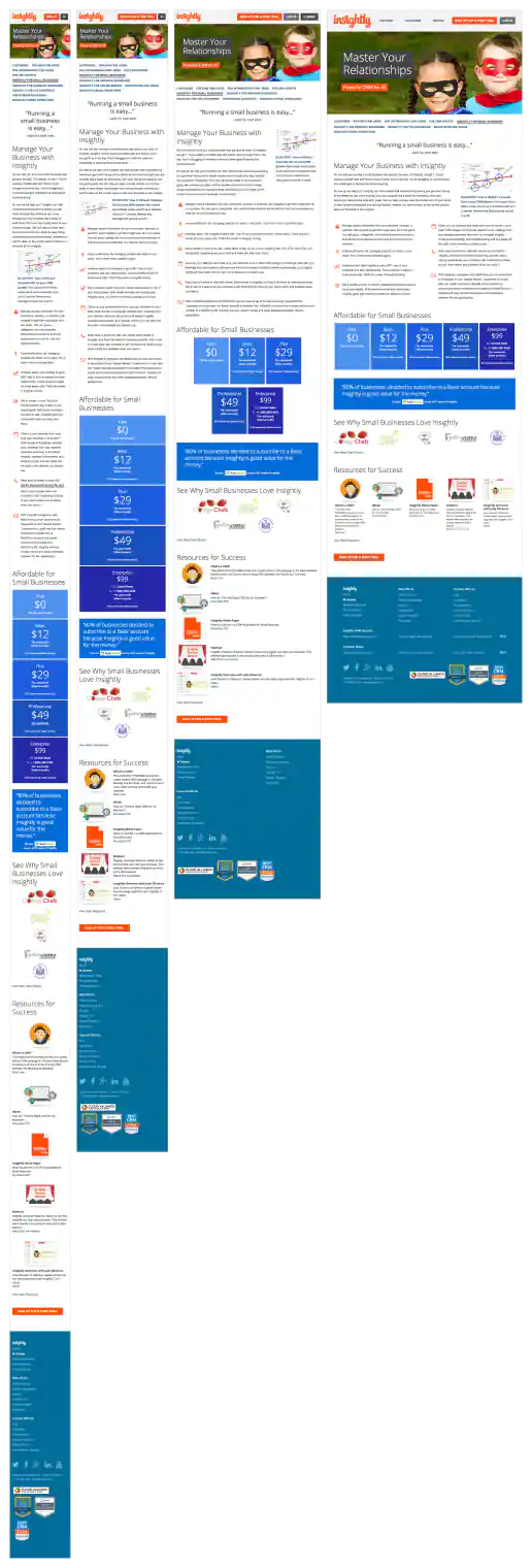
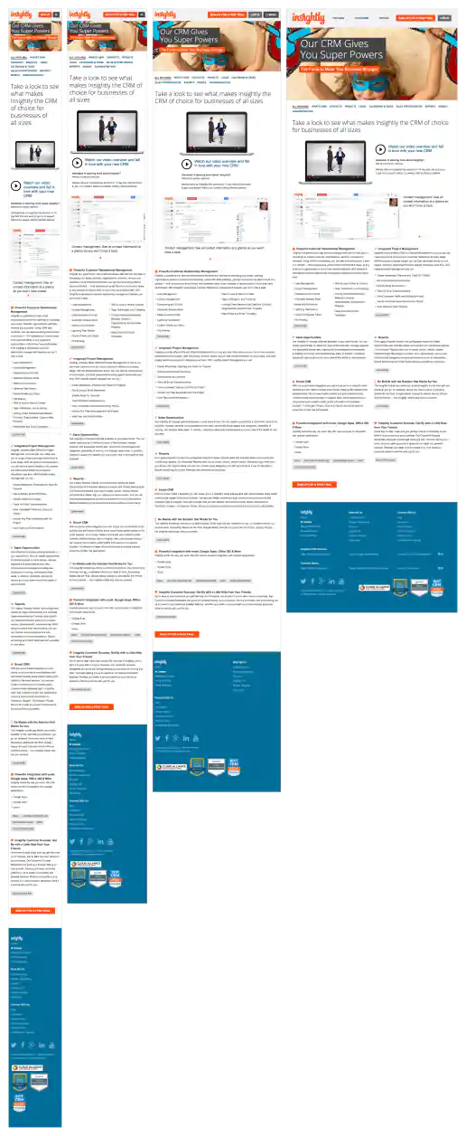
Insightly.com Responsive Website Design
Small Business Page
Project Description: Initial layouts were created by another designer for the desktop screen width then handed-off for me to develop the alternate layouts for mobile devices. I coded layouts to be flexible so they worked on as many devices as possible. With only a couple exceptions, all pages were coded with four primary target sizes in mind beginning with the "mobile first" methodology. Additional media-query breakpoints were created when content areas within the layouts did not degrade gracefully when being resized. Standard sizes I would test and create media-queries for where 480x320 for iPhone landscape mode, 320x480 for iPhone portrait mode, 768x1024 for iPad portrait mode, and 1024x768 for iPad landscape mode and desktop use cases.
Click for project detail view