Portfolio / Insightly.com Responsive Website Design
Insightly for Sales Page
Client
Market
Company Description
Insightly is a cloud based CRM and project management tool for small and medium businesses which integrates with G Suite, Microsoft Office and several other applications.
While working with the company my primary role was as front-end developer for www.insightly.com which involved maintaining the HTML, CSS, Javascript for their marketing site, creating a few html emails, a few banner ads and landing pages, plus occasional visual design projects when needed. Working with their in-house designers, developers, other contractors, and vendors I would create mockups, code prototypes, and integrate with marketing tools such as Marketo and Optimizely. Besides doing a lot of the A/B testing using Optimizely ourselves we eventually added services such as Experiment Engine, GetSmartContent, and Captora to help manage growing testing needs.
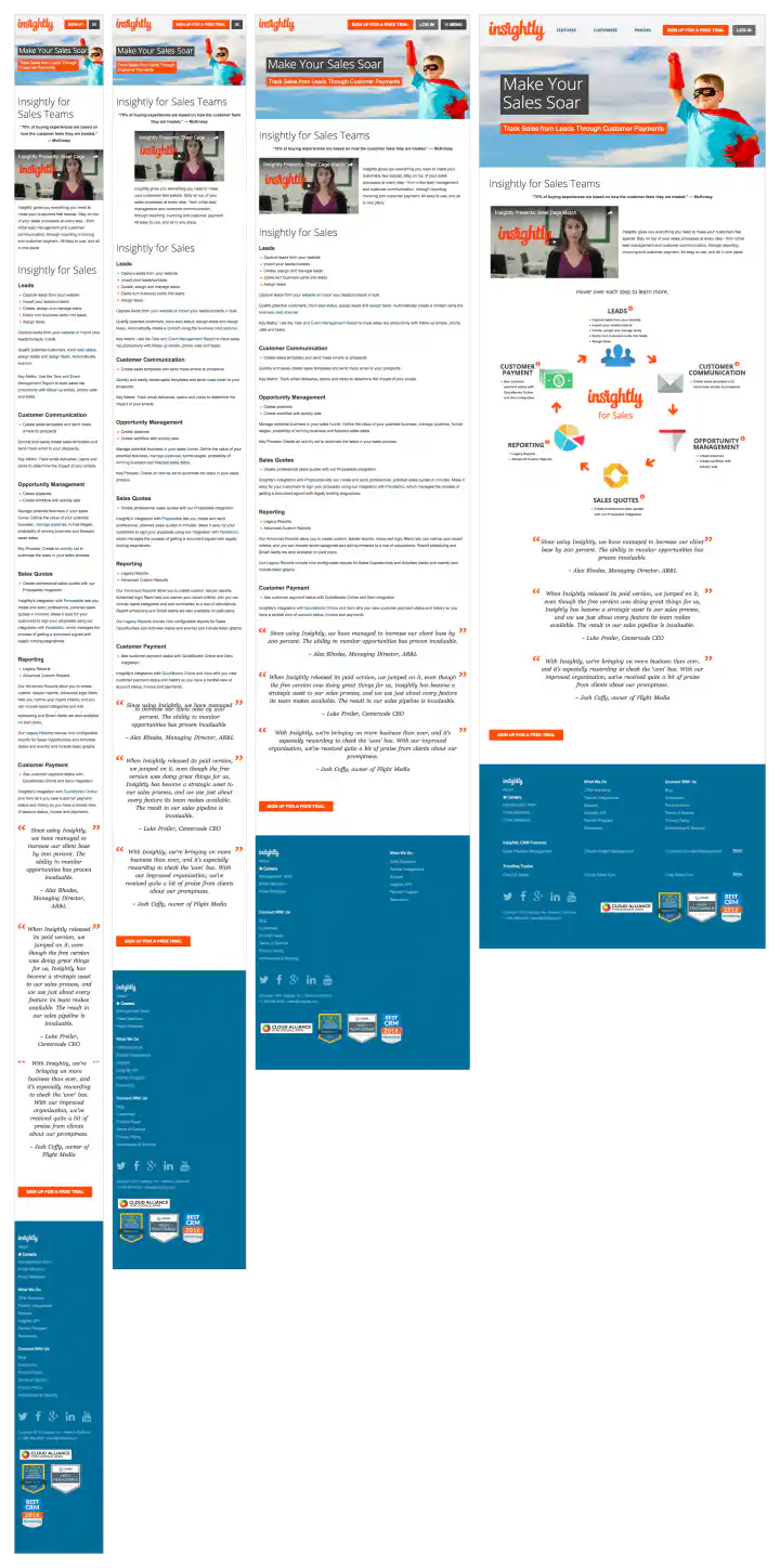
There were three major site redesigns while I was with the company as we created new sections, integrated internationalization (i18n) solutions localizing (l10n) site content for three additional languages. As part of the third redesign I built out the responsive web site design for the site by creating four additional layouts for each page and coding those break-points for mobile devices. The site was initially Microsoft .Net ASP based and I managed it using Visual Studio. Eventually we migrated to a WordPress CMS PHP configuration including custom themes and plugins I developed. We also migrated the corporate blog from Blogger to the WordPress platform and created a new design for it. In addition, the support site would occasionally need updating and design tweaks were needed along with their Facebook page, Youtube channel, and other online areas.
Industry
Media Type
Role
Year
2016
Project Description
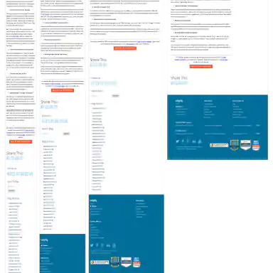
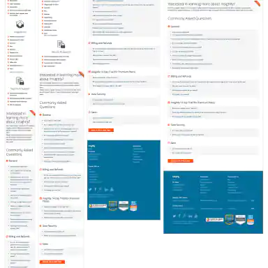
Initial layouts were created by another designer for the desktop screen width then handed-off for me to develop the alternate layouts for mobile devices. I coded layouts to be flexible so they worked on as many devices as possible. With only a couple exceptions, all pages were coded with four primary target sizes in mind beginning with the "mobile first" methodology. Additional media-query breakpoints were created when content areas within the layouts did not degrade gracefully when being resized. Standard sizes I would test and create media-queries for where 480x320 for iPhone landscape mode, 320x480 for iPhone portrait mode, 768x1024 for iPad portrait mode, and 1024x768 for iPad landscape mode and desktop use cases.
Samples In This Project
-
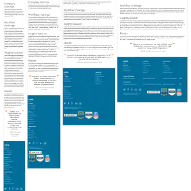
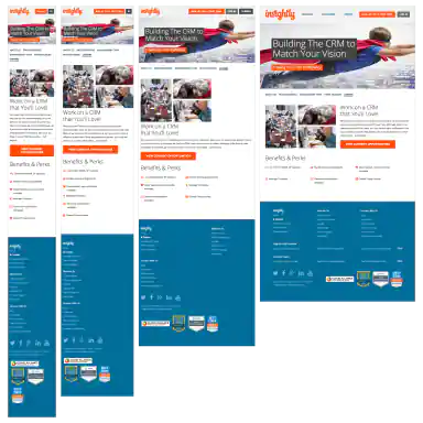
Homepage -
Features Page -
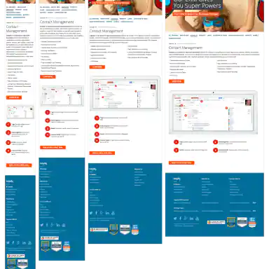
Contact Management Page -
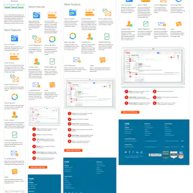
Project Management Page 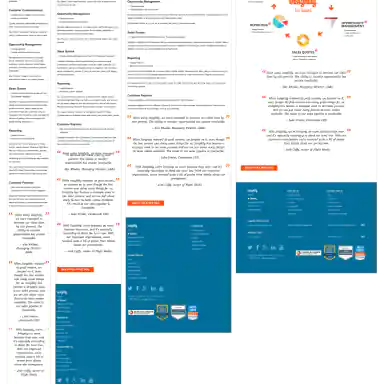
You
Are
Here Insightly for Sales Page-
Customers Page -
Customer Case Study Page Template -
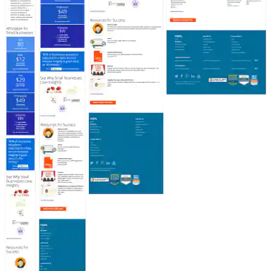
Small Business Page -
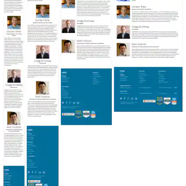
Management Team Page -
Careers Page -
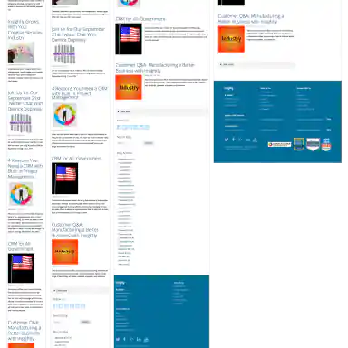
Main Blog Page -
Blog Article Page Template -
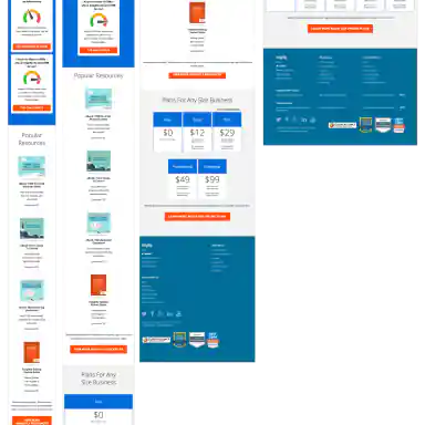
Pricing Page -
Mobile Only Pricing Page -
Login Page