-
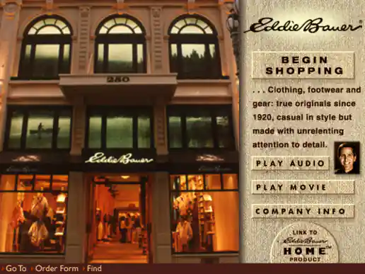
2Market CD Eddie Bauer Interface Designs
Project Description: Eddie Bauer was one of the catalogs presented on the 2Market CD. Sometimes vendors would just send their logo and let us design the interface for their catalog. I usually managed to preserve the brands look for well known companies so sign-offs went smoothly.
Click for project detail view
-
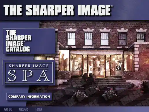
2Market CD The Sharper Image Interface Designs
Project Description: The Sharper Image was another one of the catalogs presented on the 2Market CD. Sometimes vendors would just send their logo and ask us to handle the interface design for their catalog. Since I was already familiar with the Sharper Image brand through their mailed catalog and had noticed their advertising on occasion plus I had visited their stores shopping a few times, I was able to successfully maintain the brands look and feel.
Click for project detail view
-
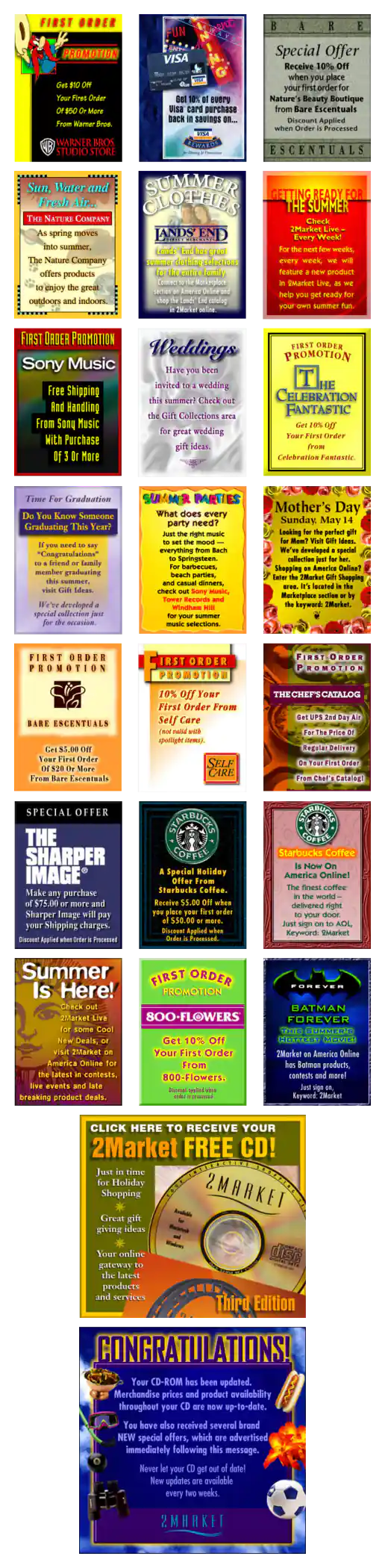
2Market Promotions
Project Description: The computer-based shopping service 2Market was formed by a partnership between America Online, Apple Computer and Medior in 1994. The CD-ROM version included 27 vendor catalogs including promotions (such as Chef's Catalog, Lands' End, Spiegel, Warner Bros. Studio Stores, New York's Metropolitan Museum of Art, and Sony Music). Occasionally new promotions were downloaded after connecting through AOL and presented as timely offers to potential customers.
Click for project detail view
-
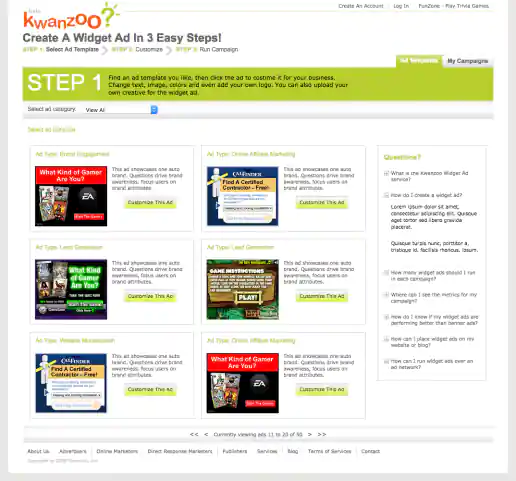
Kwanzoo Website Redesign
Ad Template Selection Page
Project Description:
Click for project detail view
-
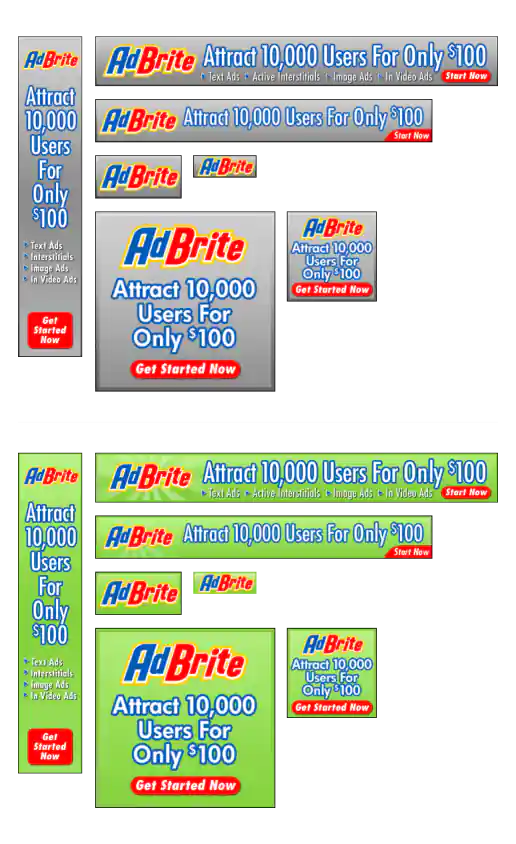
AdBrite Banner Ads
Project Description: Some quickie banner ads thrown together for AdBrite. By providing gray background and green background versions they could either choose which they liked better or test which others like better. By providing choices clients and customers are happier with the decisions they make.
Click for project detail view
-
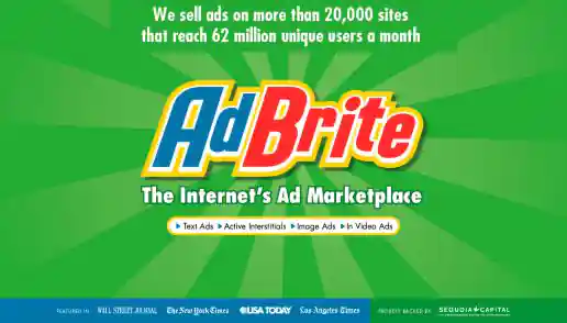
AdBrite Conference Booth Background Graphic
Project Description: Based on their logo I create perhaps half a dozen design variations before we settled on this version.
Click for project detail view
-
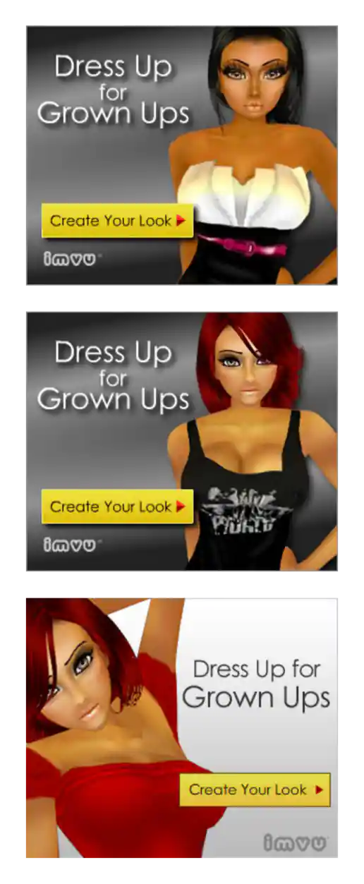
IMVU “Dress Up for Grown Ups” Campaign
Additional Alternates Tested
Project Description: Here we initially tested a few different taglines, models, clothing, and backgrounds using the 300x250 format. After determining which combination produced the best results additional ad sizes were created. Eventually localized versions for ten different geo-tarted audiences as well. Versions were also created to blend in with specific web site placements so they didn't stand out as being ads too much.
Click for project detail view
-
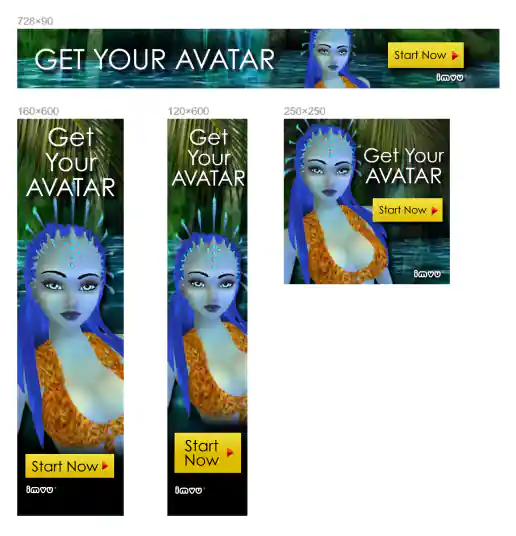
IMVU “Avatar” Movie Theme Campaign
Additional Banner Ad Sizes
Project Description: After going through several alternate looks for the avatar – including different poses, clothing, and background environments – we settled on going with this direction and tested a few different headline and button text combinations. Based on the direction landing page tests were also done and eventually the IMVU homepage included the design in the main image rotation.
Click for project detail view
-
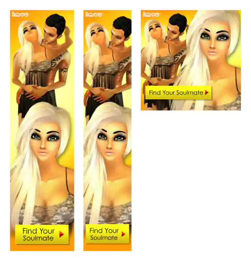
IMVU “Harlequin Pose” Banner Ads
Additional Banner Ad Sizes Created After Testing
Project Description: Two concepts initially created for testing before additional sizes created of the winning design direction.
Click for project detail view
-
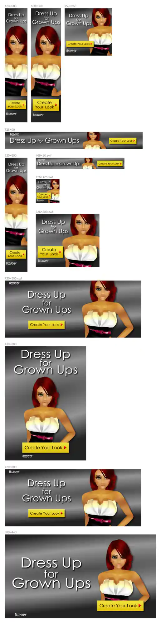
IMVU “Dress Up for Grown Ups” Campaign
Additional Banner Ad Sizes Created After Testing – 12 sizes
Project Description: Here we initially tested a few different taglines, models, clothing, and backgrounds using the 300x250 format. After determining which combination produced the best results additional ad sizes were created. Eventually localized versions for ten different geo-tarted audiences as well. Versions were also created to blend in with specific web site placements so they didn't stand out as being ads too much.
Click for project detail view
-
Wrinkle Cream Banner Ads
Additional LREC Examples
Project Description:
Click for project detail view

-
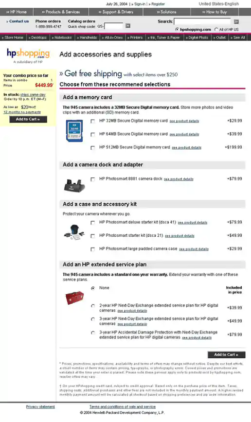
HPShopping.com PC Configurator
Adds-ons Page Design
Project Description:
Click for project detail view
-
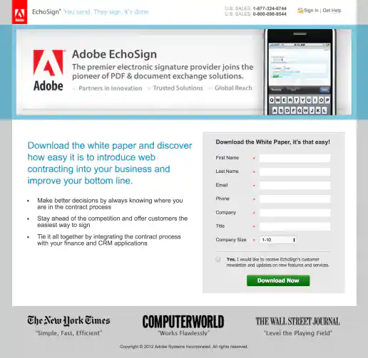
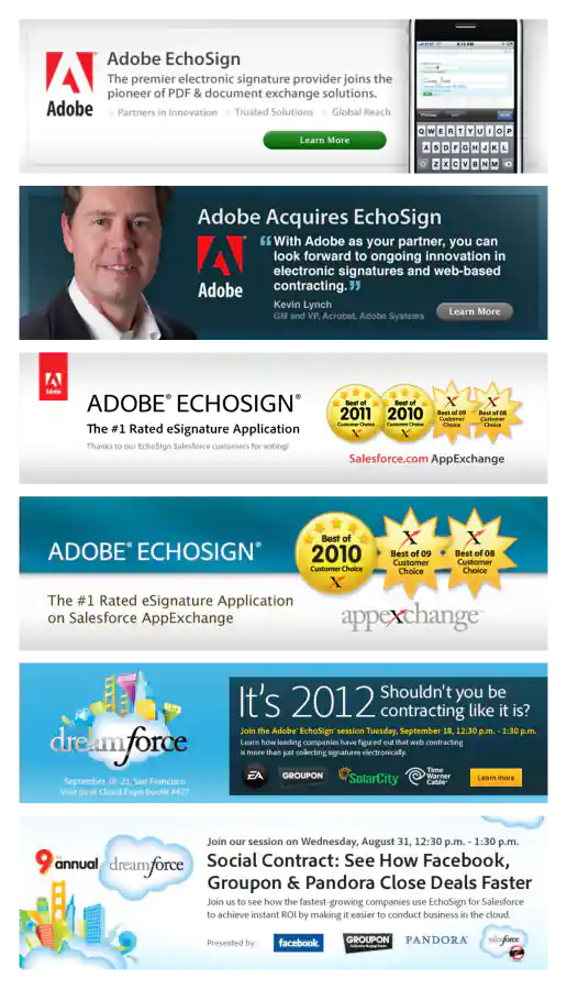
Adobe EchoSign Co-branded Landing Page Design
Project Description: Immediately after Adobe acquired EchoSign we did a quick update throughout the site merging the two brands by basically just sticking the Adobe red tag in the header and adding some legal text in the footer. This is an example of a landing page that I created during this time which still shows the EchoSign look with a few Adobe branding elements.
Click for project detail view
-
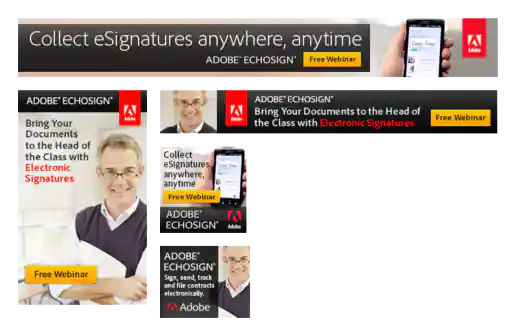
Adobe EchoSign Community College Week Banner Ads
Project Description: These were reworded/updated for use targeting CFOs also. The guy with the glasses kinda looks like like he could be either a professor or an accountant.
Click for project detail view
-
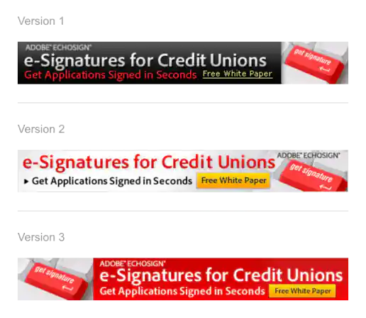
Adobe EchoSign Credit Union Banner Ad Variations
Project Description:
Click for project detail view
-
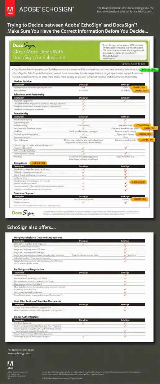
Adobe EchoSign DocuSign Corrections Interactive PDF
Project Description: Interactive PDF created with rollovers highlighting incorrect sections of a DocuSign comparison white paper that DocuSign was distributing. You have to download the PDF to your hard drive and open it in Acrobat Reader to see the rollovers. It doesn't work if you just view the PDF in a web browser.
Click for project detail view
-
Adobe EchoSign Free Trial Campaign for Real Estate Agents and Brokers
Project Description: We iterated on these two directions a few times. Other versions included text such as “...and Save 50% on a Pro Account” in addition to the free documents offer.
Click for project detail view
-
Adobe EchoSign Graphics for Trade Show Booth
Project Description:
Click for project detail view
-
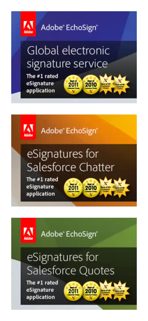
Adobe EchoSign Homepage Billboard Image Design Examples
Project Description: This is only a few of the many I either created from scratch or repurposed and updated over a few years. For example each year EchoSign would have a booth and participate at the Salesforce Dreamforce conference and the billboard image that appears on the homepage would need to be updated each year announcing sessions featuring EchoSign or awards EchoSign has won.
Click for project detail view
-
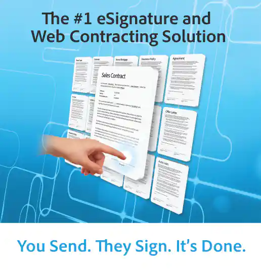
Adobe EchoSign Landing Page with Stats Billboard
Project Description: Showing numbers is a tactic for connecting with businesses by making the company look more legit/impressive. Mentioning time saved, number of customers, and amount saved is similar to saying it's quick, easy, and free but in a less consumery retail-like way.
Click for project detail view
-
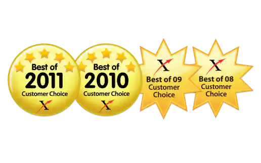
Adobe EchoSign Salesforce AppExchange Customer Choice Award Badges
Project Description: I couldn't find large clean versions of these online so I recreated them in Adobe Illustrator as vector art so we could use them in print and online. Pretty close match I think.
Click for project detail view
-
Adobe EchoSign Salesforce Website Graphics
Project Description: Not really banner ads (they don’t have buttons or a call-to-action), but I wasn't sure where to put these. Maybe these could be in a media-type category called “Branding Elements” or something.
Click for project detail view
-
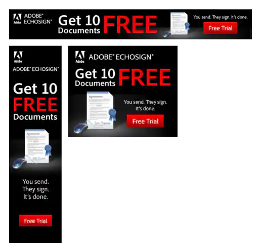
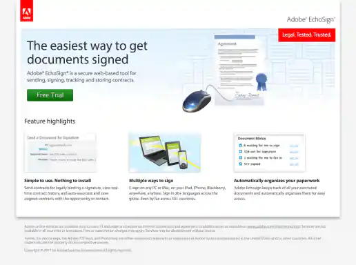
Adobe EchoSign Short Landing Page
Project Description: The collage with the agreement and mouse was created in Adobe Illustrator, only the mouse photo was a raster image. The illustrated contract includes real contract text in case anyone looked at it closely. A second version of this landing page design included a Free Webinar button next to the Free Trial button.
Click for project detail view
-
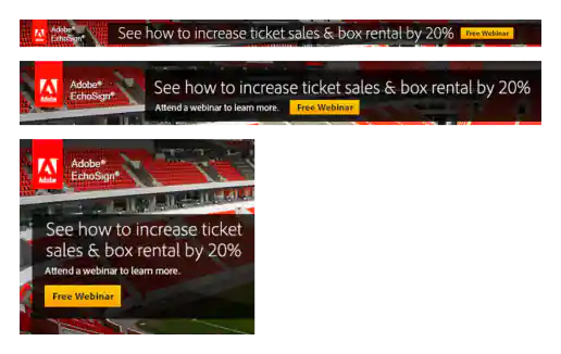
Adobe EchoSign Sports Related Banner Ads
Project Description:
Click for project detail view