Portfolio / Project List
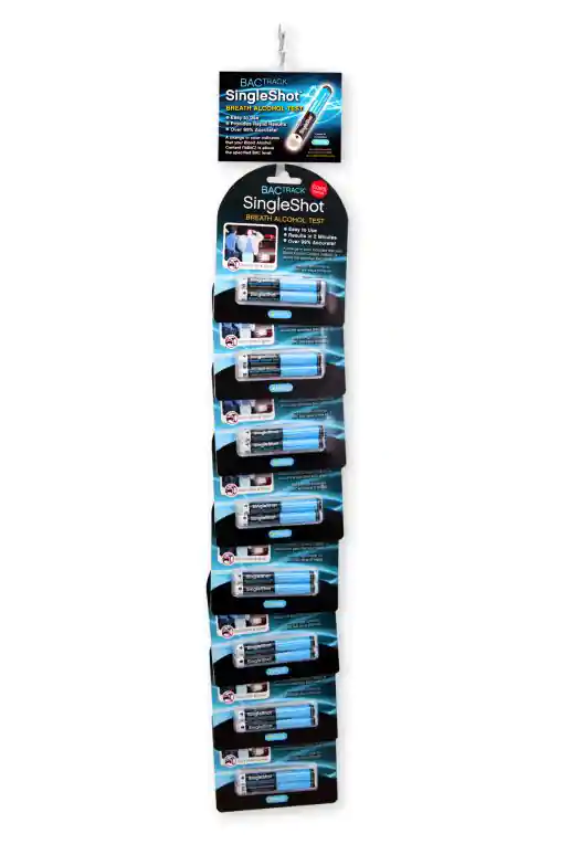
BACtrack Select Series POP Tower Display Header Card Design
Project Description:Showing bleed with magenta spot color indicating die-cut keyline.
BACtrack Shipper Tray Countertop Display Design 3D Walkaround
Project Description:This 3D walk-around provides a demonstration of the design for a table-top display which is shipped to retailers. The walkaround provides some idea of what the experience will be looking at the shape and graphics placed on the outside of the display.
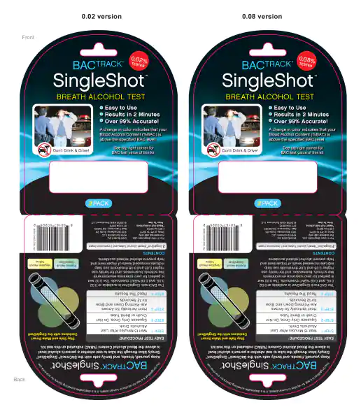
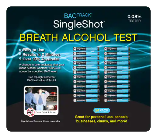
BACtrack SingleShot Costco Oversized Clamshell Packaging Design
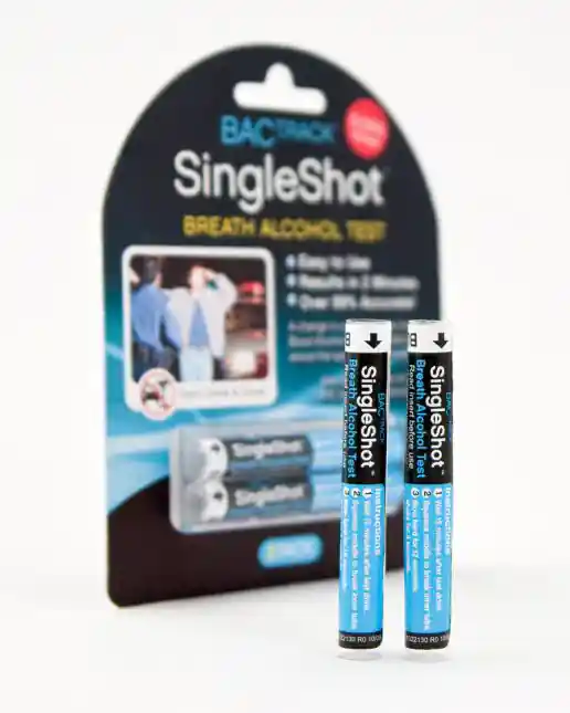


BACtrack “Don’t Drink and Drive” Graphic Symbol
Project Description:Created initially as something to use on an empty page in product manuals. If the folios required x number of pages and the content filled less than that we needed something that looked relevant to add. On some projects I would add a “Notes” page or something similar. I avoid having one of those “This page intentionally left blank.” statements which aren't inspiring or informative. This graphic became useful on additional projects such as advertisements and product packaging also.

Project Description:Back in 1998 this took some advanced production optimizing the color palette so the animated gif could download as quick as possible over a 56K modem connection.

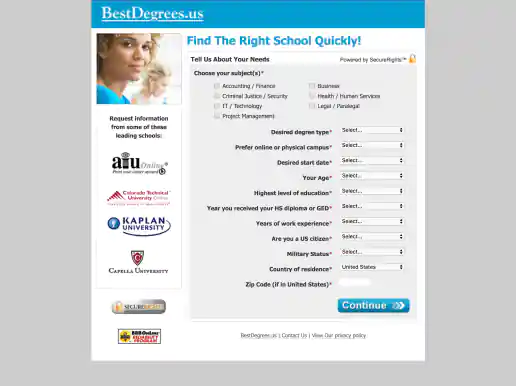
Project Description:A project me and another guy at Yahoo! developed outside of work to see if we could sell EDU vertical leads. We used the .us domain name extension based on some insight we had that U.S. colleges have a strong appeal to non-U.S. citizens who would like to come to the U.S. for college. I tried to keep the visual design clean and simple, though the photo of the girl starring at you might be a little distracting.
Project Description:Created just for fun. Had to get it out of my system.
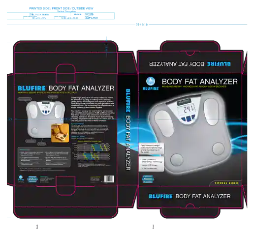
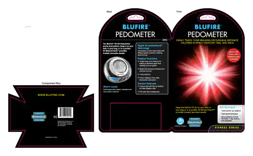
BluFire Body Fat Analyzer Packaging
Project Description:Showing production art with bleed and magenta spot color keyline indicating die-cut shapes and folds.
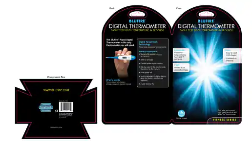
BluFire Digital Thermometer Clamshell Packaging Header Card
Project Description:Showing production art with bleed and magenta spot color keyline indicating die-cut shapes and folds.

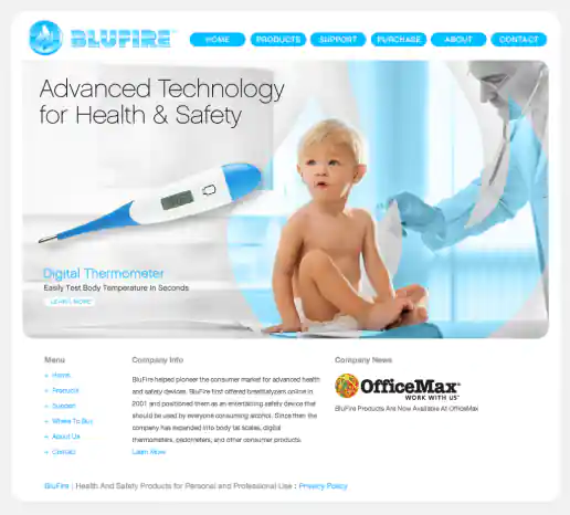
Project Description:Ecommerce website created after logo and packaging treatments where designed. I decided to use rounded shapes so the site feels more friendly than technical and I used flat shapes with no shading or shadows to create a clean, flat, uncomplicated look.