Portfolio / Project List

ApartmentSearch.com Region Based A/B Landing Page Test Variations
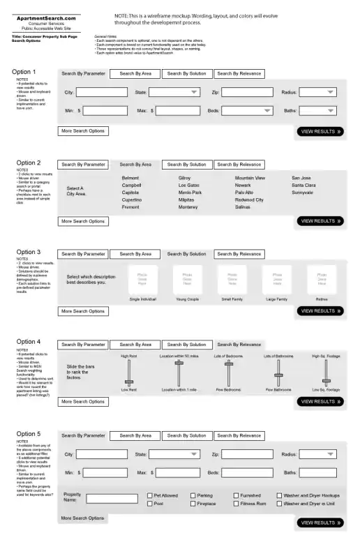
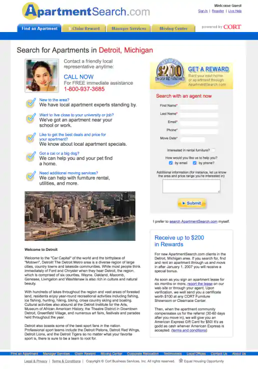
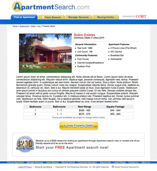
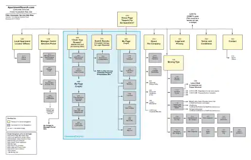
ApartmentSearch.com Search Flow UX Design
Project Description:Alternate search user experiences wireframed and presented after doing initial design research and competitive analysis. Wireframes show search interfaces which allow users to locate properties they might be interested in by manually entering search keywords, clicking categories, selecting their solution (persona) type, rating importance of features, and other methods. Criteria could also be expanded or minimized depending on how detailed users wanted to get when selecting their needs. Screenshots and walkthroughs of competition were presented to make sure we were providing a familiar, expected, common search interface pattern yet also improving the experience for users.
Apple Point-of-Purchase Printer Samples
Project Description:Apple use to make printers that were sold in stores such as Circuit City and Best Buy. Some printer displays would have a special button attached so customers could push it and see the printers in-action printing a sample page. This project also included a custom counter-top standee display with tabbed laminated pages that customers could flip though to view more samples and read detailed product specifications (wish I documented those along with that cool industrial design!). Art Director: Mark Drury.
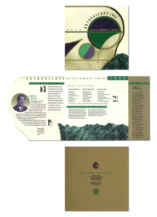
Arthroscopy Seminar Brochure Design
Project Description:This tri-fold brochure mailer combined some interesting design elements. Such as the third panel which opened to reveal a large stripe of gold ink presenting the special speakers and faculty names. It was great we had a budget to use the gold ink which helped elevate conceptually how notable the event was. By abstracting and stylizing the technical illustration of a knee we created a unique look and a shape which worked perfectly as a die cut cover. This is one of those projects where we would hang out in the back at Kinko’s banging away on their fancy Apple Quadra computers paying to use Adobe Illustrator and Photoshop by the hour. I would push around elements on the screen, try different colors, swap in and out different illustrations we had found, until something clicked and looked good. Art Director: Lane Hiers
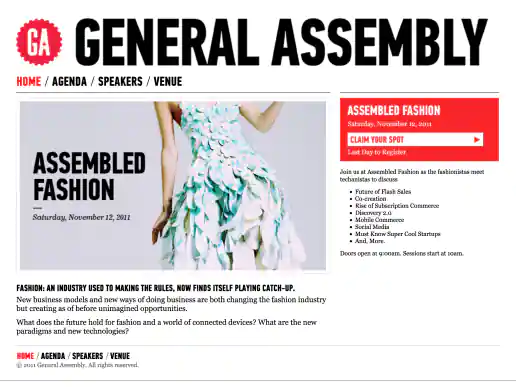
Project Description:Assembled Fashion was a brief sub-brand of General Assembly created for this fashion themed conference. Initially when my client had the fashion conference idea I had started designing an entirely different looking website. But as General Assembly became involved with putting on the conference I adopted they're look and feel. It's always an interesting experience adopting another designers look and feel and discovering a new style to work with.
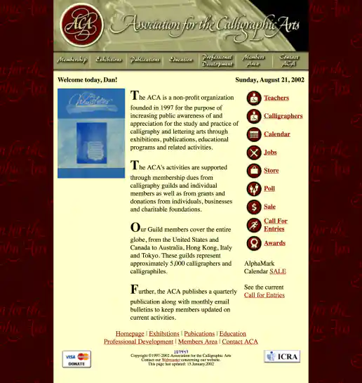
Association for the Calligraphic Arts Website Redesign
Project Description:Freebie redesign project I worked on early in my career in exchange for a letter of reference. The experience was an education.
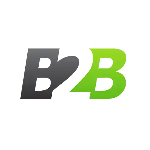
Project Description:The client needed something to distinguish a subject area of their conference events specifically meant for business-to-business marketing professionals. After trying a few arrangements of the letters I came up with this pretty quickly and applied colors and a style that fit in with the rest of the brand so it still looked related to the event.
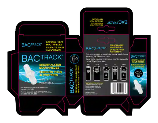
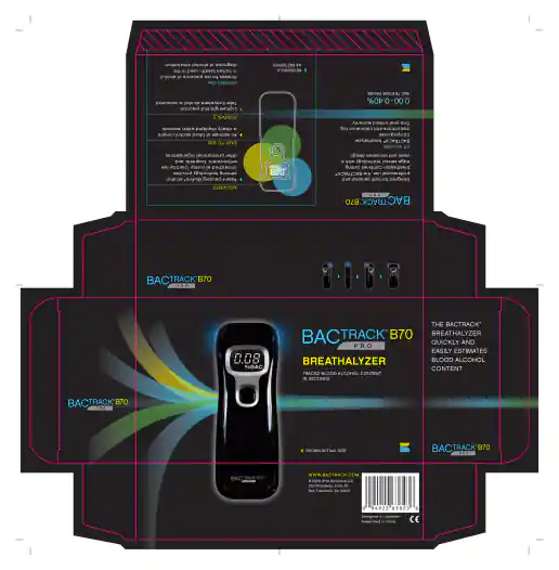
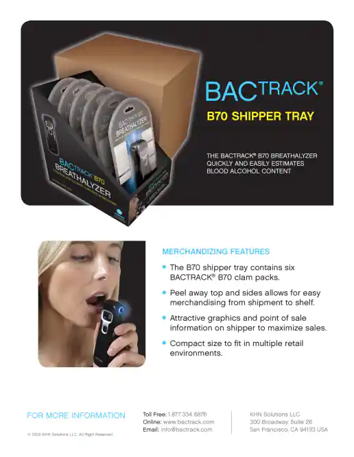
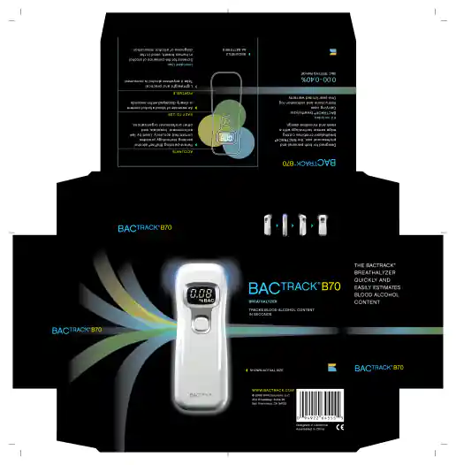
BACtrack 10 Piece Breathalyzer Mouthpiece International Packaging
Project Description:Showing production art with bleed and magenta spot color keyline indicating die-cut shapes.
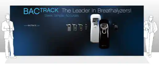
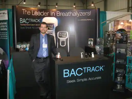
BACtrack 20×10 Serpentine Conference Booth Background Graphic
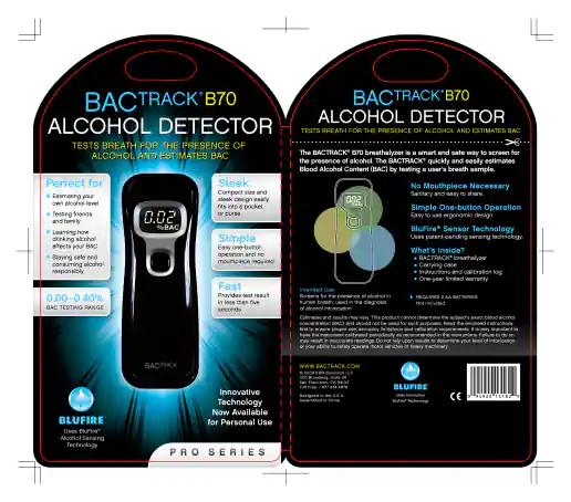
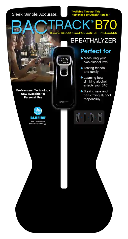
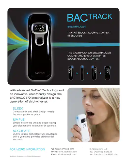
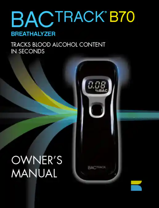
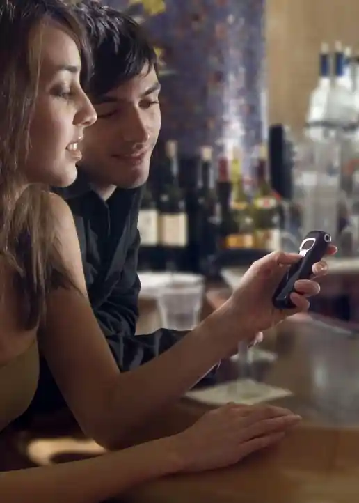
BACtrack B70 Product and Lifestyle Photoshoot – 26 Examples
Project Description:As Art Director on this project I made recommendations for selecting the photographer, models, and shooting locations. Direction included letting the photographer know the type of lighting we wanted to try (based on his previous work), clothing options for the models to bring (flat colors with minimal patterns that don’t look busy), position of the models based on various scenarios (such as facing the camera, other models, or towards the product), and angles for shooting long shots with less background cropping along and closeups with products held close. Having a budget and being able to work with a pro photographer helped a lot. We were able to achieve the visual style we were going for in addition to just getting lots of shots at different angles and situations to work with. By giving the photographer room to also direct models and get creative within the scenarios as the shoot progressed we were able to create additional unplanned image assets that otherwise could not have been imagined beforehand. Wonderfully rewarding collaboration I'd say! Some photos I also later retouched by adding digital readouts on the screens, glows, removing backgrounds, dodging and burning areas, spot removals and so on which can take some time. This collection shows a few pre-retouching and a few after retouching. By including some time for the photographer and models to improvise and get creative during the shoot, the resulting outcome was definitely improved and better than expected overall. We created a *lot* of valuable images for the client, affiliates, and press to use in promoting the products visually on the website, in ads, on TV, print, and other media.