Portfolio / Project List

Real Estate Agent Training Course – Short Format Commercial
Project Description:An exercise I created to demonstrate some of my basic video animation and editing abilities.
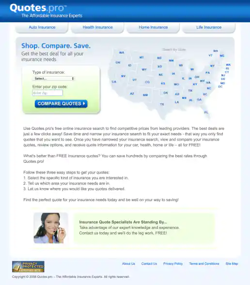
Project Description:Quotes.pro was all about generating sales leads for the auto, health, home, and life insurance industries. The site consisted of landing pages for the four insurance verticals plug geo-targeted landing pages based on the visitors U.S. state location. Articles and url structure included targeted keywords to help generate natural SEO traffic as well (such as if someone searched Google for "Texas auto insurance") and the geo-targeted landing pages provided relevant high-quality content (500 word crowd sourced articles) for AdWords campaigns with headlines such as "Shop Texas Auto Insurance".
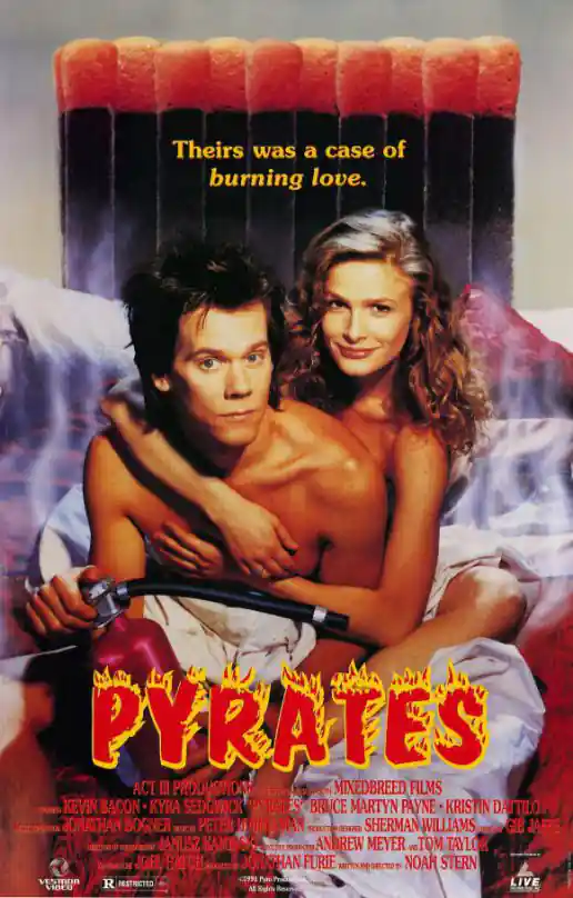
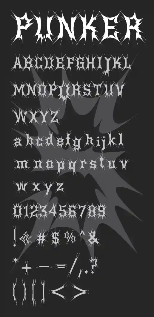
Project Description:Early in my career it was great to see a design I contributed to get submitted along with the Art Directors and Senior Designers. One of the poster mockups I created for Pyrates included this font I picked out. I worked on a lot of other similar projects mostly doing paste-up print production work which I didn't save as portfolio pieces but sometimes wish I had.
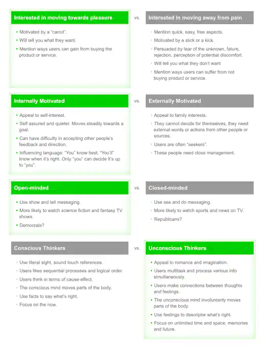
Project Description:A framework I sometimes use (even if it’s just for myself) to help plot creative direction and stimulate thinking.
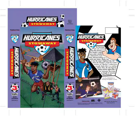
PolyGram Video Hurricanes VHS Jacket for Volume 3: Stowaway
Project Description:On this project I was primarily responsible for typesetting, finalizing the layout, and creating printer-ready artwork using QuarkXPress. Some illustrations were "for position only" (FPO) and scanned in seperately by the printer. Art Director: Scott MacPhee
PeopleSoft Connect Conference Guidebook – Onsite Version
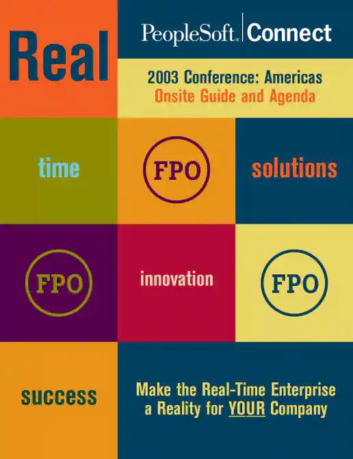
Project Description:This version of the guidebook was handed out at the event. The layout template with FPO text and graphics was created in InDesign and handed-off as a template to be populated by another designer nearer the event date so it could include more specific detailed information.
PeopleSoft Connect Conference Guidebook – Mailer Version
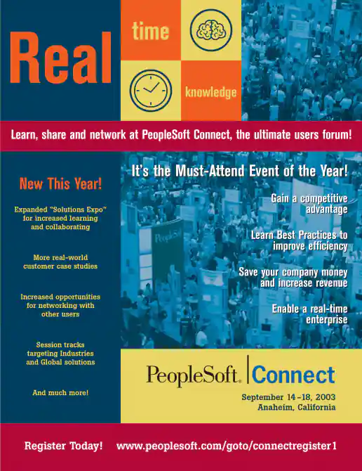
Project Description:Created in-house at PeopleSoft based on their “Real” concept (previous attendee feedback was they wanted ‘real’ content). Other event materials were leveraged for developing guidelines on use of colors, icons, fonts, graphics and wording/adjectives, such as previously created “Save the Date” postcards and wayfinding signage, My concept was to have a continuous line run page to page to tie everything together visually and to hang content from. I then used the orange from their corporate color palette to lead the viewers eye through content areas from page to page. Multiple mailer versions were sent out to generate demand and ultimately registrations for the event by targeting audiences such as past attendees, Asia Pacific, Latin America, North America, and for web download.
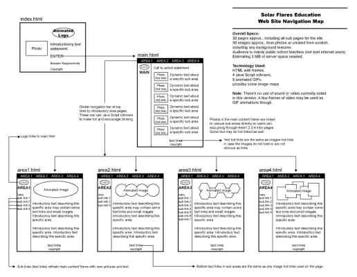
PBS Education Website Overview for Solar Flares Subject Area
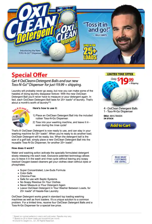
OxiClean Detergent Toss-N-Go Dispenser Campaign With Billy Mays
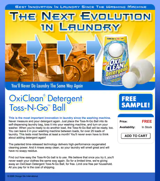
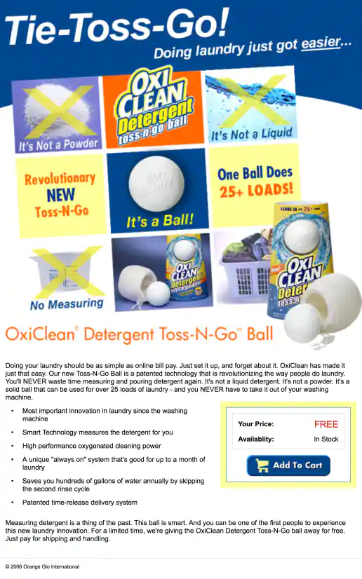
OxiClean Detergent Toss-N-Go Ball “The Next Evolution In Laundry” Campaign
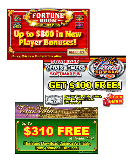
Online Gambling Casino Banner Ads – 3 Examples
Project Description:Hey - I didn’t invent pop-up, pop-over, pop-under ads! But did create a bunch that were pretty good a getting attention and clicks. Sometimes I wonder if I should show examples of this kind of work or even admit I contributed to creating such annoying intrusive marketing pieces. By confessing my participation in such practices perhaps I can move further away from them though. Some were kinda cool looking though.
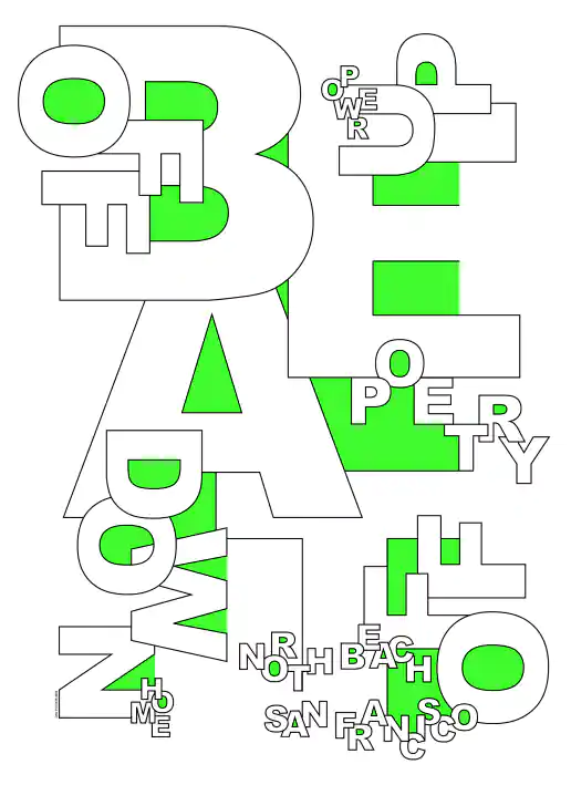
North Beach Beat Typographic Poster
Project Description:Created as part of a CalArts alumni art show I participated in. The show was held in the Presidio Park area of San Francisco while I was living in the North Beach neighborhood just down the street.
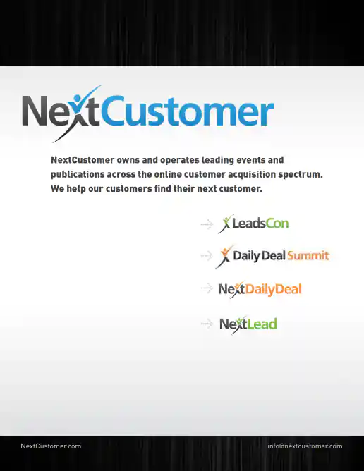
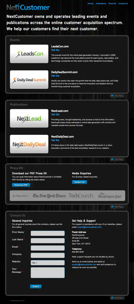
Project Description:As more and more products were developed the NextCustomer umbrella brand was created. I created this one-page website to help visitors understand the brand organization and how products related. Adding a Press Kit section and Contact Us form streamlined access for publishers to get promotional assets and to directly contact upper management which helped facilitate successful new product launches and overall business growth.
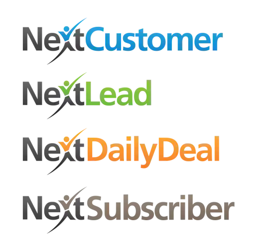
NextCustomer Family of Brands Logo Examples
Project Description:The original LeadsCon logo had a checkmark in a box as the logomark along with the logotype. This redesign for the NextCustomer logo was crowd sourced by my client and I was assigned to create the additional family of logos based on the new direction. Each website already had a distinct color I had developed previously and applied to the various logos. NextSubscriber had not been designed or developed yet so it's color is less thought out.