-
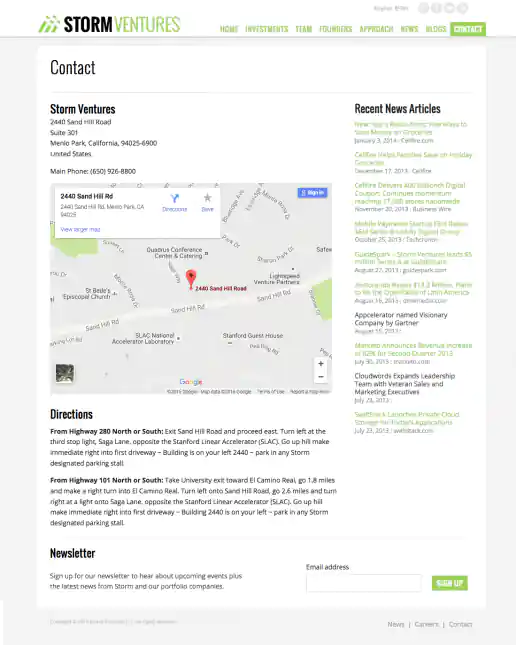
StormVentures.com Website Redesign
Contact Information Page
Project Description:
Click for project detail view
-
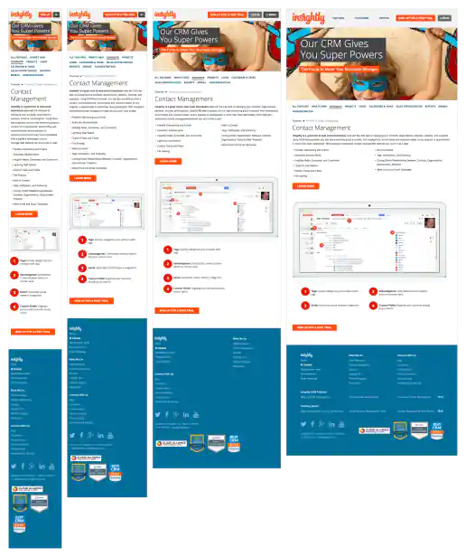
Insightly.com Responsive Website Design
Contact Management Page
Project Description: Initial layouts were created by another designer for the desktop screen width then handed-off for me to develop the alternate layouts for mobile devices. I coded layouts to be flexible so they worked on as many devices as possible. With only a couple exceptions, all pages were coded with four primary target sizes in mind beginning with the "mobile first" methodology. Additional media-query breakpoints were created when content areas within the layouts did not degrade gracefully when being resized. Standard sizes I would test and create media-queries for where 480x320 for iPhone landscape mode, 320x480 for iPhone portrait mode, 768x1024 for iPad portrait mode, and 1024x768 for iPad landscape mode and desktop use cases.
Click for project detail view
-
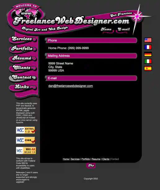
FreelanceWebDesigner.com Website Design
Contact Page
Project Description: My old site promoting freelance services. The initial idea was to create a look that was inviting and fun to interact with but also futuristic and indicated a technical savviness, perhaps like an interface you'd see in a the Jetsons TV cartoon. This is the result of that direction which combines French curve shapes (a traditional design element) with an electric spark (signifying the electronic age or futuristic direction) to give the design element some life and make ot ‘pop’.
Click for project detail view
-
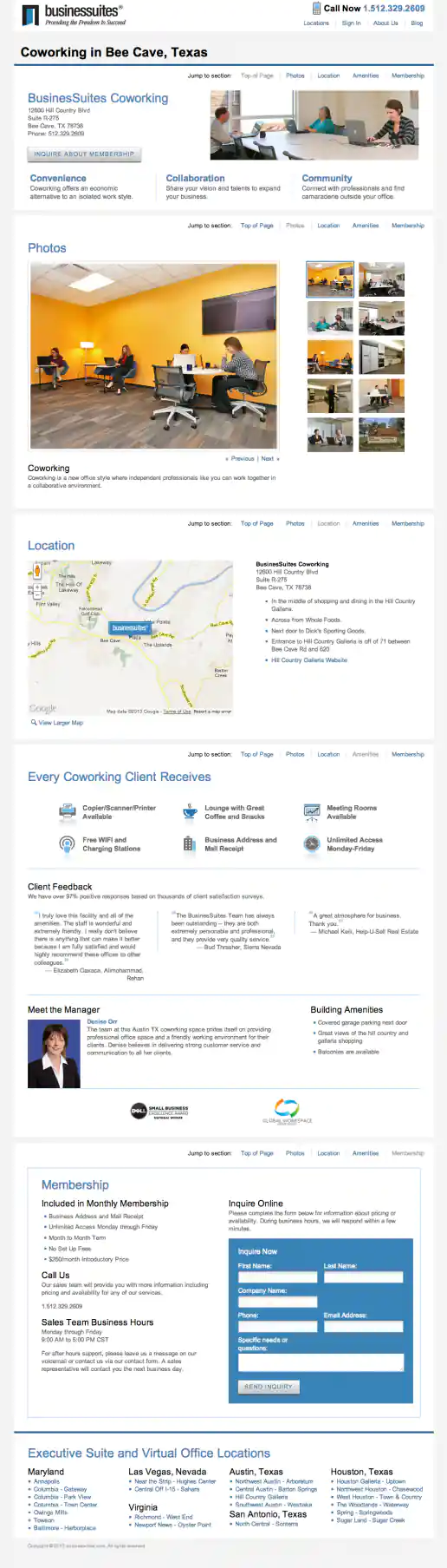
BusinesSuites Website Redesign
Coworking Page - Example 1
Project Description:
Click for project detail view
-
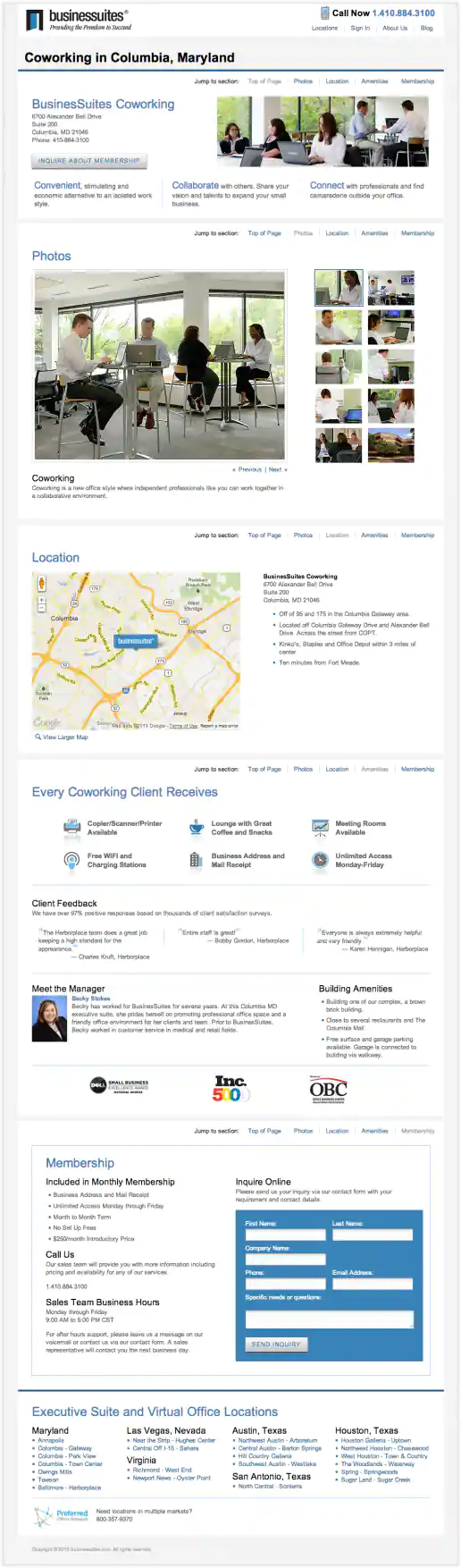
BusinesSuites Website Redesign
Coworking Page - Example 2
Project Description:
Click for project detail view
-
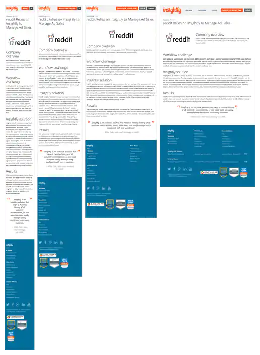
Insightly.com Responsive Website Design
Customer Case Study Page Template
Project Description: Initial layouts were created by another designer for the desktop screen width then handed-off for me to develop the alternate layouts for mobile devices. I coded layouts to be flexible so they worked on as many devices as possible. With only a couple exceptions, all pages were coded with four primary target sizes in mind beginning with the "mobile first" methodology. Additional media-query breakpoints were created when content areas within the layouts did not degrade gracefully when being resized. Standard sizes I would test and create media-queries for where 480x320 for iPhone landscape mode, 320x480 for iPhone portrait mode, 768x1024 for iPad portrait mode, and 1024x768 for iPad landscape mode and desktop use cases.
Click for project detail view
-
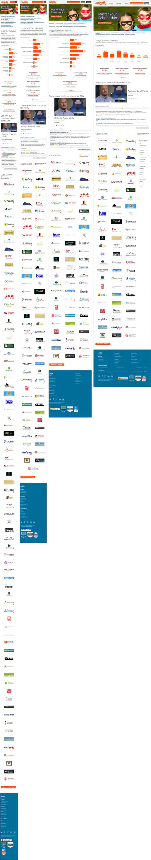
Insightly.com Responsive Website Design
Customers Page
Project Description: Initial layouts were created by another designer for the desktop screen width then handed-off for me to develop the alternate layouts for mobile devices. I coded layouts to be flexible so they worked on as many devices as possible. With only a couple exceptions, all pages were coded with four primary target sizes in mind beginning with the "mobile first" methodology. Additional media-query breakpoints were created when content areas within the layouts did not degrade gracefully when being resized. Standard sizes I would test and create media-queries for where 480x320 for iPhone landscape mode, 320x480 for iPhone portrait mode, 768x1024 for iPad portrait mode, and 1024x768 for iPad landscape mode and desktop use cases.
Click for project detail view
-
DailyDealSummit.com Website
Daily Deal Summit West Sponsors Page
Project Description:
Click for project detail view

-
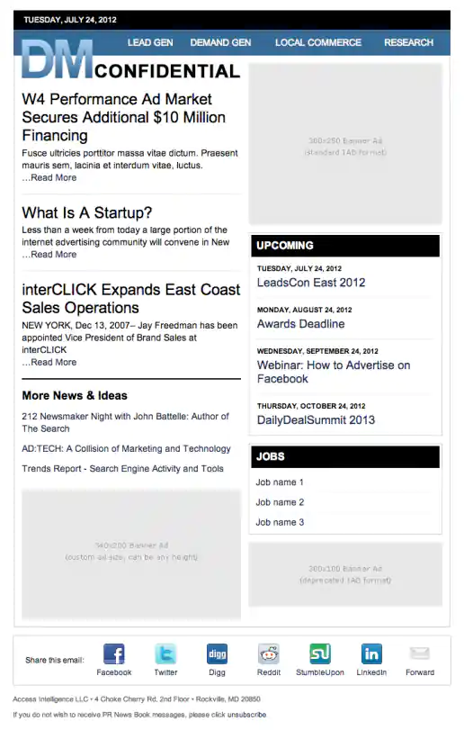
Direct Marketing Confidential Email Newsletter Template Design
Project Description:
Click for project detail view
-
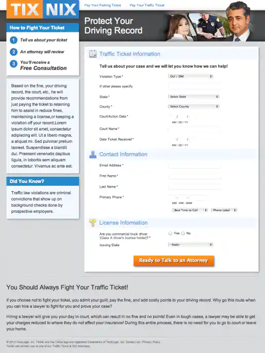
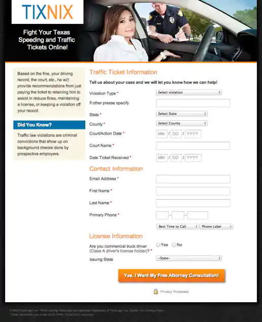
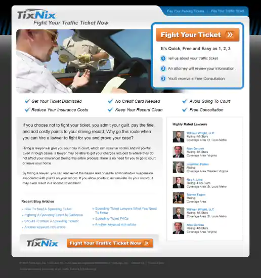
TixNix Microsite Redesign
Direction 1: Form Page
Project Description:
Click for project detail view
-
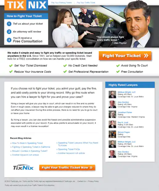
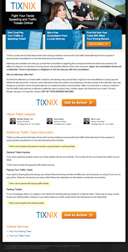
TixNix Microsite Redesign
Direction 1: Landing Page
Project Description:
Click for project detail view
-
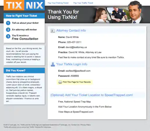
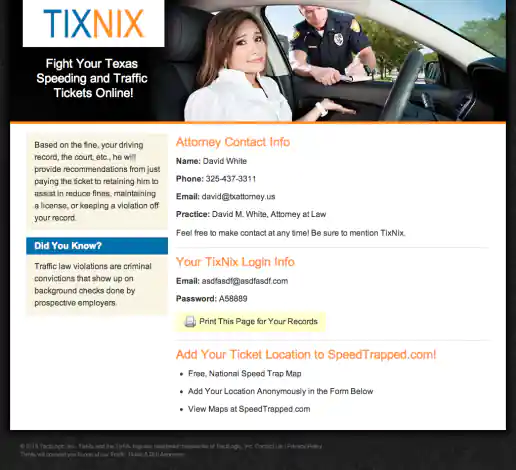
TixNix Microsite Redesign
Direction 1: Success Page
Project Description:
Click for project detail view
-
TixNix Microsite Redesign
Direction 2: Form Page
Project Description:
Click for project detail view
-
TixNix Microsite Redesign
Direction 2: Landing Page
Project Description:
Click for project detail view
-
TixNix Microsite Redesign
Direction 2: Success Page
Project Description:
Click for project detail view
-
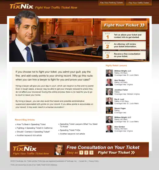
TixNix Microsite Redesign
Direction 3: Landing Page Look and Feel (Unused)
Project Description:
Click for project detail view
-
TixNix Microsite Redesign
Direction 4: Landing Page Look and Feel (Unused)
Project Description:
Click for project detail view
-
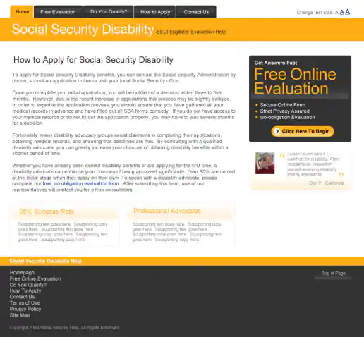
Social Security Disability Microsites
DisabilityHelp.me
Project Description: Microsite designs for disabilityhelp.me and socialsecurityhelp.com
Click for project detail view
-
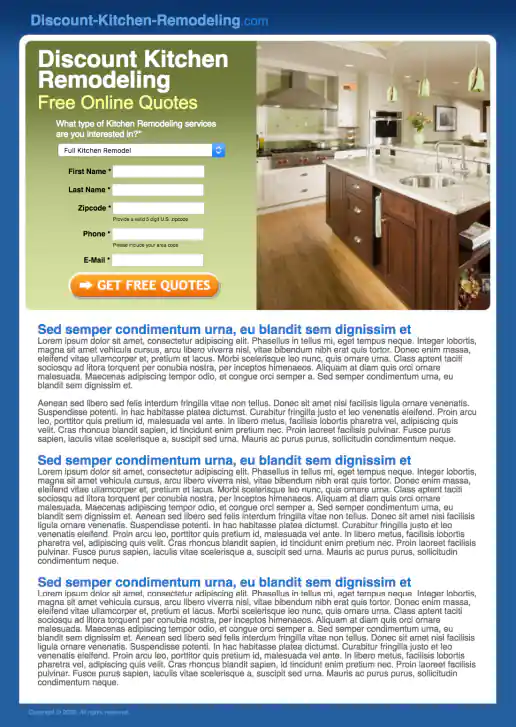
Discount-Kitchen-Remodeling.com Landing Page Design
Project Description:
Click for project detail view
-
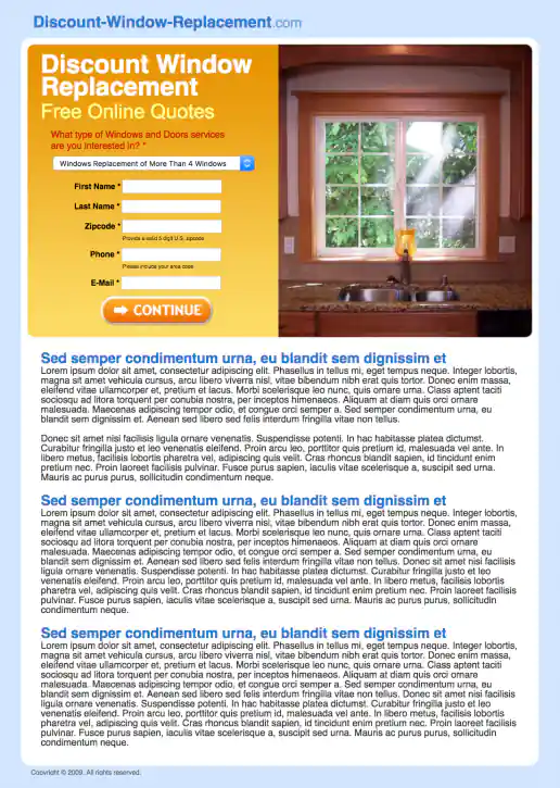
Discount-Window-Replacement.com Landing Page Design
Project Description:
Click for project detail view
-
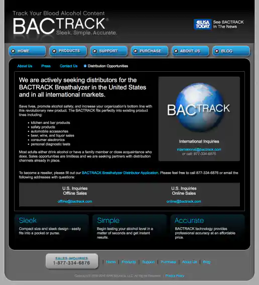
BACtrack Breathalyzers Website Redesign
Distribution Opportunities Page
Project Description:
Click for project detail view
-
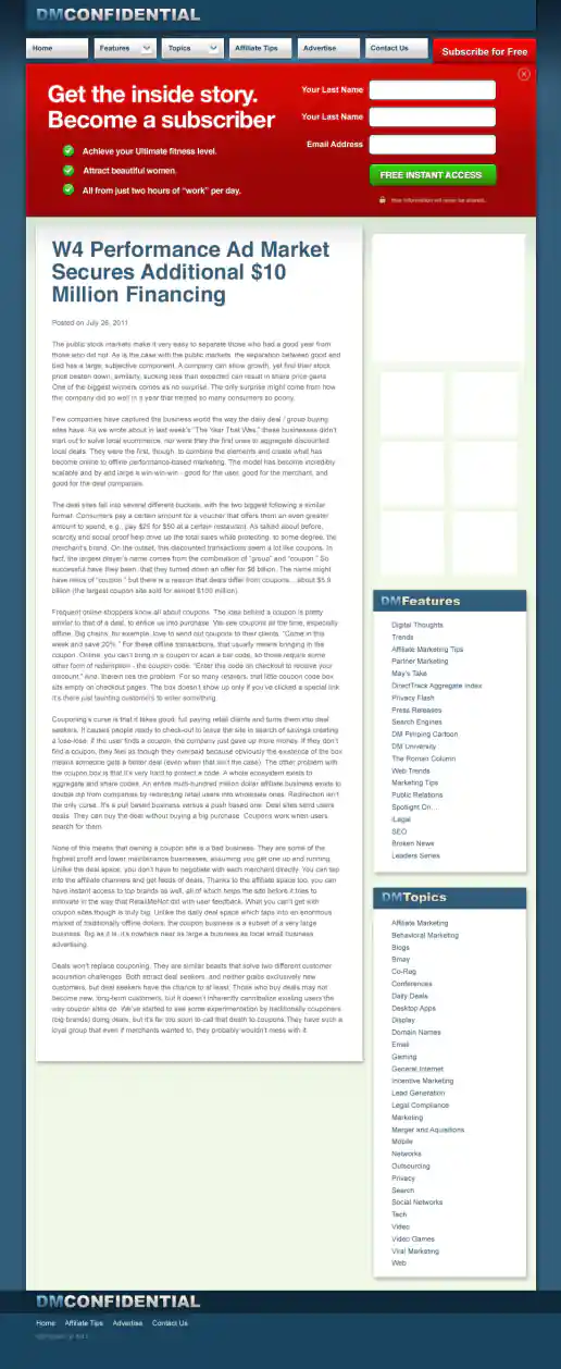
DMconfidential.com Newsletter Subscriber Signup
DMconfidential.com Newsletter Subscriber Signup – Mockups for 2 Design Directions
Project Description:
Click for project detail view
-
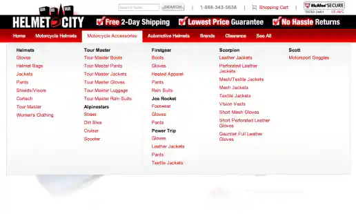
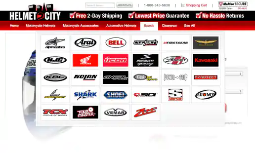
Helmet City eCommerce Website Design
Drop Down Mega-Menu: Example 1
Project Description:
Click for project detail view
-
Helmet City eCommerce Website Design
Drop-Down Mega-Menu: Example 2
Project Description:
Click for project detail view