Portfolio / Industries / Technology
-
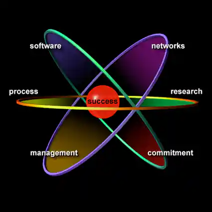
Erbes Development Group Services Graphic
Project Description:
Click for project detail view
-
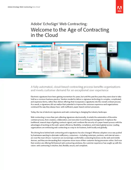
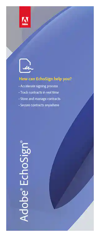
Adobe EchoSign White Papers and Data Sheets
Example Data Sheet
Project Description: Occasionally I created or updated white papers and data sheets in PDF format on various topics. The overall design and layout were based on Adobe brand standards.
Click for project detail view
-
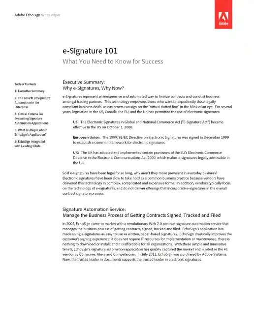
Adobe EchoSign White Papers and Data Sheets
Example White Paper
Project Description: Occasionally I created or updated white papers and data sheets in PDF format on various topics. The overall design and layout were based on Adobe brand standards.
Click for project detail view
-
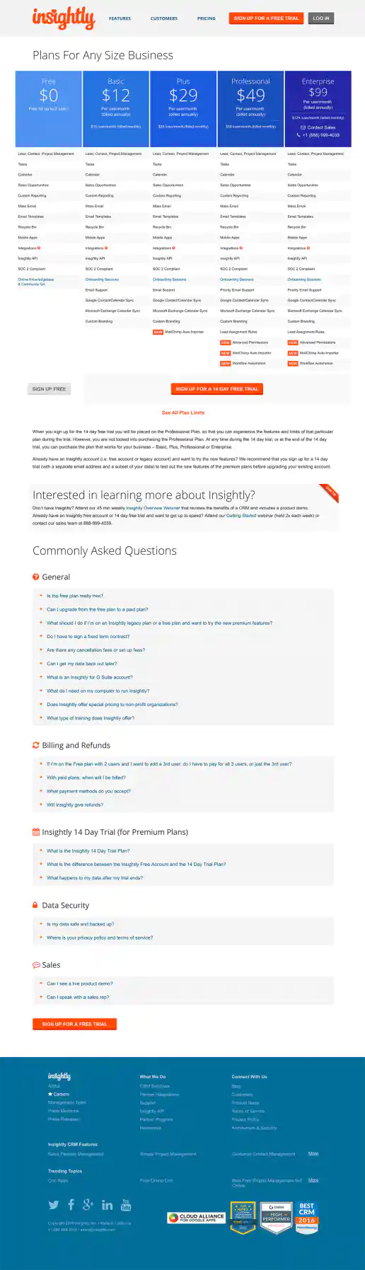
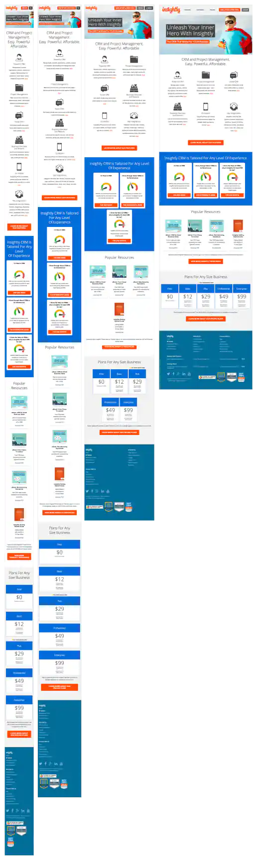
Insightly.com Pricing Page Test Variations
Features Chart Resorted and Limits Listed In Rollover
Project Description: Presented here are several iterations of the Pricing page I coded or co-designed/developed and maintained 3013 through 1016 while working with the Insightly marketing team, internal designers, and external vendors. Variations were tested using Optimizely and services such as Experiment Engine for A/B testing and conversion optimization along with KissMetrics and Google Analytics for click path tracking. Occasionally I contributed to the visual design while staying true to the look and feel of the Insightly brand. Additionally I occasionally contributed test suggestions based on best practices research, reviewing reported successes on other sites and competitive analysis. Several other versions were created as well, such as using different visual treatments for the title area and plan blurbs. etcetera.
Click for project detail view
-
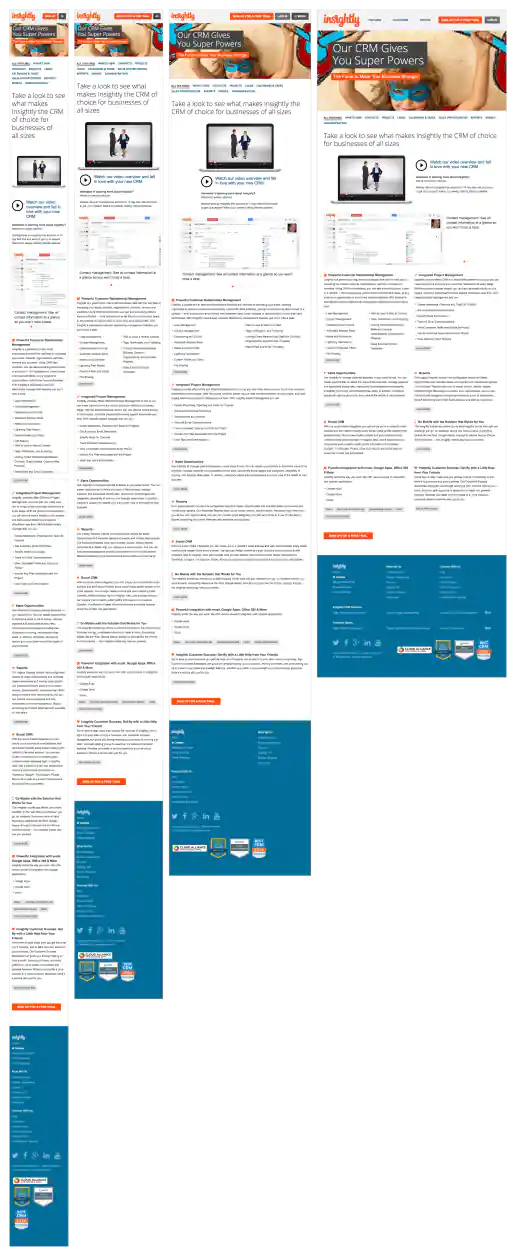
Insightly.com Responsive Website Design
Features Page
Project Description: Initial layouts were created by another designer for the desktop screen width then handed-off for me to develop the alternate layouts for mobile devices. I coded layouts to be flexible so they worked on as many devices as possible. With only a couple exceptions, all pages were coded with four primary target sizes in mind beginning with the "mobile first" methodology. Additional media-query breakpoints were created when content areas within the layouts did not degrade gracefully when being resized. Standard sizes I would test and create media-queries for where 480x320 for iPhone landscape mode, 320x480 for iPhone portrait mode, 768x1024 for iPad portrait mode, and 1024x768 for iPad landscape mode and desktop use cases.
Click for project detail view
-
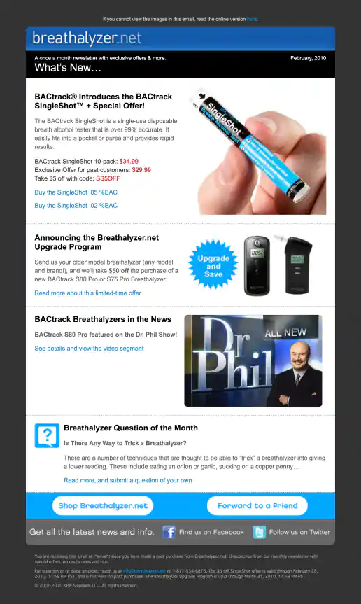
Breathalyzer.net Email Newsletter Template Design
February Issue
Project Description:
Click for project detail view
-
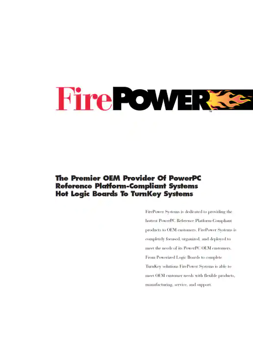
FirePower Systems Tri-fold Power PC Logic Board Brochure
Project Description:
Click for project detail view
-
FontsFontsFonts.com Logo
Project Description:
Click for project detail view

-
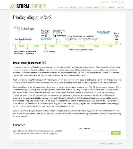
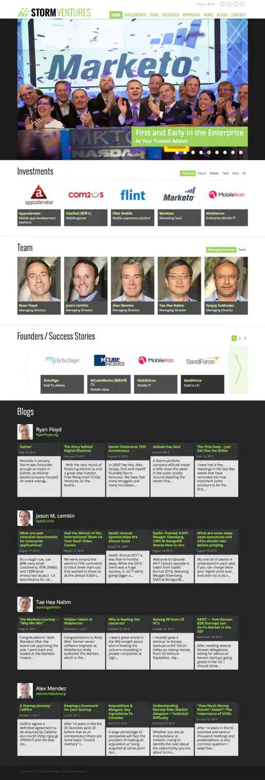
StormVentures.com Website Redesign
Founding Company Profile Page
Project Description:
Click for project detail view
-
Adobe EchoSign Conference Floor Display Signs
Four Design Variations
Project Description: I forget which of these was the final. It was fun working with the shapes in their corporate background imagery.
Click for project detail view
-
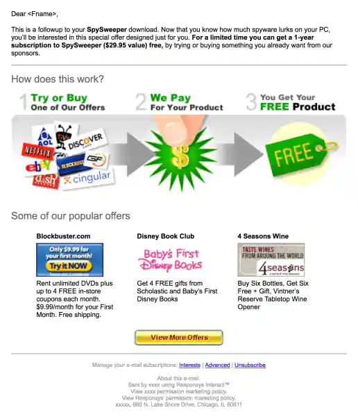
MyOfferPal: WebRoot, Spy Sweeper Campaign
Free Trial Followup HTML Email - Version 1
Project Description:
Click for project detail view

-
MyOfferPal: WebRoot, Spy Sweeper Campaign
Free Trial Followup HTML Email - Version 2
Project Description:
Click for project detail view
-
Adobe EchoSign “Increase The Speed” Campaign
Free Webinar Version
Project Description: This campaign was targeted at CFOs and real estate professionals using customized text in the emails and landing pages.
Click for project detail view

-
Adobe EchoSign “Increase The Speed” Campaign
Free White Paper Version
Project Description: This campaign was targeted at CFOs and real estate professionals using customized text in the emails and landing pages.
Click for project detail view

-
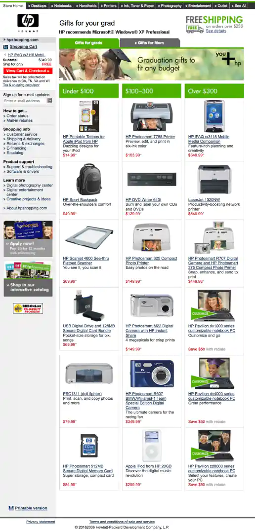
HPShopping.com Gift Guide
Gifts for Grads
Project Description:
Click for project detail view
-
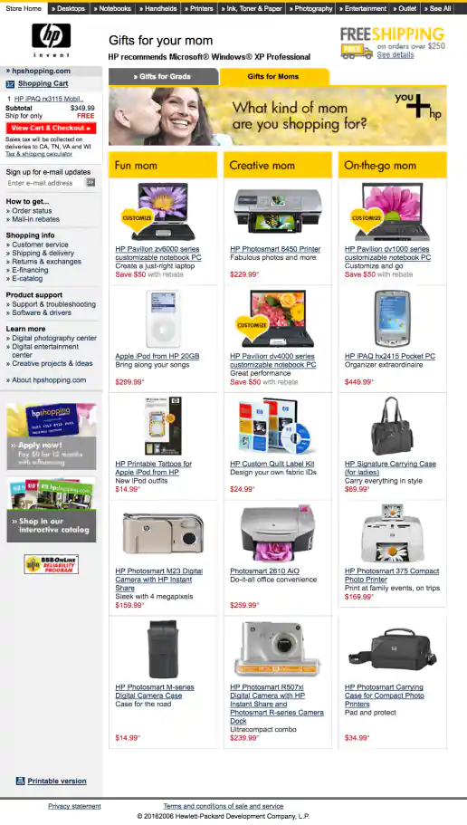
HPShopping.com Gift Guide
Gifts for Moms
Project Description:
Click for project detail view
-
Insightly.com Responsive Website Design
Homepage
Project Description: Initial layouts were created by another designer for the desktop screen width then handed-off for me to develop the alternate layouts for mobile devices. I coded layouts to be flexible so they worked on as many devices as possible. With only a couple exceptions, all pages were coded with four primary target sizes in mind beginning with the "mobile first" methodology. Additional media-query breakpoints were created when content areas within the layouts did not degrade gracefully when being resized. Standard sizes I would test and create media-queries for where 480x320 for iPhone landscape mode, 320x480 for iPhone portrait mode, 768x1024 for iPad portrait mode, and 1024x768 for iPad landscape mode and desktop use cases.
Click for project detail view
-
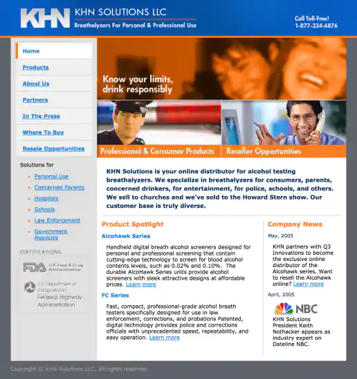
KHN Solutions Website Design
Homepage
Project Description:
Click for project detail view
-
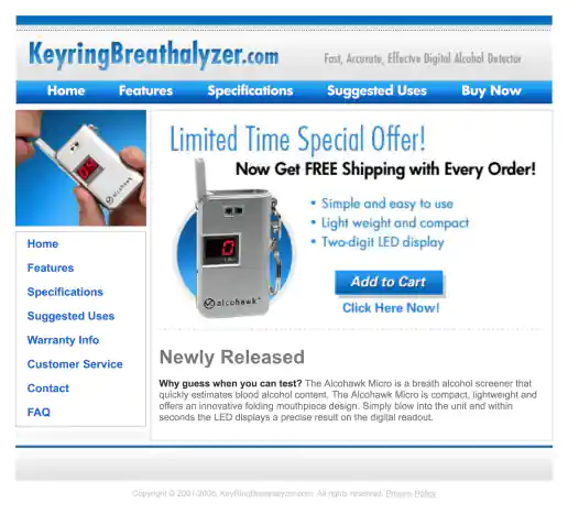
KeyringBreathalyzer.com Microsite Website
Homepage
Project Description:
Click for project detail view
-
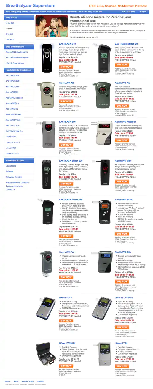
BreathalyzerSuperstore.com Affiliate Website Design
Homepage
Project Description:
Click for project detail view
-
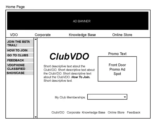
ClubVDO Website Wireframes
Homepage
Project Description:
Click for project detail view
-
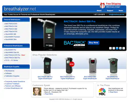
Breathalyzer.net Website Design
Homepage
Project Description:
Click for project detail view
-
StormVentures.com Website Redesign
Homepage
Project Description:
Click for project detail view
-
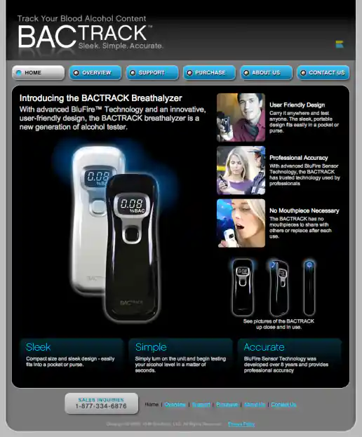
BACtrack Breathalyzers Website Redesign
Homepage - 2006
Project Description:
Click for project detail view