Portfolio / Industries / Technology
-
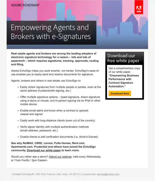
Adobe EchoSign Real Estate Agents and Brokers Campaign
Email
Project Description:
Click for project detail view
-
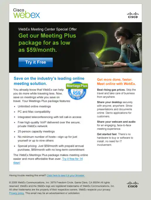
Cisco WebEx Meetings Plus Summer Campaign
Email
Project Description:
Click for project detail view
-
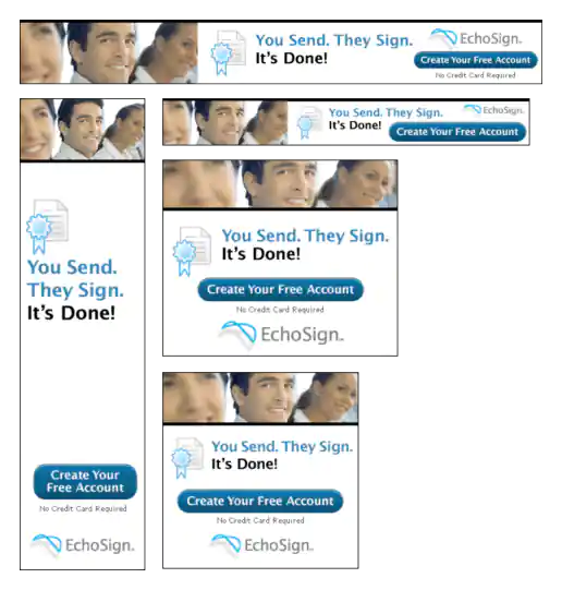
EchoSign “Waiting for Offers” Banner Ads
Project Description:
Click for project detail view
-
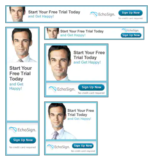
EchoSign “Achieve Happiness” Banner Ads
Project Description:
Click for project detail view
-
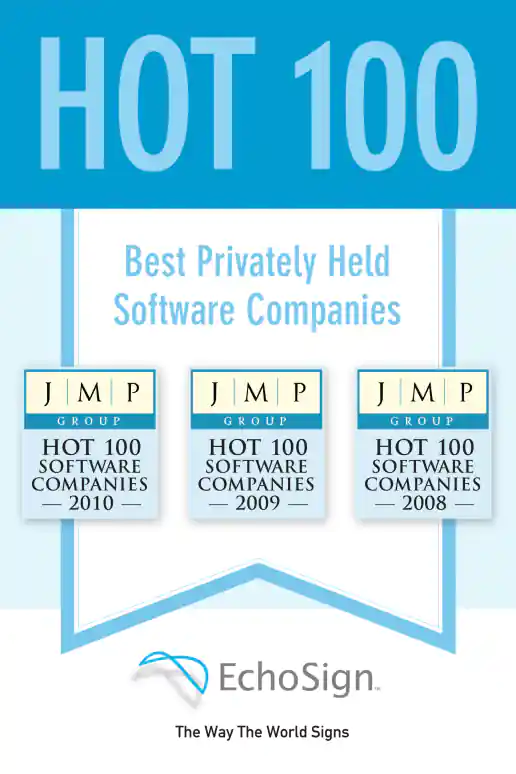
EchoSign JMP “Hot 100” Award Poster
Project Description: 24x36 poster created to hang around the office.
Click for project detail view
-
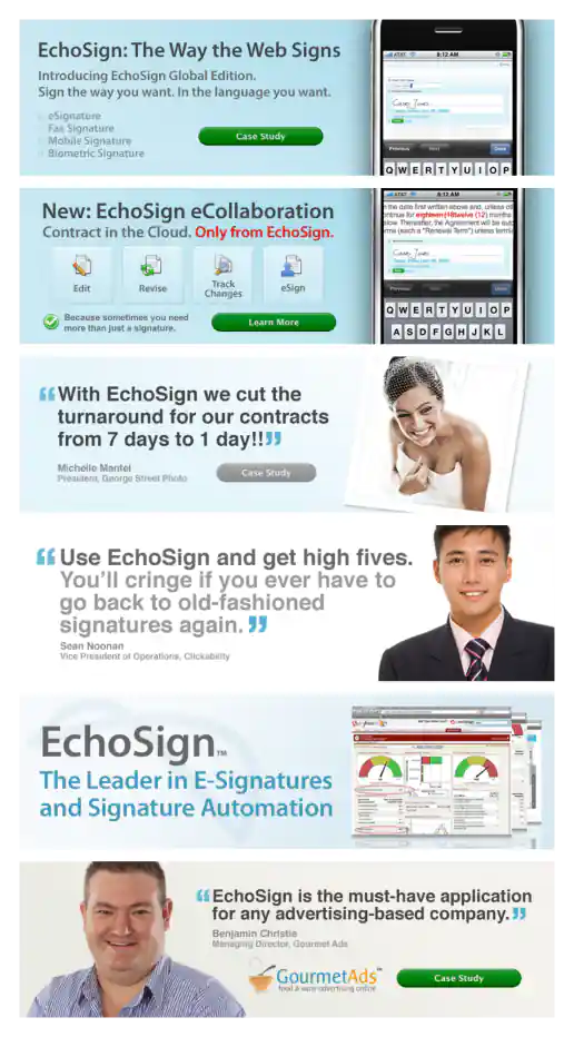
EchoSign Homepage Billboard Image Design Examples
Project Description: The look-and-feel for the EchoSign brand was already established by another designer. These are a few examples of the many I either created from scratch or repurposed/updated within the established standards.
Click for project detail view
-
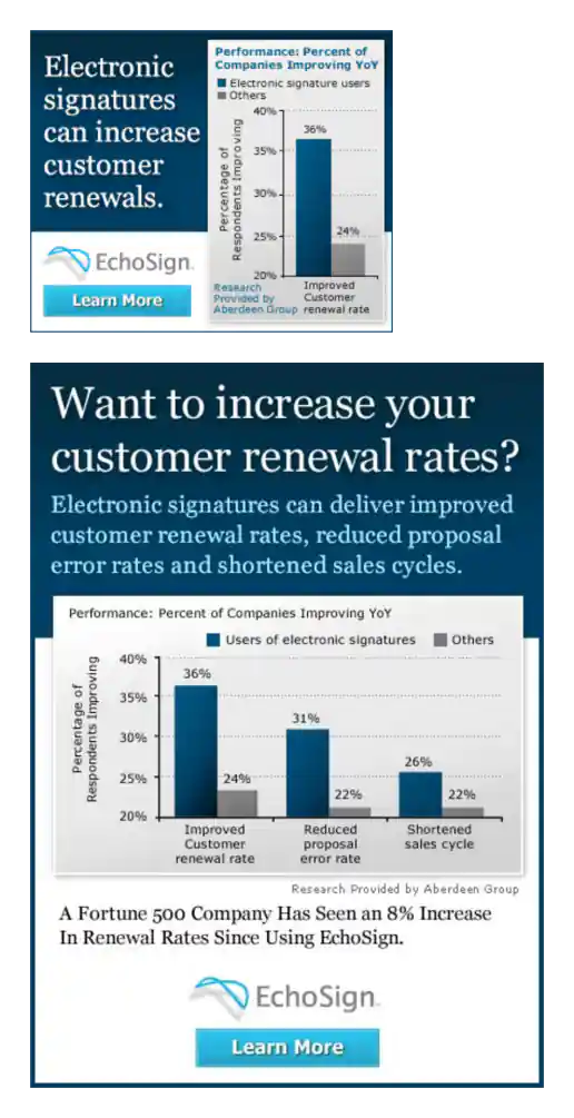
EchoSign Electronic Signatures Value Bar Chart Banner Ads
Project Description:
Click for project detail view
-
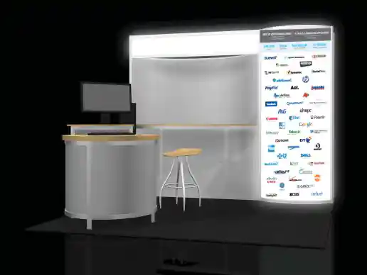
EchoSign Conference Booth Lighted Logo Panel Design
Project Description: Created in Adobe Illustrator. Gathering all the latest vector art for the logos and layout them out took a little time, but it'll made sure they look sharp when printed large.
Click for project detail view
-
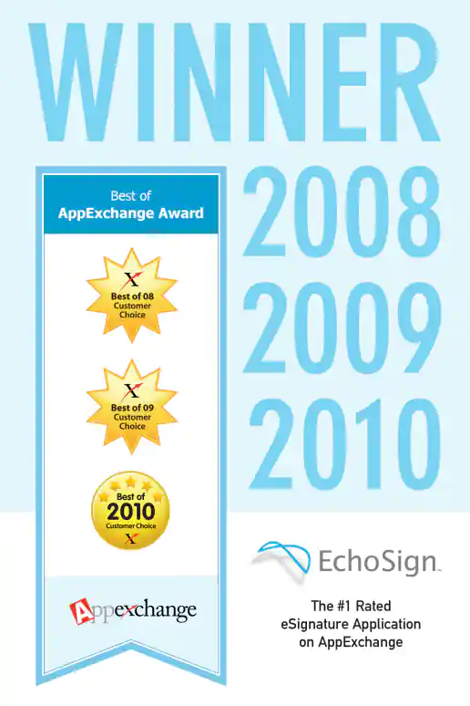
EchoSign AppExchange “Best Of” Award Poster
Project Description: 24x36 poster created to hang around the office. There was an earlier version with drop shadows on the medallions similar to the JMP “Hot 100” awards poster badges. I think the client didn't want the drop shadows in the version though.
Click for project detail view
-
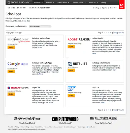
Adobe EchoSign Website Redesign Phase 2 Examples
EchoApps Integrations Page
Project Description:
Click for project detail view
-
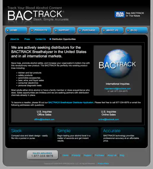
BACtrack Breathalyzers Website Redesign
Distribution Opportunities Page
Project Description:
Click for project detail view
-
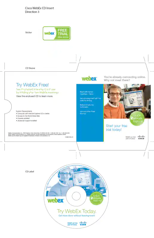
Cisco WebEx CD
Direction 3
Project Description: Box sticker went on the outside of Linksys and NetGear router product packaging and the CD was inserted into the box to encourage folks who buy routers to try WebEx. You could see the NetGear routers with the sticker on the shelves in stores such as Fry’s Electronics.
Click for project detail view
-
EchoSign “Last Day of the Quarter” Campaign Banner Ads
Direction 3
Project Description:
Click for project detail view
-
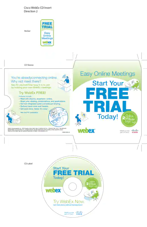
Cisco WebEx CD
Direction 2
Project Description: Box sticker went on the outside of Linksys and NetGear router product packaging and the CD was inserted into the box to encourage folks who buy routers to try WebEx. You could see the NetGear routers with the sticker on the shelves in stores such as Fry’s Electronics.
Click for project detail view
-
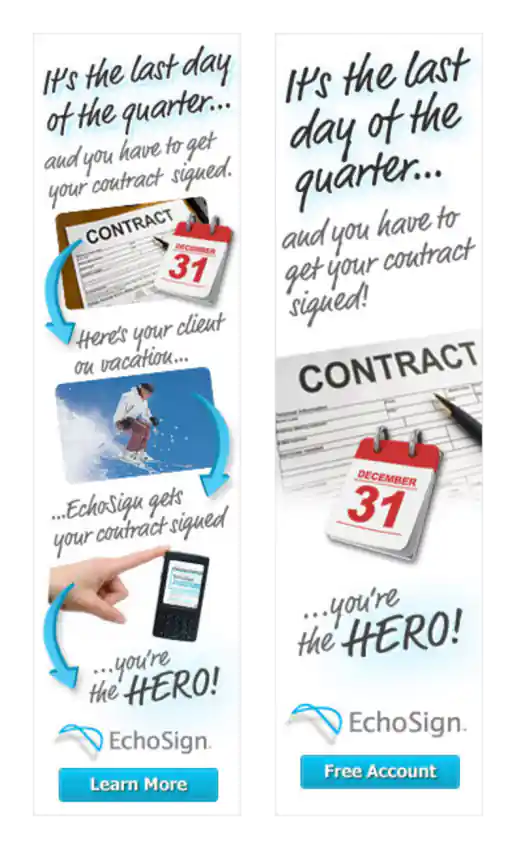
EchoSign “Last Day of the Quarter” Campaign Banner Ads
Direction 2
Project Description:
Click for project detail view
-
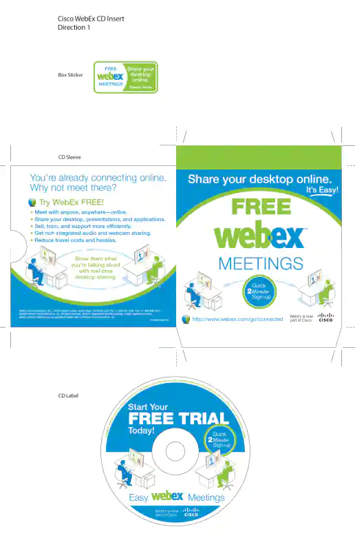
Cisco WebEx CD
Direction 1
Project Description: Box sticker went on the outside of Linksys and NetGear router product packaging and the CD was inserted into the box to encourage folks who buy routers to try WebEx. You could see the NetGear routers with the sticker on the shelves in stores such as Fry’s Electronics.
Click for project detail view
-
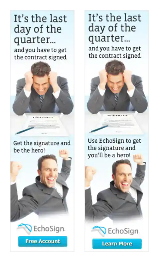
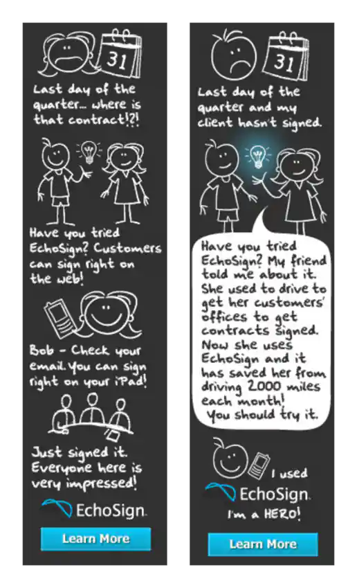
EchoSign “Last Day of the Quarter” Campaign Banner Ads
Direction 1
Project Description:
Click for project detail view
-
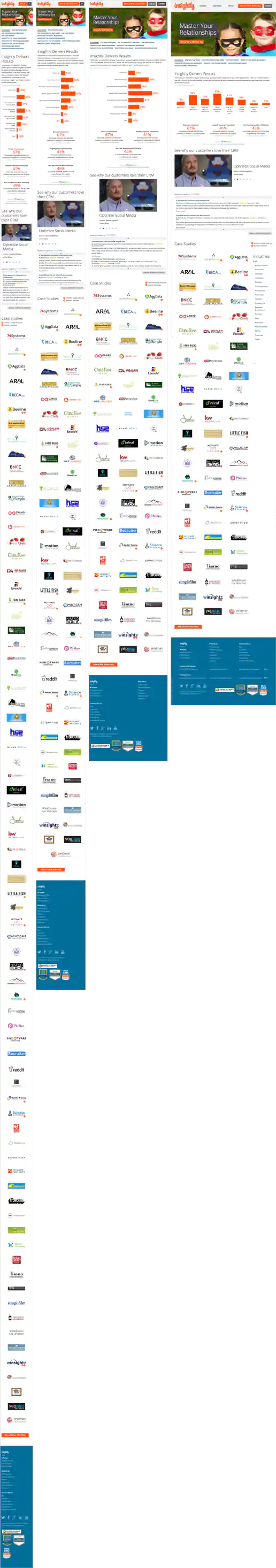
Insightly.com Responsive Website Design
Customers Page
Project Description: Initial layouts were created by another designer for the desktop screen width then handed-off for me to develop the alternate layouts for mobile devices. I coded layouts to be flexible so they worked on as many devices as possible. With only a couple exceptions, all pages were coded with four primary target sizes in mind beginning with the "mobile first" methodology. Additional media-query breakpoints were created when content areas within the layouts did not degrade gracefully when being resized. Standard sizes I would test and create media-queries for where 480x320 for iPhone landscape mode, 320x480 for iPhone portrait mode, 768x1024 for iPad portrait mode, and 1024x768 for iPad landscape mode and desktop use cases.
Click for project detail view
-
Insightly.com Responsive Website Design
Customer Case Study Page Template
Project Description: Initial layouts were created by another designer for the desktop screen width then handed-off for me to develop the alternate layouts for mobile devices. I coded layouts to be flexible so they worked on as many devices as possible. With only a couple exceptions, all pages were coded with four primary target sizes in mind beginning with the "mobile first" methodology. Additional media-query breakpoints were created when content areas within the layouts did not degrade gracefully when being resized. Standard sizes I would test and create media-queries for where 480x320 for iPhone landscape mode, 320x480 for iPhone portrait mode, 768x1024 for iPad portrait mode, and 1024x768 for iPad landscape mode and desktop use cases.
Click for project detail view
-
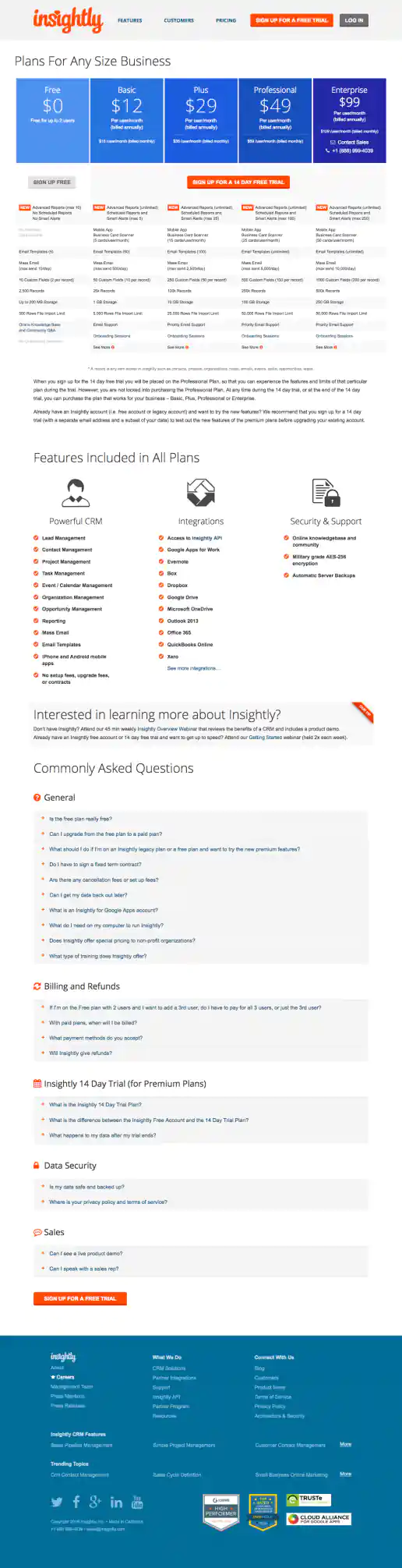
Insightly.com Pricing Page Test Variations
CTA Buttons Moved Above Features Chart And Directly Below Pricing
Project Description: Presented here are several iterations of the Pricing page I coded or co-designed/developed and maintained 3013 through 1016 while working with the Insightly marketing team, internal designers, and external vendors. Variations were tested using Optimizely and services such as Experiment Engine for A/B testing and conversion optimization along with KissMetrics and Google Analytics for click path tracking. Occasionally I contributed to the visual design while staying true to the look and feel of the Insightly brand. Additionally I occasionally contributed test suggestions based on best practices research, reviewing reported successes on other sites and competitive analysis. Several other versions were created as well, such as using different visual treatments for the title area and plan blurbs. etcetera.
Click for project detail view
-
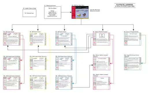
Fujitsu Lifebook In-Store Demo Presentation
Content Flow Navigration Map
Project Description: After reviewing the content outline, wireframing the flow, and designing individual screens I created a storyboard to explain the animation needed in written frame-by-frame form. Then I created a basic video slideshow storyboard to demonstrate some of the timing and effects we’re going for so the client and animator has a better understanding of what the final version should look like.
Click for project detail view
-
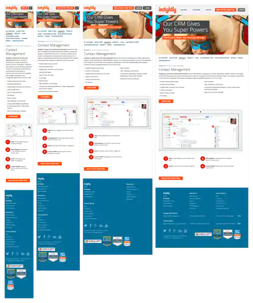
Insightly.com Responsive Website Design
Contact Management Page
Project Description: Initial layouts were created by another designer for the desktop screen width then handed-off for me to develop the alternate layouts for mobile devices. I coded layouts to be flexible so they worked on as many devices as possible. With only a couple exceptions, all pages were coded with four primary target sizes in mind beginning with the "mobile first" methodology. Additional media-query breakpoints were created when content areas within the layouts did not degrade gracefully when being resized. Standard sizes I would test and create media-queries for where 480x320 for iPhone landscape mode, 320x480 for iPhone portrait mode, 768x1024 for iPad portrait mode, and 1024x768 for iPad landscape mode and desktop use cases.
Click for project detail view
-
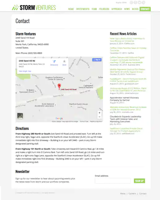
StormVentures.com Website Redesign
Contact Information Page
Project Description:
Click for project detail view
-
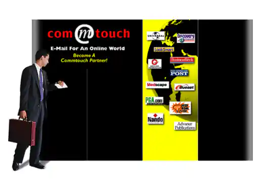
Commtouch Conference Booth Graphics
Project Description:
Click for project detail view