Portfolio / Industries / Healthcare
-
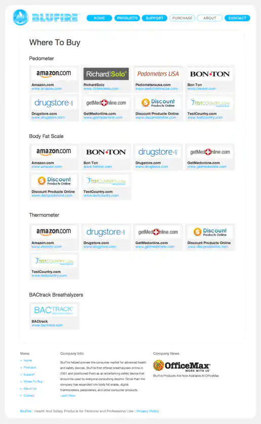
BluFire Website Design
“Where To Buy” Page – Version 2
Project Description: Ecommerce website created after logo and packaging treatments where designed. I decided to use rounded shapes so the site feels more friendly than technical and I used flat shapes with no shading or shadows to create a clean, flat, uncomplicated look.
Click for project detail view
-
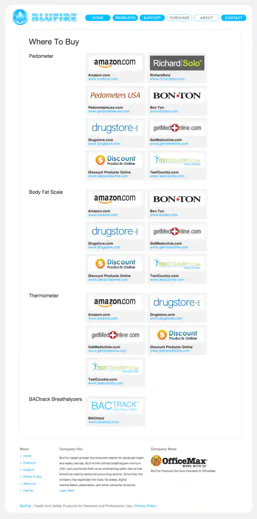
BluFire Website Design
“Where To Buy” Page – Version 1
Project Description: Ecommerce website created after logo and packaging treatments where designed. I decided to use rounded shapes so the site feels more friendly than technical and I used flat shapes with no shading or shadows to create a clean, flat, uncomplicated look.
Click for project detail view
-
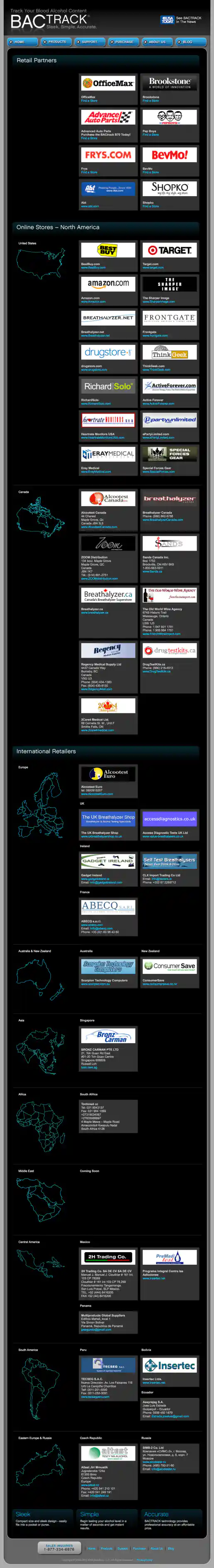
BACtrack Breathalyzers Website Redesign
“Where To Buy” Page
Project Description:
Click for project detail view
-
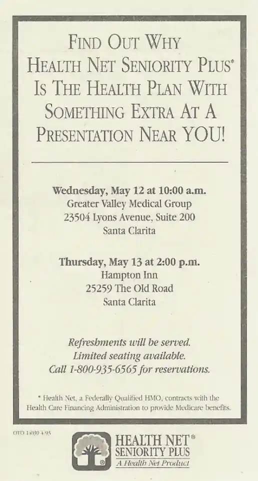
Health Net Newspaper Ads
Wide Example
Project Description: A couple examples of newspaper ads I would layout and produce for managers. Working at Health Net corporate headquarters, we produced the advertising and marketing materials used throughout the United States. Initial design templates where provided by the agency that created the overall brand directions and I maintained the style across different formats for various needs. Here's where I honed my typographic layout skills using Quark Express and became “The Quark Master”.
Click for project detail view
-
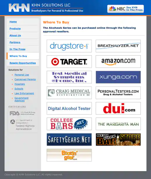
KHN Solutions Website Design
Where To Buy Page
Project Description:
Click for project detail view
-
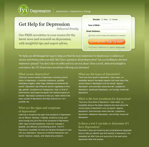
FYI Living Newsletter Sign-Up Landing Page Design
Version 4
Project Description: FYI Living was looking to improve their newsletter sign-up conversion rates for different subject areas such as fitness, nutrition, depression, pregnancy and others and needed an alternate look to test. After researching similar sites I noticed many where overly marketing oriented and tended to look kinda cheesy. I developed a few directions to avoid the typical look then narrowed down to these four initial designs to gather feedback on and potential test. These try to look more clinical news oriented and reserved in nature. They intentionally don't include photos since visitors sometimes get distracted by photos (especially of people) on landing pages and study them rather than focusing on the informational content being offered. “Clarity trumps persuasion” is a tactic worth testing in my experience, even though the simpler style doesn't necessarily look as punchy as landing page designs which include big colorful photos.
Click for project detail view
-
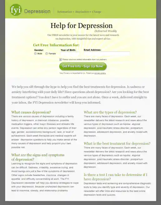
FYI Living Newsletter Sign-Up Landing Page Design
Version 3
Project Description: FYI Living was looking to improve their newsletter sign-up conversion rates for different subject areas such as fitness, nutrition, depression, pregnancy and others and needed an alternate look to test. After researching similar sites I noticed many where overly marketing oriented and tended to look kinda cheesy. I developed a few directions to avoid the typical look then narrowed down to these four initial designs to gather feedback on and potential test. These try to look more clinical news oriented and reserved in nature. They intentionally don't include photos since visitors sometimes get distracted by photos (especially of people) on landing pages and study them rather than focusing on the informational content being offered. “Clarity trumps persuasion” is a tactic worth testing in my experience, even though the simpler style doesn't necessarily look as punchy as landing page designs which include big colorful photos.
Click for project detail view
-
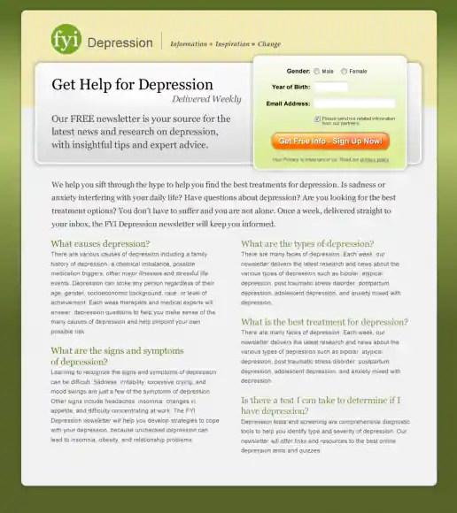
FYI Living Newsletter Sign-Up Landing Page Design
Version 2
Project Description: FYI Living was looking to improve their newsletter sign-up conversion rates for different subject areas such as fitness, nutrition, depression, pregnancy and others and needed an alternate look to test. After researching similar sites I noticed many where overly marketing oriented and tended to look kinda cheesy. I developed a few directions to avoid the typical look then narrowed down to these four initial designs to gather feedback on and potential test. These try to look more clinical news oriented and reserved in nature. They intentionally don't include photos since visitors sometimes get distracted by photos (especially of people) on landing pages and study them rather than focusing on the informational content being offered. “Clarity trumps persuasion” is a tactic worth testing in my experience, even though the simpler style doesn't necessarily look as punchy as landing page designs which include big colorful photos.
Click for project detail view
-
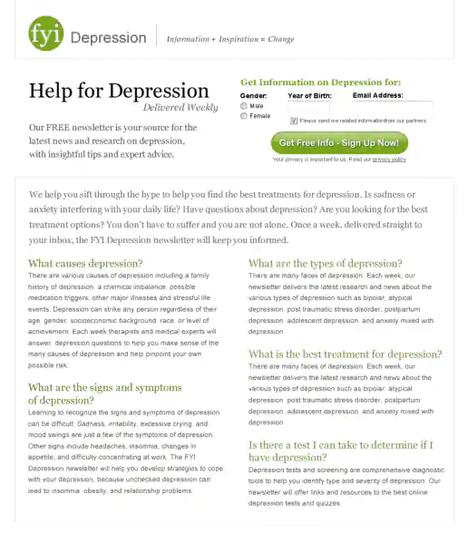
FYI Living Newsletter Sign-Up Landing Page Design
Version 1
Project Description: FYI Living was looking to improve their newsletter sign-up conversion rates for different subject areas such as fitness, nutrition, depression, pregnancy and others and needed an alternate look to test. After researching similar sites I noticed many where overly marketing oriented and tended to look kinda cheesy. I developed a few directions to avoid the typical look then narrowed down to these four initial designs to gather feedback on and potential test. These try to look more clinical news oriented and reserved in nature. They intentionally don't include photos since visitors sometimes get distracted by photos (especially of people) on landing pages and study them rather than focusing on the informational content being offered. “Clarity trumps persuasion” is a tactic worth testing in my experience, even though the simpler style doesn't necessarily look as punchy as landing page designs which include big colorful photos.
Click for project detail view
-
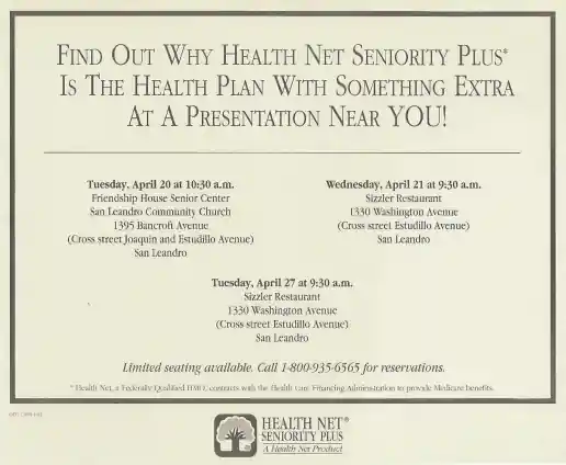
Health Net Newspaper Ads
Tall Example
Project Description: A couple examples of newspaper ads I would layout and produce for managers. Working at Health Net corporate headquarters, we produced the advertising and marketing materials used throughout the United States. Initial design templates where provided by the agency that created the overall brand directions and I maintained the style across different formats for various needs. Here's where I honed my typographic layout skills using Quark Express and became “The Quark Master”.
Click for project detail view
-
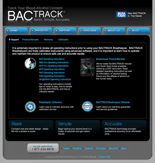
BACtrack Breathalyzers Website Redesign
Support Page
Project Description:
Click for project detail view
-
Trusted Hands Network Landing Page Design
Step 3: Confirmation Page
Project Description:
Click for project detail view
-
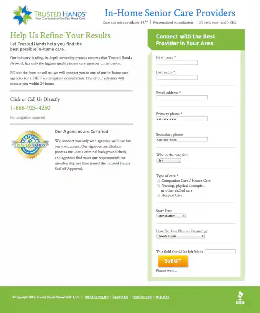
Trusted Hands Network Landing Page Design
Step 2: Long Form
Project Description:
Click for project detail view
-
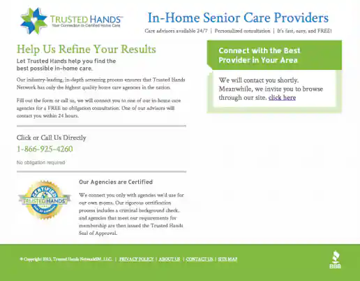
Trusted Hands Network Landing Page Design
Step 1: Short Form
Project Description:
Click for project detail view
-
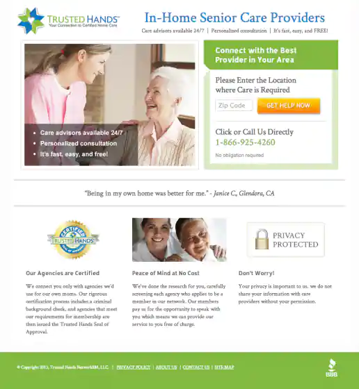
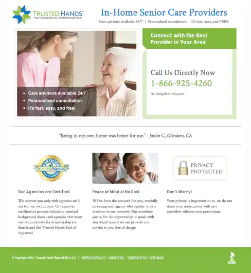
Trusted Hands Network Landing Page Design
Step 1 Alternate: Phone Number Only
Project Description:
Click for project detail view
-
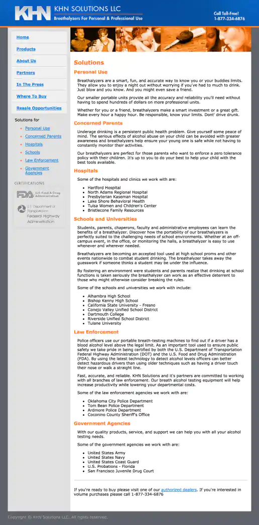
KHN Solutions Website Design
Solutions Page
Project Description:
Click for project detail view
-
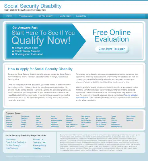
Social Security Disability Microsites
SocialSecurityHelp.com
Project Description: Microsite designs for disabilityhelp.me and socialsecurityhelp.com
Click for project detail view
-
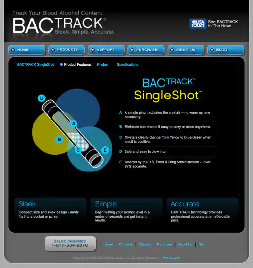
BACtrack Breathalyzers Website Redesign
Singleshot Product Features Page
Project Description:
Click for project detail view
-
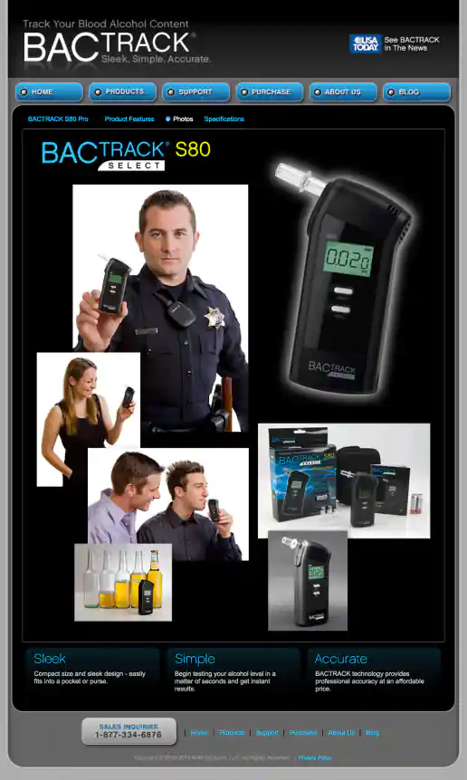
BACtrack Breathalyzers Website Redesign
S80 Product Photos Page
Project Description:
Click for project detail view
-
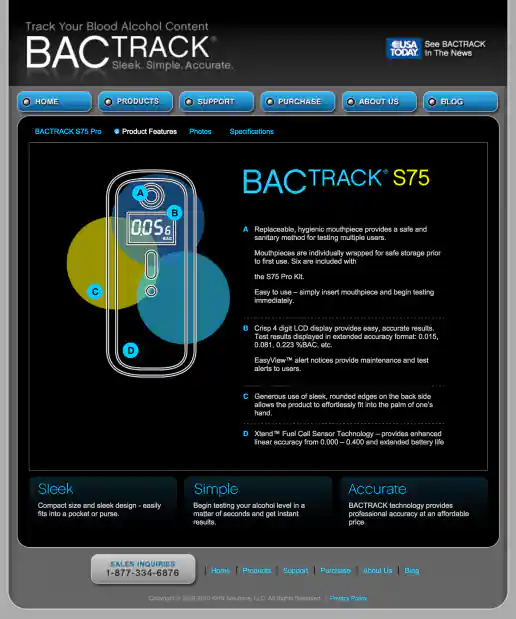
BACtrack Breathalyzers Website Redesign
S75 Product Features Page
Project Description:
Click for project detail view
-
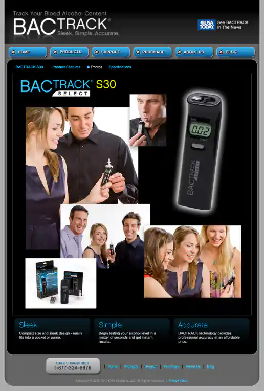
BACtrack Breathalyzers Website Redesign
S30 Product Photos Page
Project Description:
Click for project detail view
-
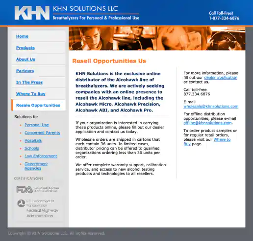
KHN Solutions Website Design
Resale Opportunities Page
Project Description:
Click for project detail view
-
Rebloom.com Banner Ads – 8 Versions
Project Description: Design variations provided to the client to gather feedback and direction on towards refining to meet their messaging needs or to test and see which performed better. Concepts came from the client plus I added a few additional ideas based on related stock imagery I found and ideas generated while focusing on their brand and their marketplace.
Click for project detail view
-
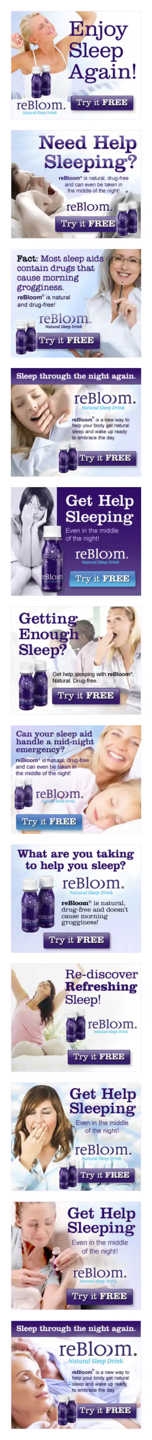
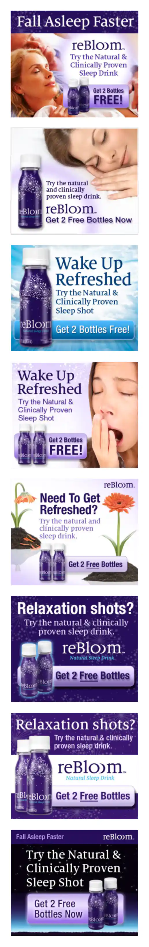
Rebloom.com Banner Ads – 12 Versions
Project Description: Design variations provided to the client to gather feedback and direction on towards refining to meet their messaging needs or to test and see which performed better. Concepts came from the client plus I added a few additional ideas based on related stock imagery I found and ideas generated while focusing on their brand and their marketplace.
Click for project detail view