-
BluFire Website Design
Product Image Page
Project Description: Ecommerce website created after logo and packaging treatments where designed. I decided to use rounded shapes so the site feels more friendly than technical and I used flat shapes with no shading or shadows to create a clean, flat, uncomplicated look.
Click for project detail view
-
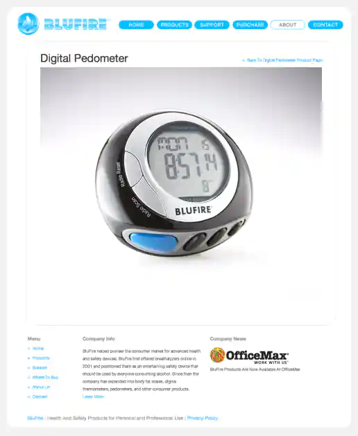
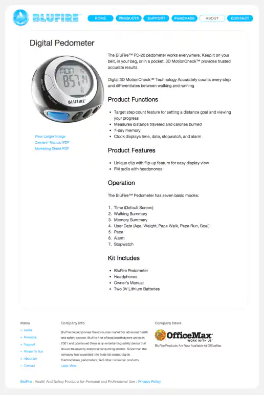
BluFire Website Design
Product Detail Page
Project Description: Ecommerce website created after logo and packaging treatments where designed. I decided to use rounded shapes so the site feels more friendly than technical and I used flat shapes with no shading or shadows to create a clean, flat, uncomplicated look.
Click for project detail view
-
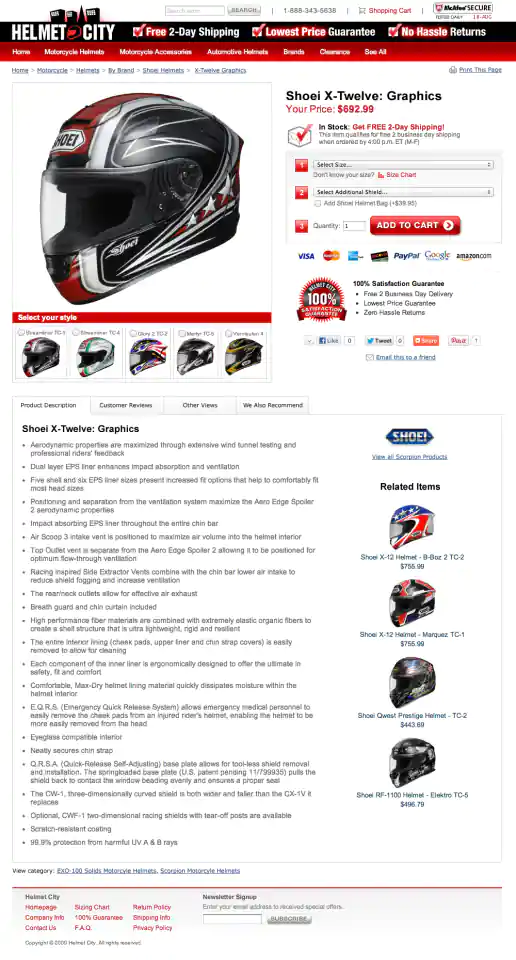
Helmet City eCommerce Website Design
Product Detail Page
Project Description:
Click for project detail view
-
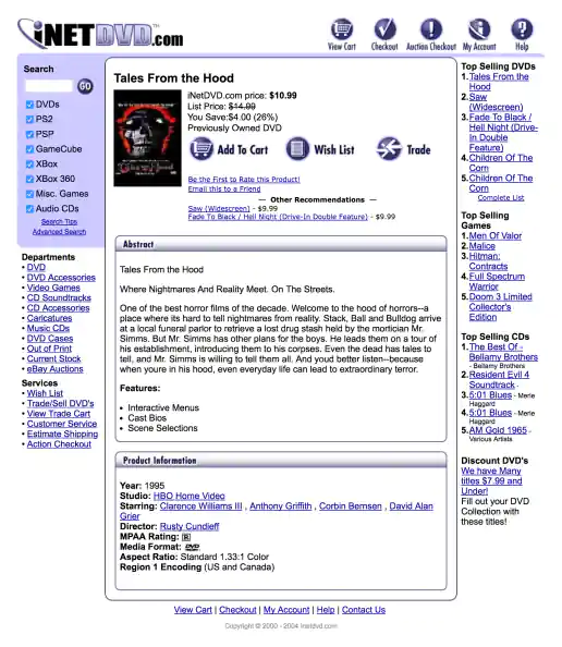
iNetDVD.com Website
Product Detail Page
Project Description:
Click for project detail view
-
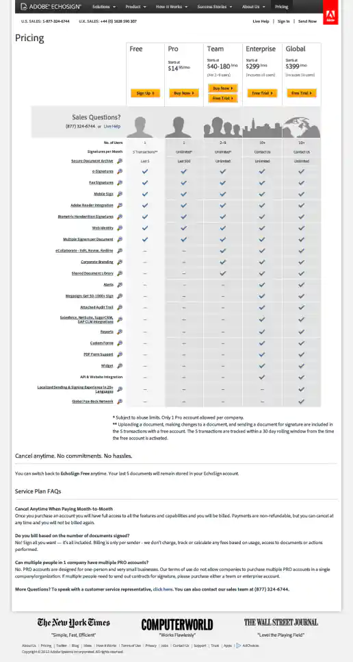
Adobe EchoSign Website Redesign Phase 2 Examples
Pricing Page
Project Description:
Click for project detail view
-
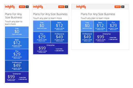
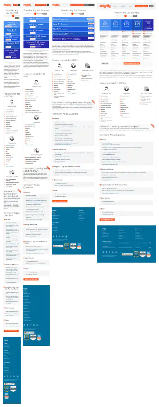
Insightly.com Responsive Website Design
Pricing Page
Project Description: Initial layouts were created by another designer for the desktop screen width then handed-off for me to develop the alternate layouts for mobile devices. I coded layouts to be flexible so they worked on as many devices as possible. With only a couple exceptions, all pages were coded with four primary target sizes in mind beginning with the "mobile first" methodology. Additional media-query breakpoints were created when content areas within the layouts did not degrade gracefully when being resized. Standard sizes I would test and create media-queries for where 480x320 for iPhone landscape mode, 320x480 for iPhone portrait mode, 768x1024 for iPad portrait mode, and 1024x768 for iPad landscape mode and desktop use cases.
Click for project detail view
-
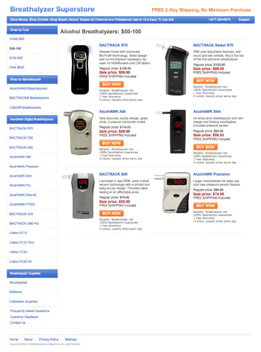
BreathalyzerSuperstore.com Affiliate Website Design
Price Category Page
Project Description:
Click for project detail view
-
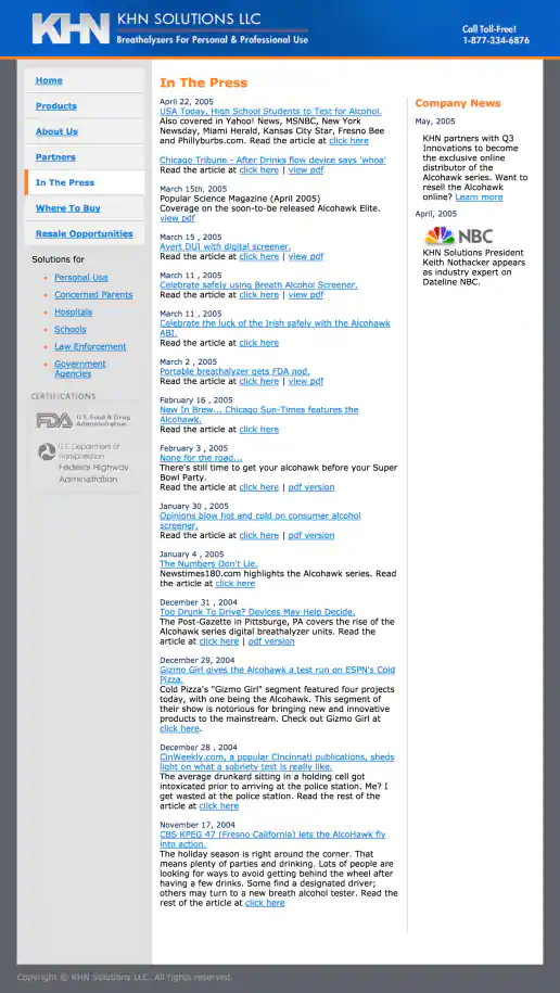
KHN Solutions Website Design
Press Coverage Page
Project Description:
Click for project detail view
-
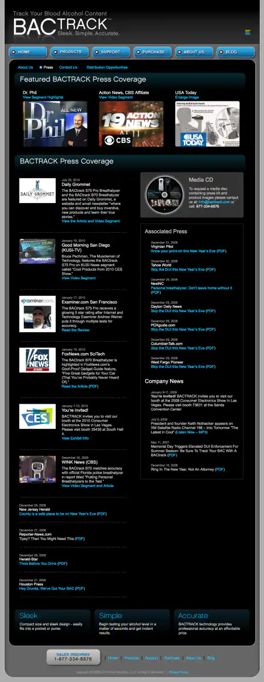
BACtrack Breathalyzers Website Redesign
Press Coverage Page
Project Description:
Click for project detail view
-
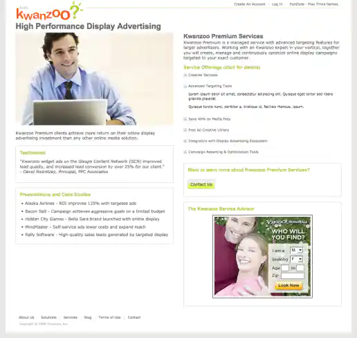
Kwanzoo Website Redesign
Premium Services Information Page
Project Description:
Click for project detail view
-
FreelanceWebDesigner.com Website Design
Portfolio Page
Project Description: My old site promoting freelance services. The initial idea was to create a look that was inviting and fun to interact with but also futuristic and indicated a technical savviness, perhaps like an interface you'd see in a the Jetsons TV cartoon. This is the result of that direction which combines French curve shapes (a traditional design element) with an electric spark (signifying the electronic age or futuristic direction) to give the design element some life and make ot ‘pop’.
Click for project detail view

-
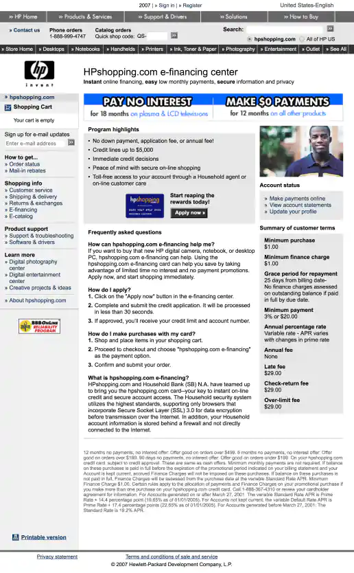
HPShopping.com e-Financing Center 2 Offers
Pay No Interest for 18 Months or Make $0 Payments for 12 Months
Project Description:
Click for project detail view
-
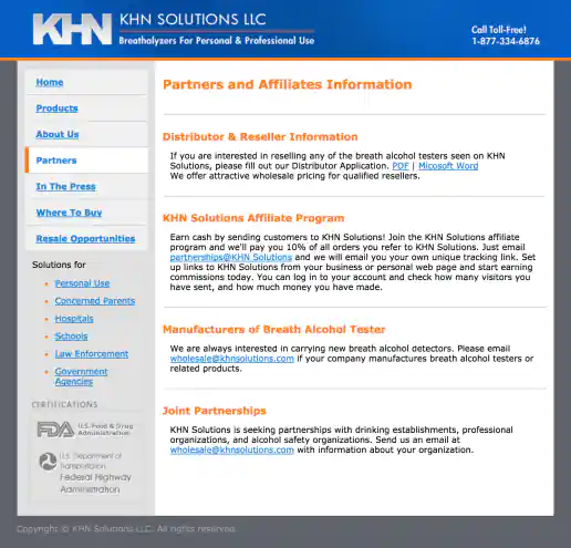
KHN Solutions Website Design
Partners Page
Project Description:
Click for project detail view
-
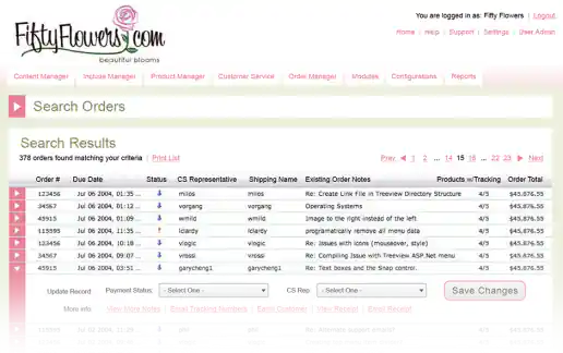
FiftyFlowers.com eCommerce Order Management System Interface Design Proposal Mockups
Orders List
Project Description: A few quick mockups presented as a proposal for the commerce website administration and order management area of FiftyFlowers.com. By using colors that complimented the logo and improving the over layout of elements, this CMS user interface became immediately recognizable and aesthetically more pleasant to look at (and use) than interacting with the generic geeky look and feel that the engineers had initially developed.
Click for project detail view
-
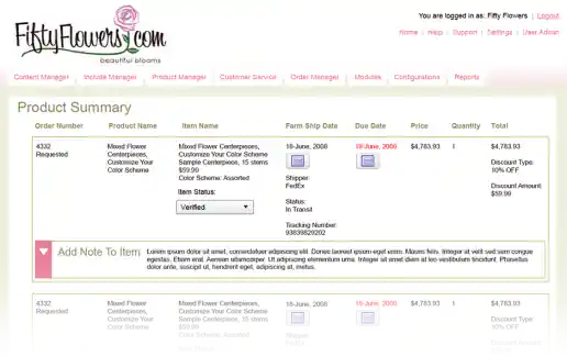
FiftyFlowers.com eCommerce Order Management System Interface Design Proposal Mockups
Order Summary
Project Description: A few quick mockups presented as a proposal for the commerce website administration and order management area of FiftyFlowers.com. By using colors that complimented the logo and improving the over layout of elements, this CMS user interface became immediately recognizable and aesthetically more pleasant to look at (and use) than interacting with the generic geeky look and feel that the engineers had initially developed.
Click for project detail view
-
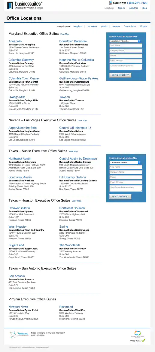
BusinesSuites Website Redesign
Office Locations Page
Project Description:
Click for project detail view
-
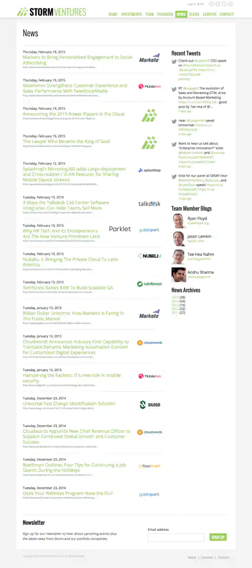
StormVentures.com Website Redesign
News Page
Project Description:
Click for project detail view
-
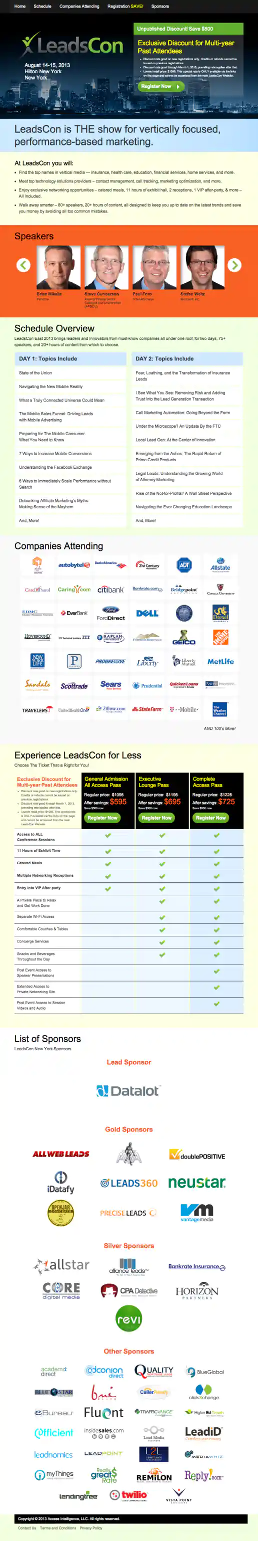
LeadsCon.com Landing Page Creator
New York Event Example
Project Description: Event organizer needed an easy way to create individual landing pages for several targeted offers geared towards partners, vendors, past attendees, for speaker promotions, trade groups, magazine audiences, and the general public. Each landing page offered special discounts and was only accessible at a special link which potential customers would receive via email campaigns or see in an ad somewhere. By creating templates for the East Coast and West Coast events that could easily be updated on the backend, dozens of landing pages were created by the event manager without needing additional coding or design cycles each time.
Click for project detail view
-
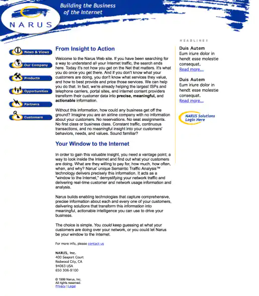
Narus.com Website Design
Project Description:
Click for project detail view
-
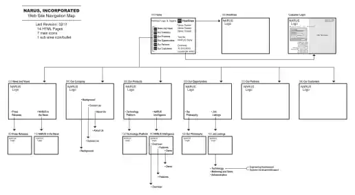
Narus.com Corporate Website Navigation Map
Project Description:
Click for project detail view
-
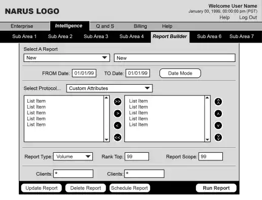
Narus Intelligence Product UX Wireframes
Project Description:
Click for project detail view
-
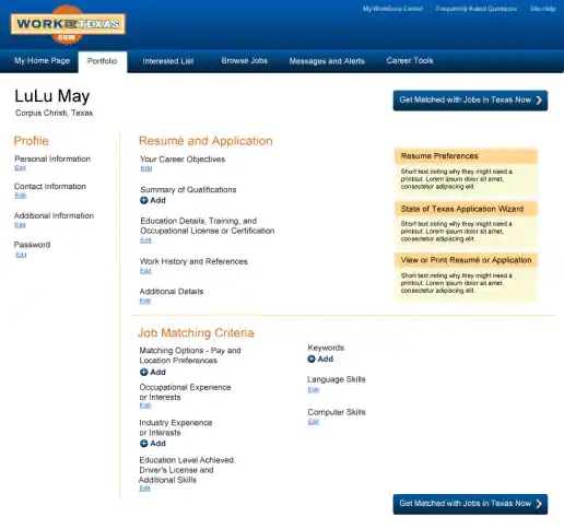
WorkInTexas.com Website Redesign
My Portfolio Page
Project Description:
Click for project detail view
-
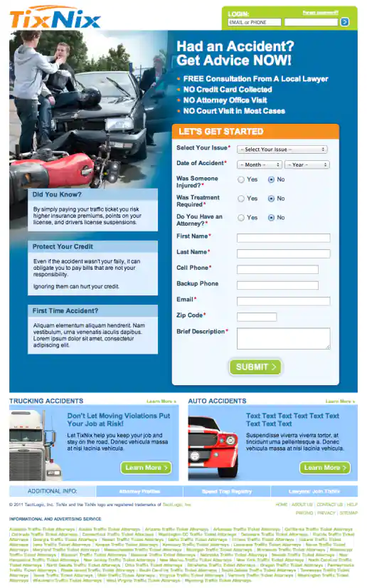
TixNix Landing Pages Based on Accident Type
Motorcycle Accident
Project Description:
Click for project detail view
-
Insightly.com Responsive Website Design
Mobile Only Pricing Page
Project Description: Initial layouts were created by another designer for the desktop screen width then handed-off for me to develop the alternate layouts for mobile devices. I coded layouts to be flexible so they worked on as many devices as possible. With only a couple exceptions, all pages were coded with four primary target sizes in mind beginning with the "mobile first" methodology. Additional media-query breakpoints were created when content areas within the layouts did not degrade gracefully when being resized. Standard sizes I would test and create media-queries for where 480x320 for iPhone landscape mode, 320x480 for iPhone portrait mode, 768x1024 for iPad portrait mode, and 1024x768 for iPad landscape mode and desktop use cases.
Click for project detail view