-
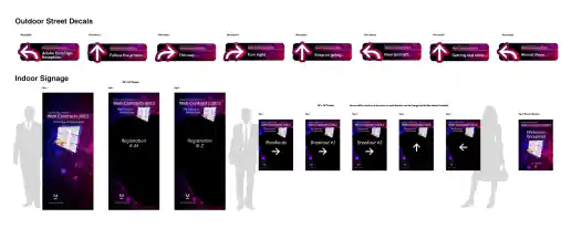
Adobe EchoSign Wayfinding Street Decal and Floor Signage Mockups
Project Description:
Click for project detail view
-
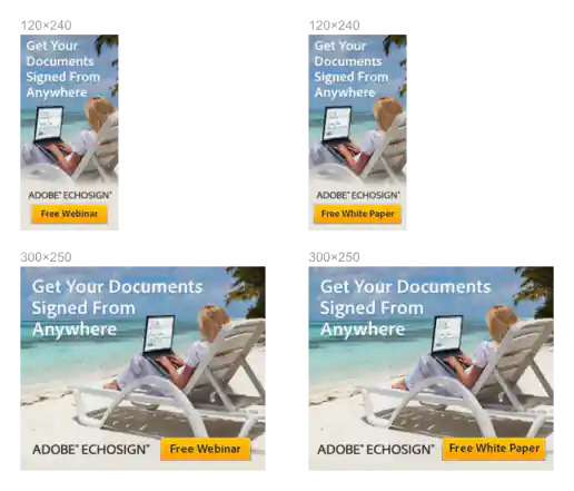
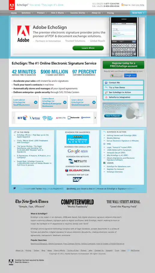
Adobe EchoSign “Get Documents Signed Anywhere” Campaign Banner Ads
Project Description: For this project I gathered stock photos to represent different unexpected situations where people could be while signing a document. Concept was based on a “Sign From Anywhere” idea we had used previously from the marketing manager.
Click for project detail view
-
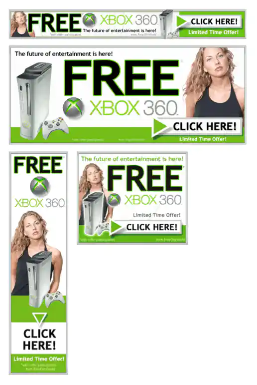
Adteractive Free XBox 360 Campaign Banner Ads
Project Description:
Click for project detail view
-
Adobe EchoSign Website Redesign Phase 1 Example Co-branded Homepage Redesign – Before and After Examples
After Version
Project Description: This was the first iteration of the site redesign right after the merger announcement between EchoSign and Adobe. I had seen other companies simply just adding the red Adobe tag to their header and updating their footers so this seemed to be the most appropriate solution, plus it was the easiest to do quickly. The bottom of the red Adobe tag is not suppose to be tangent with other page elements, is suppose to look like it's hang when placed at the top of a page. Although this was a violation of the brand standards we made an exception since it was temporary.
Click for project detail view
-
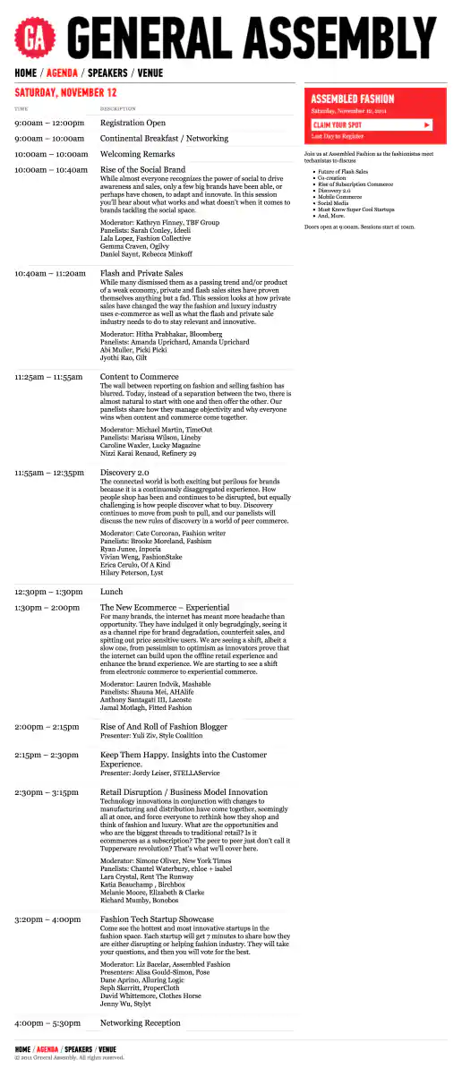
AssembledFashion.com Website
Agenda Page
Project Description: Assembled Fashion was a brief sub-brand of General Assembly created for this fashion themed conference. Initially when my client had the fashion conference idea I had started designing an entirely different looking website. But as General Assembly became involved with putting on the conference I adopted they're look and feel. It's always an interesting experience adopting another designers look and feel and discovering a new style to work with.
Click for project detail view
-
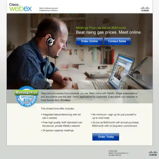
Cisco WebEx Meetings Plus Summer Campaign
Another Landing Page
Project Description:
Click for project detail view
-
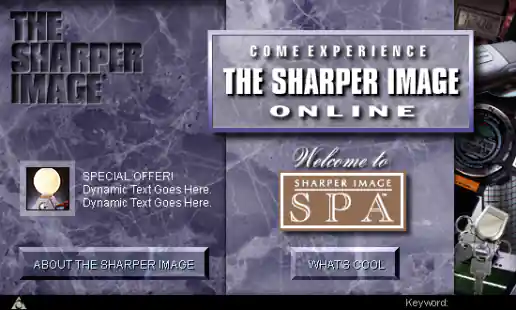
AOL Channel Art for The Sharper Image
Project Description: Visual design created based on The Sharper Image corporate look and feel. Since I had previously worked on other marketing vehicles for them I was already familiar with their brand standards which helped make this project a success.
Click for project detail view
-
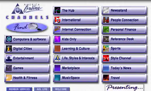
AOL Channels Screen
Project Description: One of the iterations I worked on for AOL version 3. This version might have been too “cyber” looking and the text on the buttons is dithering oddly I think. Another designer came up with the final version which used oval shaped buttons which had a friendlier feel and was less technical looking.
Click for project detail view
-
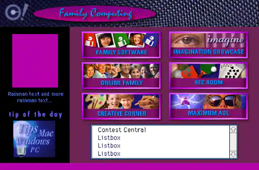
AOL Family Computing Channel
Project Description: One of AOLs most popular areas in version 3 was the Family Computing channel including it's chatting forums and games. The screen design integrated lots of visual eye candy to peek users interest to explore the different areas and get more intimate with the various subjects.
Click for project detail view
-
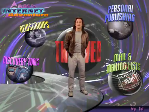
AOL Internet Adventure CD-ROM Interface Design
Project Description:
Click for project detail view
-
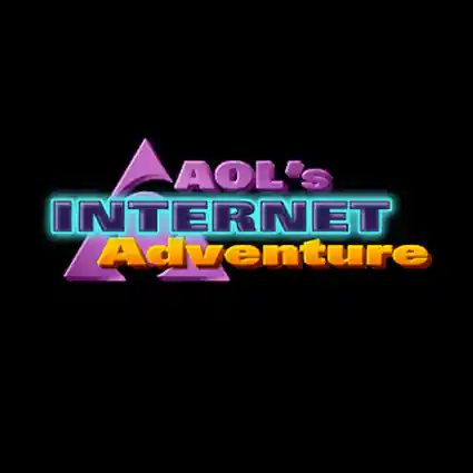
AOL Internet Adventure Logo
Project Description: This is the opening bumper animation that plays when the application first loads. I created the frames in Photoshop and a video editor created the clip. The producer and video editor came up with a great sound also which rings in the opening with a chime.
Click for project detail view
-
AOL Live Channel Logo
Project Description:
Click for project detail view

-
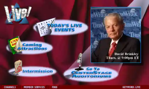
AOL Live! Channel
Project Description: AOL Live! was the TV Guide for online events and the design needed to inform and entice users in an organized manner while keeping track of everything going on. I worked on developing the graphics for the main channel screen and sub-screens.
Click for project detail view
-
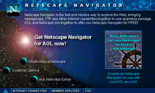
AOL Netscape Navigator Screen
Project Description:
Click for project detail view
-
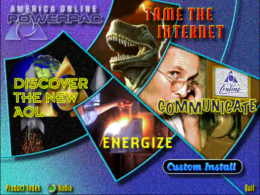
AOL PowerPac CD Interface Design
Project Description:
Click for project detail view
-
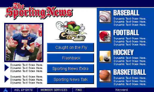
AOL The Sporting News Channel Screens
Project Description:
Click for project detail view
-
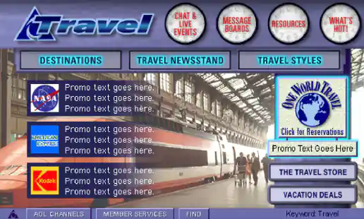
AOL Travel Channel
Project Description:
Click for project detail view
-
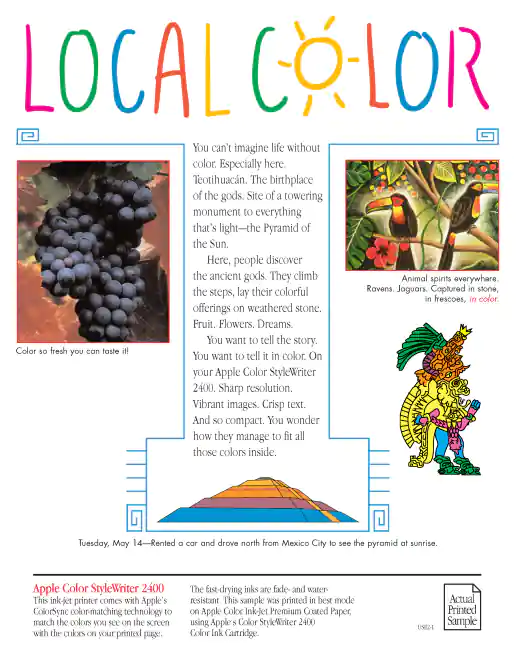
Apple Point-of-Purchase Printer Samples
Apple Color StyleWriter 2400 Printer Sample
Project Description: Apple use to make printers that were sold in stores such as Circuit City and Best Buy. Some printer displays would have a special button attached so customers could push it and see the printers in-action printing a sample page. This project also included a custom counter-top standee display with tabbed laminated pages that customers could flip though to view more samples and read detailed product specifications (wish I documented those along with that cool industrial design!). Art Director: Mark Drury.
Click for project detail view
-
Apple Point-of-Purchase Printer Samples
Apple Color StyleWriter Pro Printer Sample
Project Description: Apple use to make printers that were sold in stores such as Circuit City and Best Buy. Some printer displays would have a special button attached so customers could push it and see the printers in-action printing a sample page. This project also included a custom counter-top standee display with tabbed laminated pages that customers could flip though to view more samples and read detailed product specifications (wish I documented those along with that cool industrial design!). Art Director: Mark Drury.
Click for project detail view
-
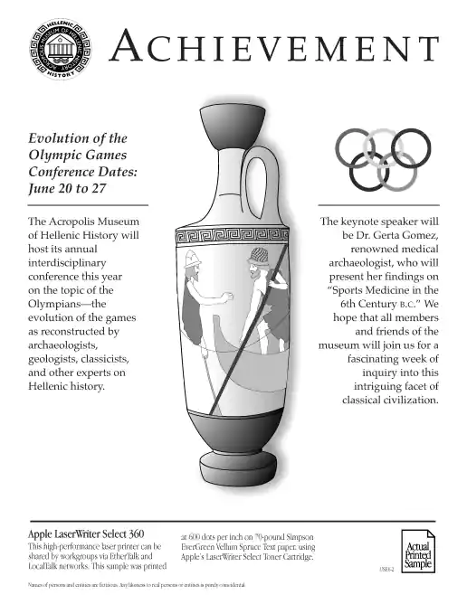
Apple Point-of-Purchase Printer Samples
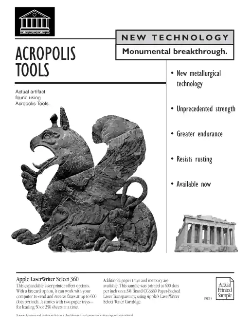
Apple LaserWriter Select 360 Printer Sample (v1)
Project Description: Apple use to make printers that were sold in stores such as Circuit City and Best Buy. Some printer displays would have a special button attached so customers could push it and see the printers in-action printing a sample page. This project also included a custom counter-top standee display with tabbed laminated pages that customers could flip though to view more samples and read detailed product specifications (wish I documented those along with that cool industrial design!). Art Director: Mark Drury.
Click for project detail view
-
Apple Point-of-Purchase Printer Samples
Apple LaserWriter Select 360 Printer Sample (v2)
Project Description: Apple use to make printers that were sold in stores such as Circuit City and Best Buy. Some printer displays would have a special button attached so customers could push it and see the printers in-action printing a sample page. This project also included a custom counter-top standee display with tabbed laminated pages that customers could flip though to view more samples and read detailed product specifications (wish I documented those along with that cool industrial design!). Art Director: Mark Drury.
Click for project detail view
-
Apple Point-of-Purchase Printer Samples
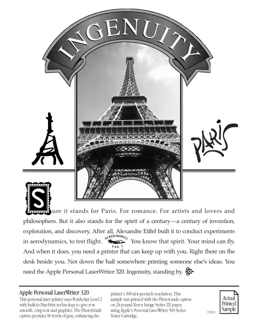
Apple Personal LaserWriter 320 Printer Sample
Project Description: Apple use to make printers that were sold in stores such as Circuit City and Best Buy. Some printer displays would have a special button attached so customers could push it and see the printers in-action printing a sample page. This project also included a custom counter-top standee display with tabbed laminated pages that customers could flip though to view more samples and read detailed product specifications (wish I documented those along with that cool industrial design!). Art Director: Mark Drury.
Click for project detail view
-
Apple Point-of-Purchase Printer Samples
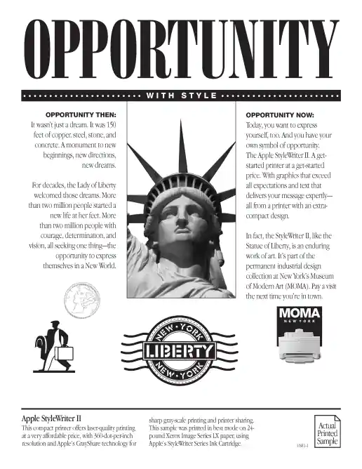
Apple StyleWriter II Printer Sample
Project Description: Apple use to make printers that were sold in stores such as Circuit City and Best Buy. Some printer displays would have a special button attached so customers could push it and see the printers in-action printing a sample page. This project also included a custom counter-top standee display with tabbed laminated pages that customers could flip though to view more samples and read detailed product specifications (wish I documented those along with that cool industrial design!). Art Director: Mark Drury.
Click for project detail view
-
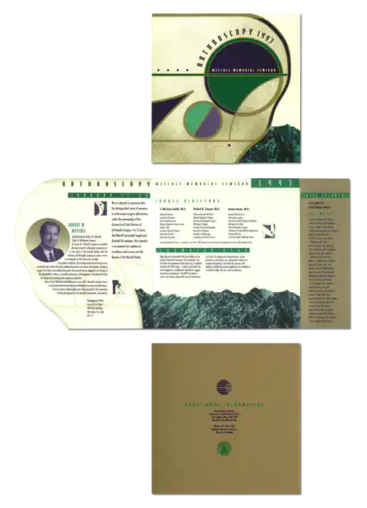
Arthroscopy Seminar Brochure Design
Project Description: This tri-fold brochure mailer combined some interesting design elements. Such as the third panel which opened to reveal a large stripe of gold ink presenting the special speakers and faculty names. It was great we had a budget to use the gold ink which helped elevate conceptually how notable the event was. By abstracting and stylizing the technical illustration of a knee we created a unique look and a shape which worked perfectly as a die cut cover. This is one of those projects where we would hang out in the back at Kinko’s banging away on their fancy Apple Quadra computers paying to use Adobe Illustrator and Photoshop by the hour. I would push around elements on the screen, try different colors, swap in and out different illustrations we had found, until something clicked and looked good. Art Director: Lane Hiers
Click for project detail view