-
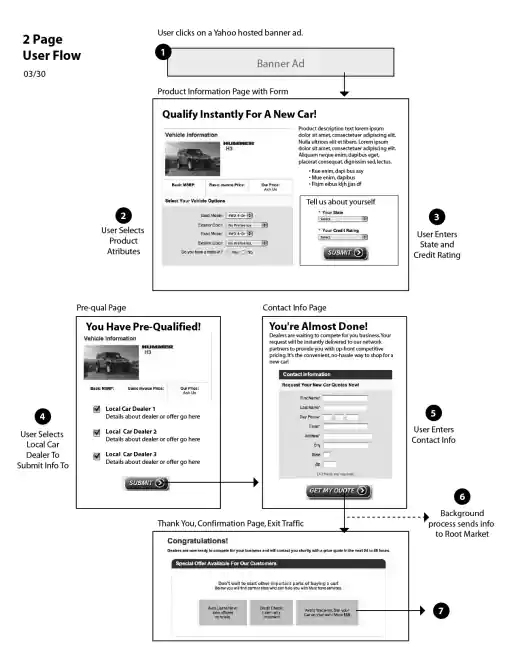
Yahoo! GM National, Regional, Dealer Promotion Opportunities and Lead Capture UX Design Strategy
1, 2, and 3-Step Content Flow Alternatives
Project Description: This presentation shows national, regional, and dealer promotion placement opportunities plus the lead capture experience (or customer user flow) steps.
Click for project detail view
-
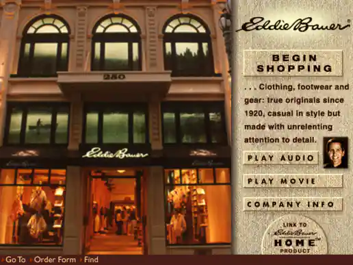
2Market CD Eddie Bauer Interface Designs
Project Description: Eddie Bauer was one of the catalogs presented on the 2Market CD. Sometimes vendors would just send their logo and let us design the interface for their catalog. I usually managed to preserve the brands look for well known companies so sign-offs went smoothly.
Click for project detail view
-
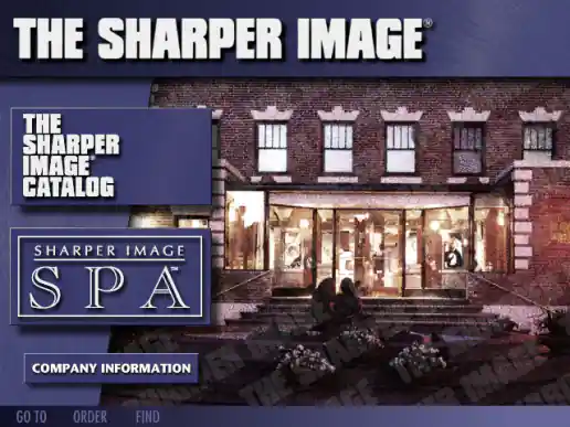
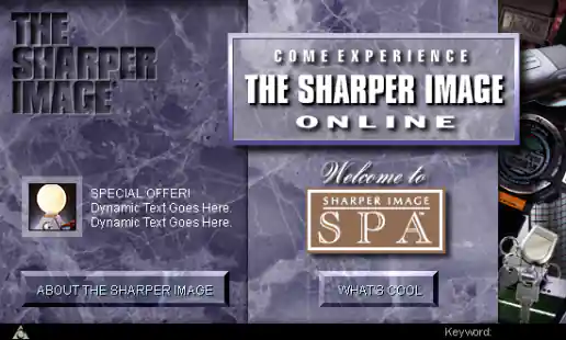
2Market CD The Sharper Image Interface Designs
Project Description: The Sharper Image was another one of the catalogs presented on the 2Market CD. Sometimes vendors would just send their logo and ask us to handle the interface design for their catalog. Since I was already familiar with the Sharper Image brand through their mailed catalog and had noticed their advertising on occasion plus I had visited their stores shopping a few times, I was able to successfully maintain the brands look and feel.
Click for project detail view
-
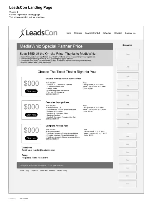
LeadsCon Landing Page Wireframes
6 Initial Directions
Project Description:
Click for project detail view
-
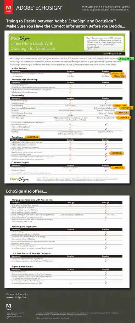
Adobe EchoSign DocuSign Corrections Interactive PDF
Project Description: Interactive PDF created with rollovers highlighting incorrect sections of a DocuSign comparison white paper that DocuSign was distributing. You have to download the PDF to your hard drive and open it in Acrobat Reader to see the rollovers. It doesn't work if you just view the PDF in a web browser.
Click for project detail view
-
AOL Channel Art for The Sharper Image
Project Description: Visual design created based on The Sharper Image corporate look and feel. Since I had previously worked on other marketing vehicles for them I was already familiar with their brand standards which helped make this project a success.
Click for project detail view
-
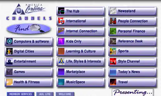
AOL Channels Screen
Project Description: One of the iterations I worked on for AOL version 3. This version might have been too “cyber” looking and the text on the buttons is dithering oddly I think. Another designer came up with the final version which used oval shaped buttons which had a friendlier feel and was less technical looking.
Click for project detail view
-
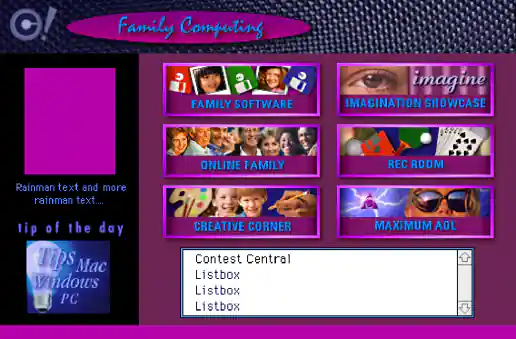
AOL Family Computing Channel
Project Description: One of AOLs most popular areas in version 3 was the Family Computing channel including it's chatting forums and games. The screen design integrated lots of visual eye candy to peek users interest to explore the different areas and get more intimate with the various subjects.
Click for project detail view
-
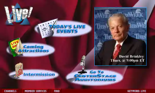
AOL Live! Channel
Project Description: AOL Live! was the TV Guide for online events and the design needed to inform and entice users in an organized manner while keeping track of everything going on. I worked on developing the graphics for the main channel screen and sub-screens.
Click for project detail view
-
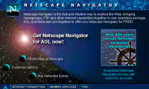
AOL Netscape Navigator Screen
Project Description:
Click for project detail view
-
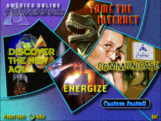
AOL PowerPac CD Interface Design
Project Description:
Click for project detail view
-
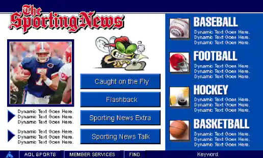
AOL The Sporting News Channel Screens
Project Description:
Click for project detail view
-
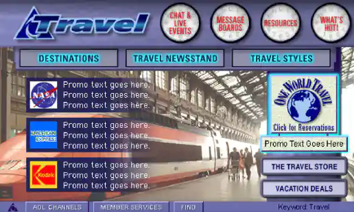
AOL Travel Channel
Project Description:
Click for project detail view
-
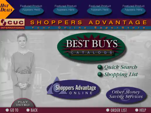
CUC Shoppers Advantage Best Buys Catalog Online Superstore
CD-ROM Interface Design
Project Description: Developed graphics for main menu and sub-screens. 3 months
Click for project detail view
-
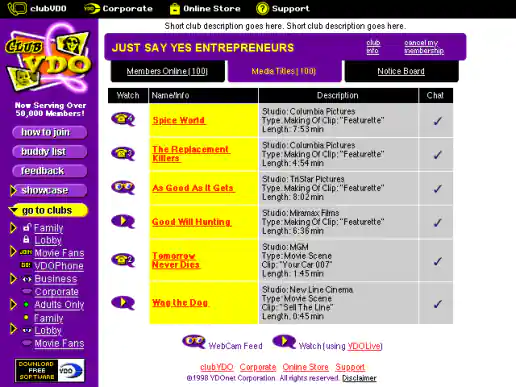
ClubVDO Website Redesign
Club Page
Project Description:
Click for project detail view
-
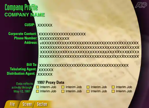
ADP Shareholder Communication Trends Demo
Company Profile Screen
Project Description: This app demonstrated the kinds of insights ADP could provide based on their data at a conference. The project was managed through a small agency named Printz in San Francisco and developed in Java. Creating the x, y coordinates for each line of text took some time but helped the developer get things in the right place without having to just eye the positions.
Click for project detail view
-
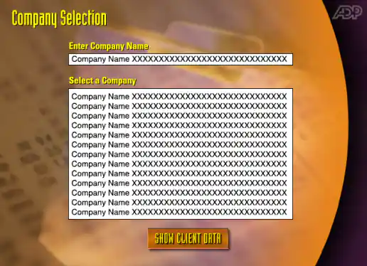
ADP Shareholder Communication Trends Demo
Company Selection Screen
Project Description: This app demonstrated the kinds of insights ADP could provide based on their data at a conference. The project was managed through a small agency named Printz in San Francisco and developed in Java. Creating the x, y coordinates for each line of text took some time but helped the developer get things in the right place without having to just eye the positions.
Click for project detail view
-
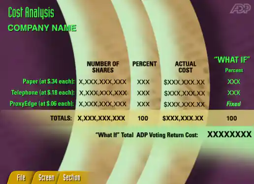
ADP Shareholder Communication Trends Demo
Cost Analysis Screen
Project Description: This app demonstrated the kinds of insights ADP could provide based on their data at a conference. The project was managed through a small agency named Printz in San Francisco and developed in Java. Creating the x, y coordinates for each line of text took some time but helped the developer get things in the right place without having to just eye the positions.
Click for project detail view
-
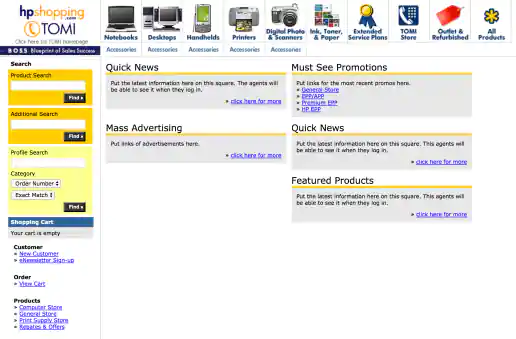
HPShopping.com Telephone Order Management Interface (TOMI) Call Center Interface
Project Description: Created as part of HPShopping’s Customer Contact Management Tool, TOMI was used by telephone operators when customers called in to place or change orders. The portal provided a central area where associates can find current promotions, see featured products to promote, along with managing customer order information. This was a quick design refresh to make the interface friendlier and more usable. Because of budget and time restraints, some screens, such as the New Customer form, were not fully designed but were at least coded with semantic HTML elements. You should have seen what at looked like back in 2004 before this refresh.
Click for project detail view
-
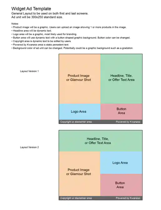
Kwanzoo Widget Ad Template Guidelines
Initial Specs
Project Description:
Click for project detail view
-
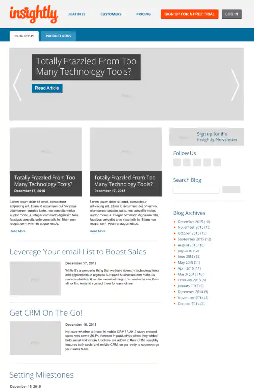
Insightly Blog Facelift Wireframes
Project Description: Example of some quickie wireframes I would put together to gather initial feedback on. Insightly wanted to jazz up the initial blog page layout so it was more magazine like. The final layout was also based on how it easy was for them to manage image sizes so they appear uniformly when in rows and don't start to look stretched or compressed.
Click for project detail view
-
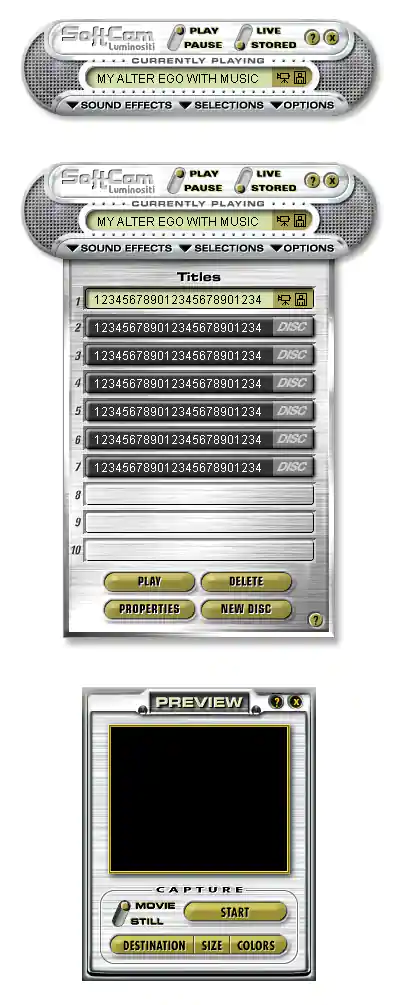
SoftCam Interface Design
Mockups
Project Description:
Click for project detail view
-
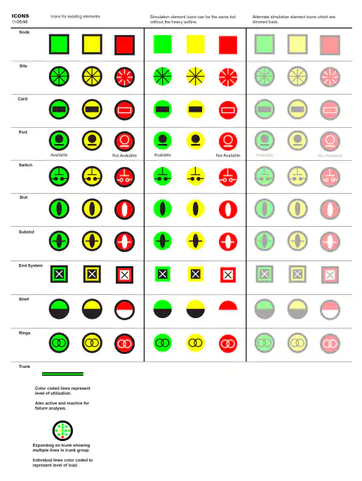
Narus Network Monitoring Icon Organization
Project Description:
Click for project detail view
-
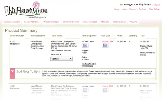
FiftyFlowers.com eCommerce Order Management System Interface Design Proposal Mockups
Order Summary
Project Description: A few quick mockups presented as a proposal for the commerce website administration and order management area of FiftyFlowers.com. By using colors that complimented the logo and improving the over layout of elements, this CMS user interface became immediately recognizable and aesthetically more pleasant to look at (and use) than interacting with the generic geeky look and feel that the engineers had initially developed.
Click for project detail view