-
Yahoo! Rich Media Ad Specifications for Instant Messenger “Thank You” Page
Project Description:
Click for project detail view
-
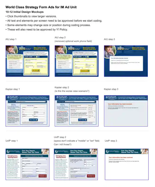
Yahoo! Mockup Presentation for EDU Vertical Campaigns UX with Form Ads
Project Description: Example presentation I put together showing user flow and content organization for three education lead capture campaigns. Presentations like this help me gather ideas and feedback from other stakeholders on project along with making sure we'll meet target objectives.
Click for project detail view
-
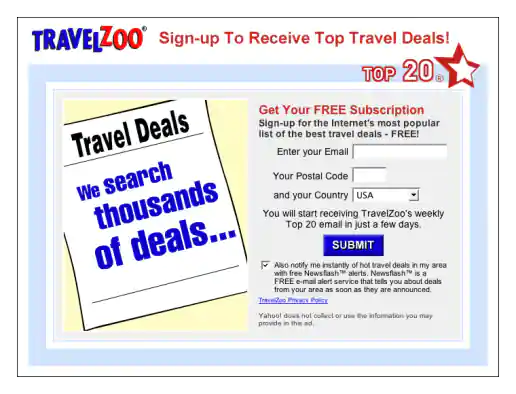
Yahoo! Messenger Form Ad Mockup for TravelZoo
Project Description:
Click for project detail view
-
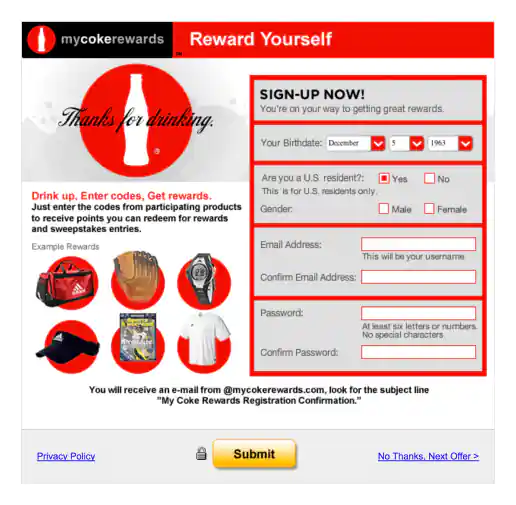
Yahoo! Messenger Form Ad Mockup for MyCokeRewards
Project Description:
Click for project detail view
-
Yahoo! Messenger Form Ad Mockup for EarnMyDegree.com
Project Description:
Click for project detail view

-
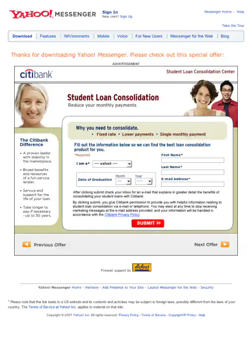
Yahoo! Messenger Form Ad Mockup for Citibank Student Loan Consolidation
Project Description:
Click for project detail view
-
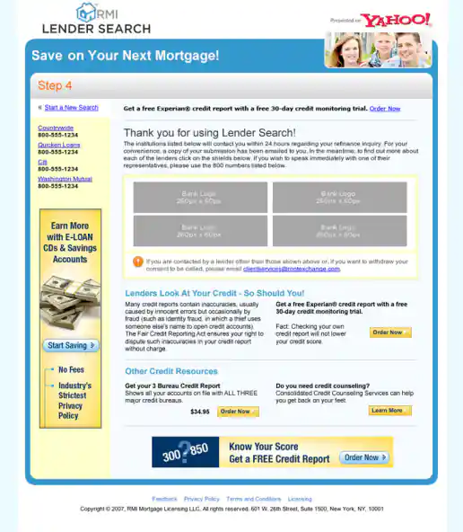
Yahoo! Lender Search “Lenders Direct” Campaign
Yahoo! Lender Search “Lenders Direct” Campaign Exit Page
Project Description: For this campaign I integrated lender logos into Flash animated ads to provide insight who the lenders are and begin to build confidence in potential customers minds before they apply for home financing. As part of this test, the logos either scrolled left to right, bottom to top, or zoomed from small to large along with style and messaging variations. The landing page look and feel borrowed from the style of the Yahoo! Travel channel and other online properties at the time to keep consistent with the Yahoo brand in general.
Click for project detail view
-
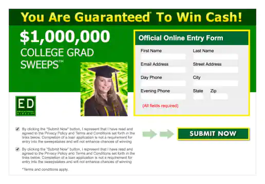
Yahoo! Form Ad Created for ED Educational Direct
Project Description:
Click for project detail view
-
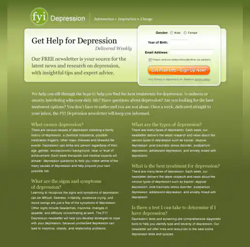
FYI Living Newsletter Sign-Up Landing Page Design
Version 4
Project Description: FYI Living was looking to improve their newsletter sign-up conversion rates for different subject areas such as fitness, nutrition, depression, pregnancy and others and needed an alternate look to test. After researching similar sites I noticed many where overly marketing oriented and tended to look kinda cheesy. I developed a few directions to avoid the typical look then narrowed down to these four initial designs to gather feedback on and potential test. These try to look more clinical news oriented and reserved in nature. They intentionally don't include photos since visitors sometimes get distracted by photos (especially of people) on landing pages and study them rather than focusing on the informational content being offered. “Clarity trumps persuasion” is a tactic worth testing in my experience, even though the simpler style doesn't necessarily look as punchy as landing page designs which include big colorful photos.
Click for project detail view
-
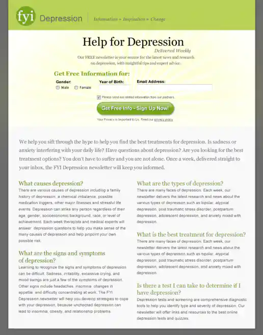
FYI Living Newsletter Sign-Up Landing Page Design
Version 3
Project Description: FYI Living was looking to improve their newsletter sign-up conversion rates for different subject areas such as fitness, nutrition, depression, pregnancy and others and needed an alternate look to test. After researching similar sites I noticed many where overly marketing oriented and tended to look kinda cheesy. I developed a few directions to avoid the typical look then narrowed down to these four initial designs to gather feedback on and potential test. These try to look more clinical news oriented and reserved in nature. They intentionally don't include photos since visitors sometimes get distracted by photos (especially of people) on landing pages and study them rather than focusing on the informational content being offered. “Clarity trumps persuasion” is a tactic worth testing in my experience, even though the simpler style doesn't necessarily look as punchy as landing page designs which include big colorful photos.
Click for project detail view
-
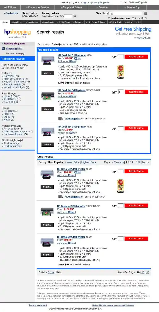
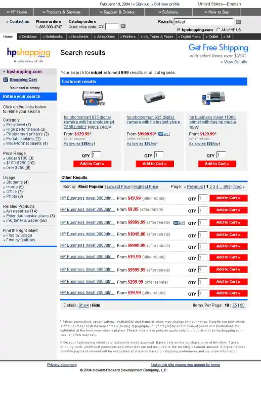
HPShopping.com Search Results Alternate Layout Mockups
Version 2: Showing Product Details
Project Description:
Click for project detail view
-
FYI Living Newsletter Sign-Up Landing Page Design
Version 2
Project Description: FYI Living was looking to improve their newsletter sign-up conversion rates for different subject areas such as fitness, nutrition, depression, pregnancy and others and needed an alternate look to test. After researching similar sites I noticed many where overly marketing oriented and tended to look kinda cheesy. I developed a few directions to avoid the typical look then narrowed down to these four initial designs to gather feedback on and potential test. These try to look more clinical news oriented and reserved in nature. They intentionally don't include photos since visitors sometimes get distracted by photos (especially of people) on landing pages and study them rather than focusing on the informational content being offered. “Clarity trumps persuasion” is a tactic worth testing in my experience, even though the simpler style doesn't necessarily look as punchy as landing page designs which include big colorful photos.
Click for project detail view
-
HPShopping.com Search Results Alternate Layout Mockups
Version 1: Hiding Product Details
Project Description:
Click for project detail view
-
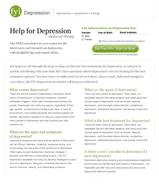
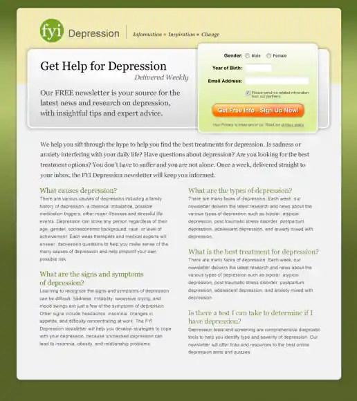
FYI Living Newsletter Sign-Up Landing Page Design
Version 1
Project Description: FYI Living was looking to improve their newsletter sign-up conversion rates for different subject areas such as fitness, nutrition, depression, pregnancy and others and needed an alternate look to test. After researching similar sites I noticed many where overly marketing oriented and tended to look kinda cheesy. I developed a few directions to avoid the typical look then narrowed down to these four initial designs to gather feedback on and potential test. These try to look more clinical news oriented and reserved in nature. They intentionally don't include photos since visitors sometimes get distracted by photos (especially of people) on landing pages and study them rather than focusing on the informational content being offered. “Clarity trumps persuasion” is a tactic worth testing in my experience, even though the simpler style doesn't necessarily look as punchy as landing page designs which include big colorful photos.
Click for project detail view
-
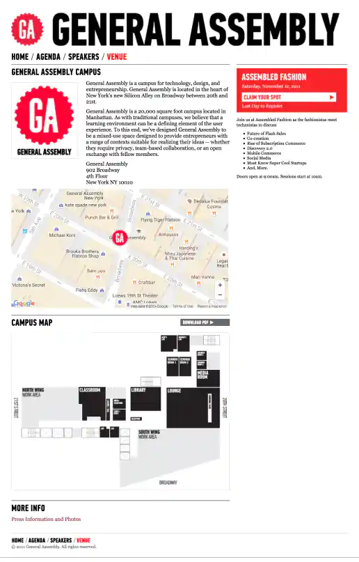
AssembledFashion.com Website
Venue Page
Project Description: Assembled Fashion was a brief sub-brand of General Assembly created for this fashion themed conference. Initially when my client had the fashion conference idea I had started designing an entirely different looking website. But as General Assembly became involved with putting on the conference I adopted they're look and feel. It's always an interesting experience adopting another designers look and feel and discovering a new style to work with.
Click for project detail view
-
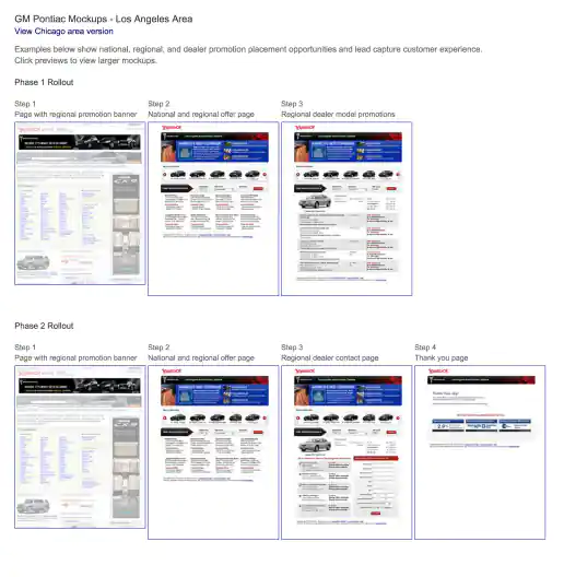
Yahoo! GM National, Regional, Dealer Promotion Opportunities and Lead Capture UX Design Strategy
UX Mockups Presentation
Project Description: This presentation shows national, regional, and dealer promotion placement opportunities plus the lead capture experience (or customer user flow) steps.
Click for project detail view
-
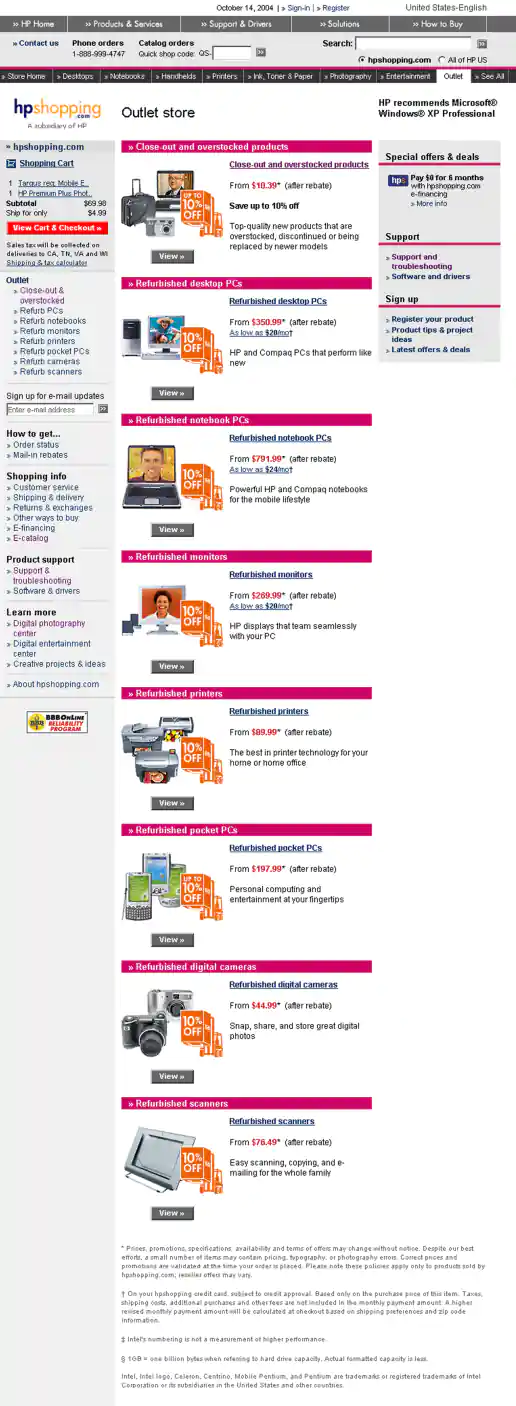
HPShopping.com Warehouse Sale Campaign
Themed Store Landing Page
Project Description:
Click for project detail view
-
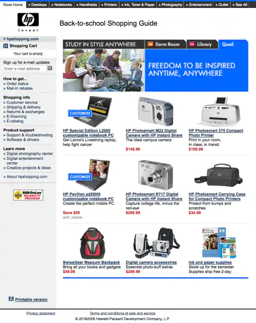
HPShopping.com Back-to-School Shopping Guide
Study Anywhere: Quad
Project Description:
Click for project detail view
-
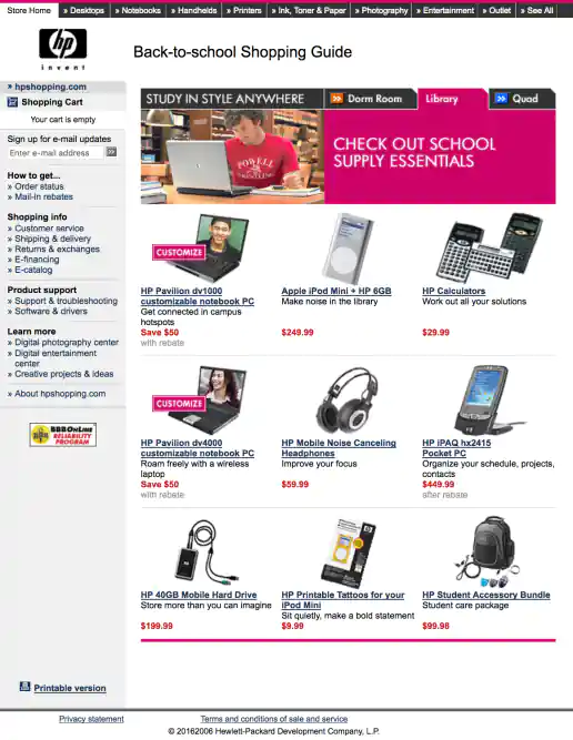
HPShopping.com Back-to-School Shopping Guide
Study Anywhere: Library
Project Description:
Click for project detail view
-
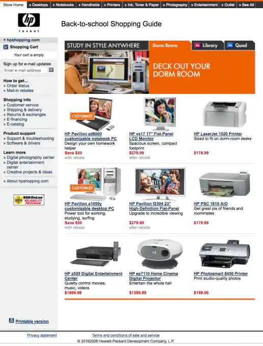
HPShopping.com Back-to-School Shopping Guide
Study Anywhere: Dorm Room
Project Description:
Click for project detail view
-
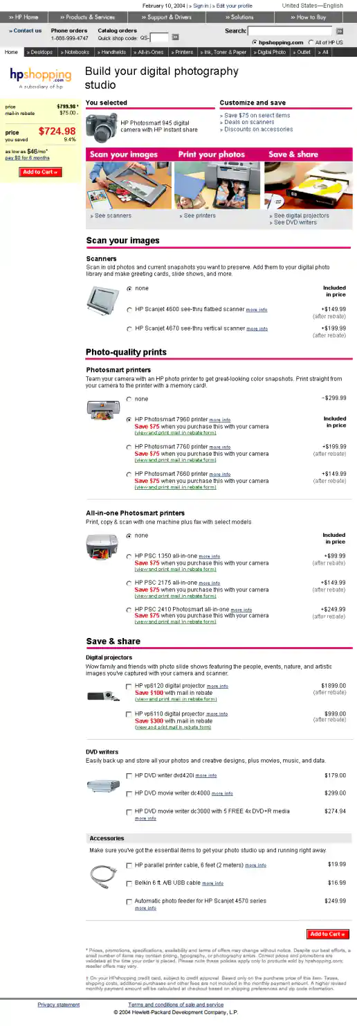
HPShopping.com Digital Photography Solutions Center
Studio Configurator
Project Description:
Click for project detail view
-
Star Wars Summit Logo
Project Description: Art Director: Troy Alders
Click for project detail view

-
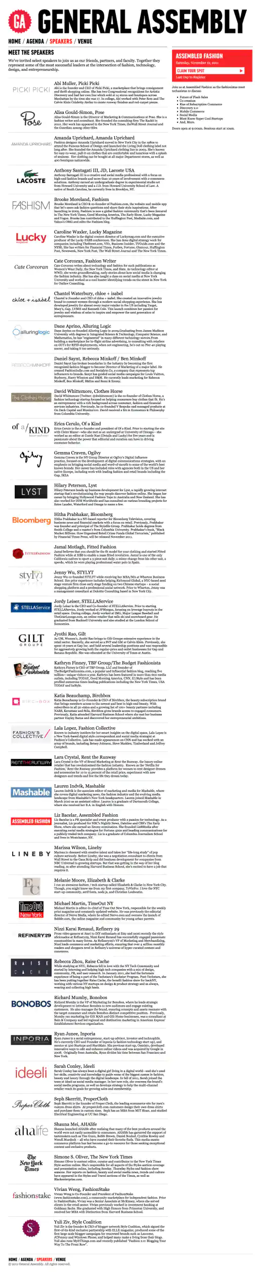
AssembledFashion.com Website
Speakers Page
Project Description: Assembled Fashion was a brief sub-brand of General Assembly created for this fashion themed conference. Initially when my client had the fashion conference idea I had started designing an entirely different looking website. But as General Assembly became involved with putting on the conference I adopted they're look and feel. It's always an interesting experience adopting another designers look and feel and discovering a new style to work with.
Click for project detail view
-
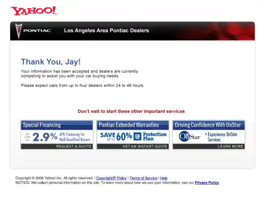
Yahoo! GM National, Regional, Dealer Promotion Opportunities and Lead Capture UX Design Strategy
Phase 2, Step 4
Project Description: This presentation shows national, regional, and dealer promotion placement opportunities plus the lead capture experience (or customer user flow) steps.
Click for project detail view