Portfolio / Media Types / Landing Pages
-
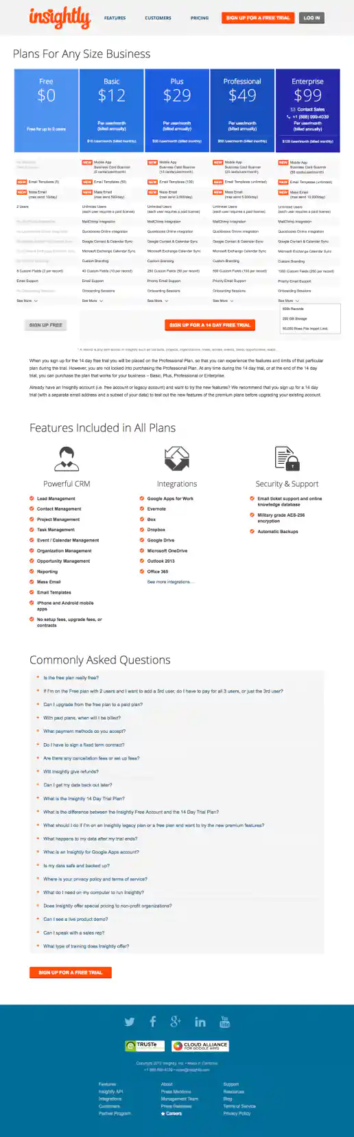
Insightly.com Pricing Page Test Variations
Version Showing Five Plans and Features Chart Enhancements
Project Description: Presented here are several iterations of the Pricing page I coded or co-designed/developed and maintained 3013 through 1016 while working with the Insightly marketing team, internal designers, and external vendors. Variations were tested using Optimizely and services such as Experiment Engine for A/B testing and conversion optimization along with KissMetrics and Google Analytics for click path tracking. Occasionally I contributed to the visual design while staying true to the look and feel of the Insightly brand. Additionally I occasionally contributed test suggestions based on best practices research, reviewing reported successes on other sites and competitive analysis. Several other versions were created as well, such as using different visual treatments for the title area and plan blurbs. etcetera.
Click for project detail view
-
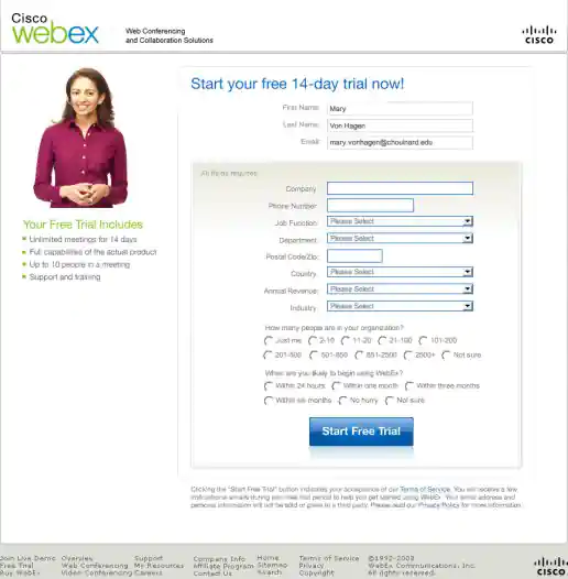
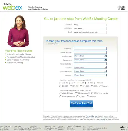
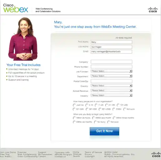
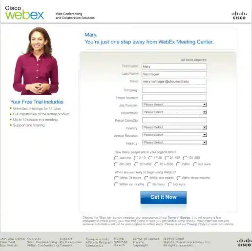
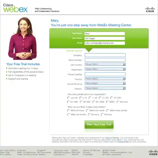
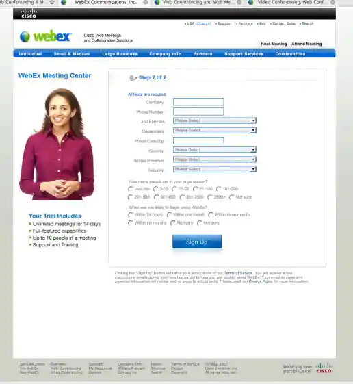
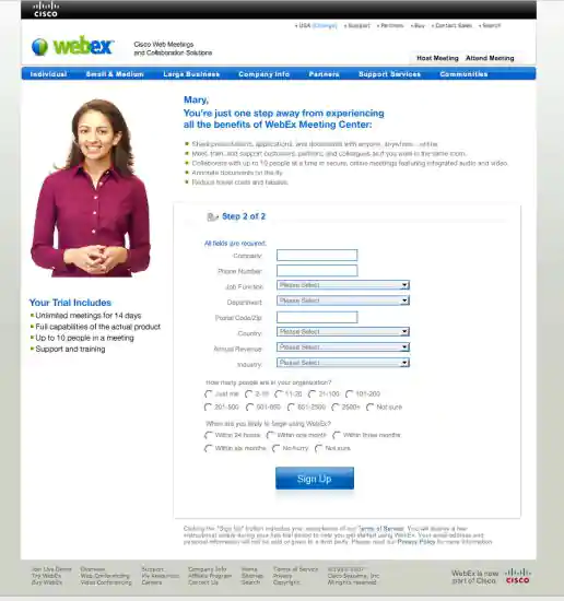
Cisco Webex Free Trial Signup Step 2 Form, Multi-variant Test Variations
Version 9
Project Description: To help explain what I was working on and the user experience which I based my decisions on, I created a quick user flow diagram showing screenshots along with short text explanations of the user journey both before and after interacting with the sign-up screens I was working on. This helped focus decisions to specific areas, optimize content to improve user experience, and identify most effective opportunities for multi-variant testing. Each of the variations were based on learnings from other Cisco Webex products, team input/feedback, plus learnings I incorporated from studying best practices in form design, lead generation, and UX marketing design.
Click for project detail view
-
Cisco Webex Free Trial Signup Step 2 Form, Multi-variant Test Variations
Version 8
Project Description: To help explain what I was working on and the user experience which I based my decisions on, I created a quick user flow diagram showing screenshots along with short text explanations of the user journey both before and after interacting with the sign-up screens I was working on. This helped focus decisions to specific areas, optimize content to improve user experience, and identify most effective opportunities for multi-variant testing. Each of the variations were based on learnings from other Cisco Webex products, team input/feedback, plus learnings I incorporated from studying best practices in form design, lead generation, and UX marketing design.
Click for project detail view

-
Cisco Webex Free Trial Signup Step 2 Form, Multi-variant Test Variations
Version 7
Project Description: To help explain what I was working on and the user experience which I based my decisions on, I created a quick user flow diagram showing screenshots along with short text explanations of the user journey both before and after interacting with the sign-up screens I was working on. This helped focus decisions to specific areas, optimize content to improve user experience, and identify most effective opportunities for multi-variant testing. Each of the variations were based on learnings from other Cisco Webex products, team input/feedback, plus learnings I incorporated from studying best practices in form design, lead generation, and UX marketing design.
Click for project detail view
-
Cisco Webex Free Trial Signup Step 2 Form, Multi-variant Test Variations
Version 6
Project Description: To help explain what I was working on and the user experience which I based my decisions on, I created a quick user flow diagram showing screenshots along with short text explanations of the user journey both before and after interacting with the sign-up screens I was working on. This helped focus decisions to specific areas, optimize content to improve user experience, and identify most effective opportunities for multi-variant testing. Each of the variations were based on learnings from other Cisco Webex products, team input/feedback, plus learnings I incorporated from studying best practices in form design, lead generation, and UX marketing design.
Click for project detail view
-
Cisco Webex Free Trial Signup Step 2 Form, Multi-variant Test Variations
Version 5
Project Description: To help explain what I was working on and the user experience which I based my decisions on, I created a quick user flow diagram showing screenshots along with short text explanations of the user journey both before and after interacting with the sign-up screens I was working on. This helped focus decisions to specific areas, optimize content to improve user experience, and identify most effective opportunities for multi-variant testing. Each of the variations were based on learnings from other Cisco Webex products, team input/feedback, plus learnings I incorporated from studying best practices in form design, lead generation, and UX marketing design.
Click for project detail view
-
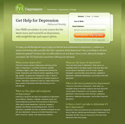
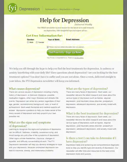
FYI Living Newsletter Sign-Up Landing Page Design
Version 4
Project Description: FYI Living was looking to improve their newsletter sign-up conversion rates for different subject areas such as fitness, nutrition, depression, pregnancy and others and needed an alternate look to test. After researching similar sites I noticed many where overly marketing oriented and tended to look kinda cheesy. I developed a few directions to avoid the typical look then narrowed down to these four initial designs to gather feedback on and potential test. These try to look more clinical news oriented and reserved in nature. They intentionally don't include photos since visitors sometimes get distracted by photos (especially of people) on landing pages and study them rather than focusing on the informational content being offered. “Clarity trumps persuasion” is a tactic worth testing in my experience, even though the simpler style doesn't necessarily look as punchy as landing page designs which include big colorful photos.
Click for project detail view
-
Cisco Webex Free Trial Signup Step 2 Form, Multi-variant Test Variations
Version 4
Project Description: To help explain what I was working on and the user experience which I based my decisions on, I created a quick user flow diagram showing screenshots along with short text explanations of the user journey both before and after interacting with the sign-up screens I was working on. This helped focus decisions to specific areas, optimize content to improve user experience, and identify most effective opportunities for multi-variant testing. Each of the variations were based on learnings from other Cisco Webex products, team input/feedback, plus learnings I incorporated from studying best practices in form design, lead generation, and UX marketing design.
Click for project detail view
-
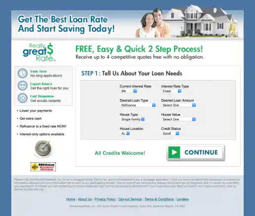
ReallyGreatRate Home Loan Landing Page
Version 3, Step 2
Project Description:
Click for project detail view

-
ReallyGreatRate Home Loan Landing Page
Version 3, Step 1
Project Description:
Click for project detail view
-
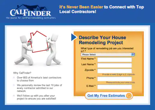
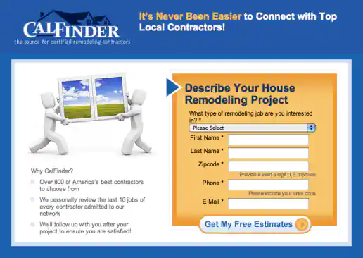
CalFinder House Remodeling “Top Local Contractors” Landing Page
Version 3
Project Description: Three alternate images presented for the client to consider testing and see which resonates more with the target audience.
Click for project detail view
-
FYI Living Newsletter Sign-Up Landing Page Design
Version 3
Project Description: FYI Living was looking to improve their newsletter sign-up conversion rates for different subject areas such as fitness, nutrition, depression, pregnancy and others and needed an alternate look to test. After researching similar sites I noticed many where overly marketing oriented and tended to look kinda cheesy. I developed a few directions to avoid the typical look then narrowed down to these four initial designs to gather feedback on and potential test. These try to look more clinical news oriented and reserved in nature. They intentionally don't include photos since visitors sometimes get distracted by photos (especially of people) on landing pages and study them rather than focusing on the informational content being offered. “Clarity trumps persuasion” is a tactic worth testing in my experience, even though the simpler style doesn't necessarily look as punchy as landing page designs which include big colorful photos.
Click for project detail view
-
Cisco Webex Free Trial Signup Step 2 Form, Multi-variant Test Variations
Version 3
Project Description: To help explain what I was working on and the user experience which I based my decisions on, I created a quick user flow diagram showing screenshots along with short text explanations of the user journey both before and after interacting with the sign-up screens I was working on. This helped focus decisions to specific areas, optimize content to improve user experience, and identify most effective opportunities for multi-variant testing. Each of the variations were based on learnings from other Cisco Webex products, team input/feedback, plus learnings I incorporated from studying best practices in form design, lead generation, and UX marketing design.
Click for project detail view
-
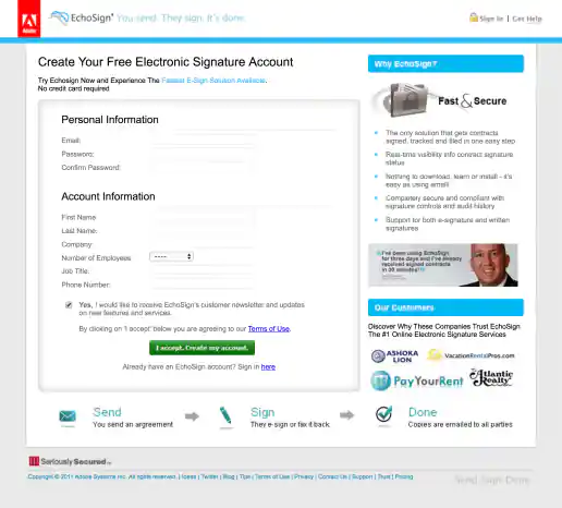
Adobe EchoSign Real Estate Audience Landing Page
Version 2: Alternate Layout, Adobe Logo Added
Project Description: Landing pages could be customized for various marketing verticals by updating the headlines text, bullet point text, testimonials, and example customer logos. Three or four layout variations were tested. Version 2 also includes the Phase 1 header and footer redesign I initially incorporated after Adobe acquired EchoSign.
Click for project detail view
-
ApartmentSearch.com Region Based A/B Landing Page Test Variations
Version 2
Project Description:
Click for project detail view

-
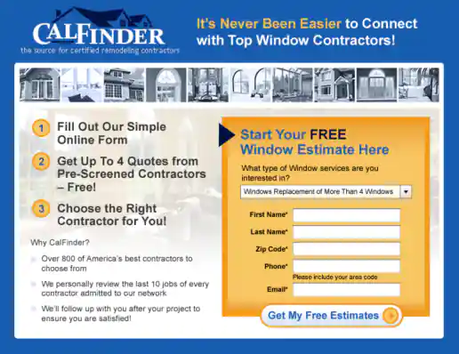
CalFinder House Remodeling “Top Local Contractors” Landing Page
Version 2
Project Description: Three alternate images presented for the client to consider testing and see which resonates more with the target audience.
Click for project detail view
-
CalFinder One-Step Signup Landing Page Design
Version 2
Project Description:
Click for project detail view
-
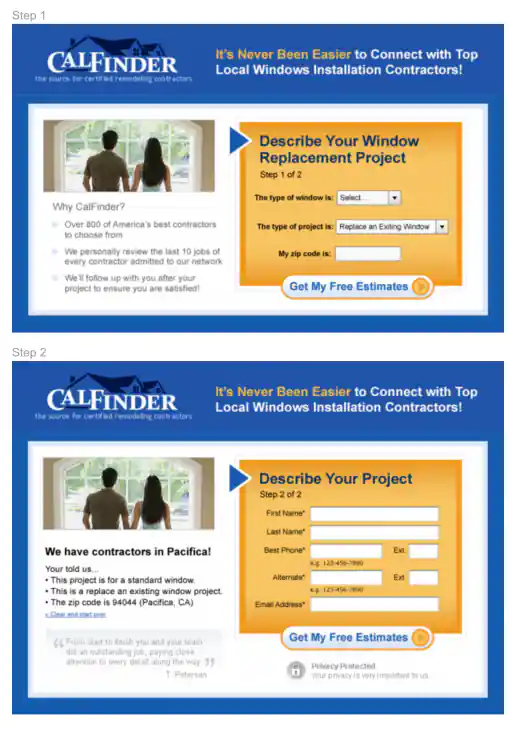
CalFinder Two-Step Signup Landing Page Design
Version 2
Project Description:
Click for project detail view
-
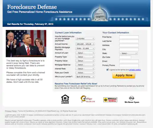
DebtRelief.org Landing Page
Version 2
Project Description:
Click for project detail view
-
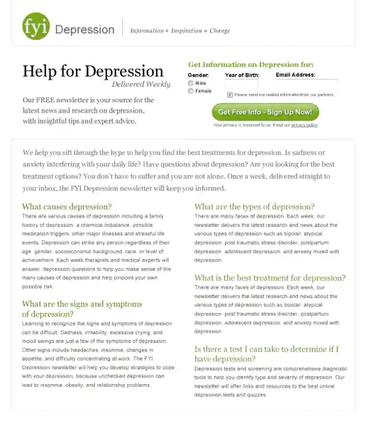
FYI Living Newsletter Sign-Up Landing Page Design
Version 2
Project Description: FYI Living was looking to improve their newsletter sign-up conversion rates for different subject areas such as fitness, nutrition, depression, pregnancy and others and needed an alternate look to test. After researching similar sites I noticed many where overly marketing oriented and tended to look kinda cheesy. I developed a few directions to avoid the typical look then narrowed down to these four initial designs to gather feedback on and potential test. These try to look more clinical news oriented and reserved in nature. They intentionally don't include photos since visitors sometimes get distracted by photos (especially of people) on landing pages and study them rather than focusing on the informational content being offered. “Clarity trumps persuasion” is a tactic worth testing in my experience, even though the simpler style doesn't necessarily look as punchy as landing page designs which include big colorful photos.
Click for project detail view
-
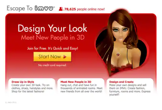
IMVU Valentines Theme Landing Page Design
Version 2
Project Description: A timely design for Valentines day. After mocking up a few directions we settled on two versions to test.
Click for project detail view
-
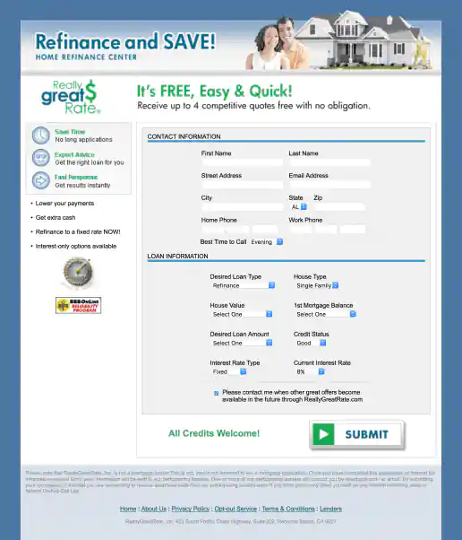
ReallyGreatRate Home Loan Landing Page
Version 2
Project Description:
Click for project detail view
-
Cisco Webex Free Trial Signup Step 2 Form, Multi-variant Test Variations
Version 2
Project Description: To help explain what I was working on and the user experience which I based my decisions on, I created a quick user flow diagram showing screenshots along with short text explanations of the user journey both before and after interacting with the sign-up screens I was working on. This helped focus decisions to specific areas, optimize content to improve user experience, and identify most effective opportunities for multi-variant testing. Each of the variations were based on learnings from other Cisco Webex products, team input/feedback, plus learnings I incorporated from studying best practices in form design, lead generation, and UX marketing design.
Click for project detail view
-
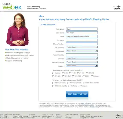
Cisco Webex Free Trial Signup Step 2 Form, Multi-variant Test Variations
Version 11
Project Description: To help explain what I was working on and the user experience which I based my decisions on, I created a quick user flow diagram showing screenshots along with short text explanations of the user journey both before and after interacting with the sign-up screens I was working on. This helped focus decisions to specific areas, optimize content to improve user experience, and identify most effective opportunities for multi-variant testing. Each of the variations were based on learnings from other Cisco Webex products, team input/feedback, plus learnings I incorporated from studying best practices in form design, lead generation, and UX marketing design.
Click for project detail view