-
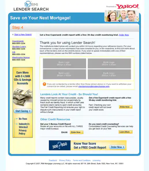
Yahoo! Lender Search “Lenders Direct” Campaign
Yahoo! Lender Search “Lenders Direct” Campaign Exit Page
Project Description: For this campaign I integrated lender logos into Flash animated ads to provide insight who the lenders are and begin to build confidence in potential customers minds before they apply for home financing. As part of this test, the logos either scrolled left to right, bottom to top, or zoomed from small to large along with style and messaging variations. The landing page look and feel borrowed from the style of the Yahoo! Travel channel and other online properties at the time to keep consistent with the Yahoo brand in general.
Click for project detail view
-
Yahoo! Lender Direct “Apply With Confidence” Banner Ads
Project Description: “Lender Direct” was one of the early names we tried as part of the partnership between Yahoo! and the lender matching service Root Markets. I intentionally designed these to look more understated, established, formal/stoic (less emotional or flashy than most banner ads) to help signal the ads were for a stable institution and not a fly-by-night mortgage loan brokerage service.
Click for project detail view

-
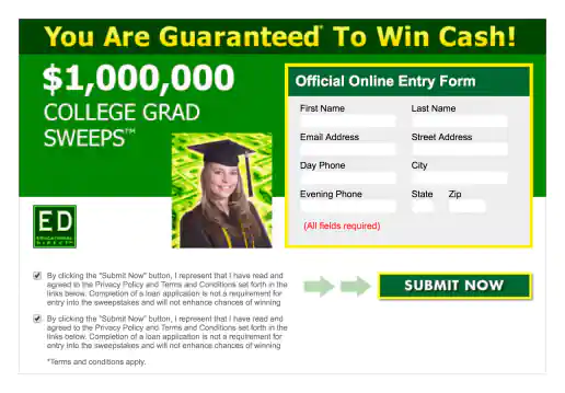
Yahoo! Form Ad Created for ED Educational Direct
Project Description:
Click for project detail view
-
WP.School Logo
Project Description:
Click for project detail view
-
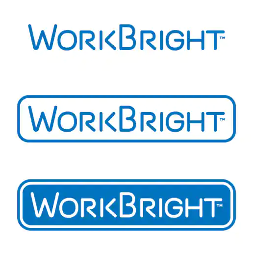
WorkBright Logo
Project Description: Logo created for a new high-powered portable work light startup that a previous client of mine was working on. Concept I came up with was to present the logo within a light or dark space, depending on need. Also the trademark ™ symbol under the T on the right starts to suggest a lamp pull switch or pull chain.
Click for project detail view
-
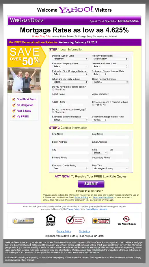
Yahoo! WebLoanDeals.com Landing Page
Wide Version 3
Project Description: A few of the initial layouts created for testing.
Click for project detail view
-
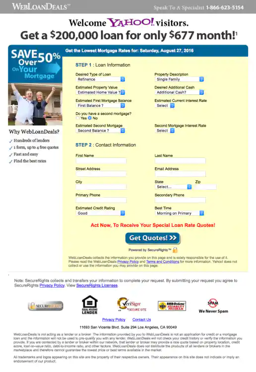
Yahoo! WebLoanDeals.com Landing Page
Wide Version 2
Project Description: A few of the initial layouts created for testing.
Click for project detail view
-
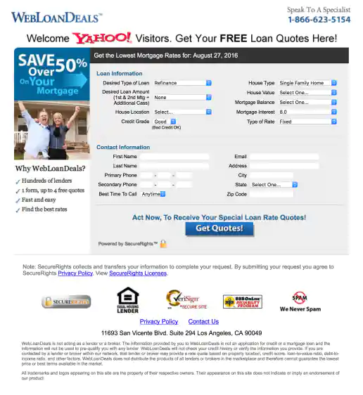
Yahoo! WebLoanDeals.com Landing Page
Wide Version 1
Project Description: A few of the initial layouts created for testing.
Click for project detail view
-
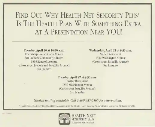
Health Net Newspaper Ads
Wide Example
Project Description: A couple examples of newspaper ads I would layout and produce for managers. Working at Health Net corporate headquarters, we produced the advertising and marketing materials used throughout the United States. Initial design templates where provided by the agency that created the overall brand directions and I maintained the style across different formats for various needs. Here's where I honed my typographic layout skills using Quark Express and became “The Quark Master”.
Click for project detail view
-
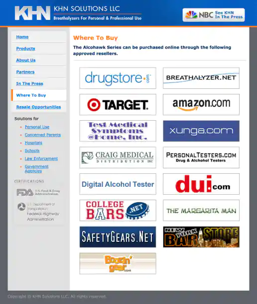
KHN Solutions Website Design
Where To Buy Page
Project Description:
Click for project detail view
-
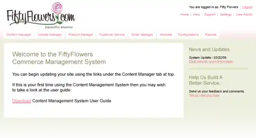
FiftyFlowers.com eCommerce Order Management System Interface Design Proposal Mockups
Welcome Page
Project Description: A few quick mockups presented as a proposal for the commerce website administration and order management area of FiftyFlowers.com. By using colors that complimented the logo and improving the over layout of elements, this CMS user interface became immediately recognizable and aesthetically more pleasant to look at (and use) than interacting with the generic geeky look and feel that the engineers had initially developed.
Click for project detail view
-
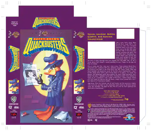
Warner Home Video Looney Tunes Daffy Duck’s Movie Quackbusters VHS Jacket
Project Description: On this project I was primarily responsible for typesetting, finalizing the layout, and creating printer-ready artwork using QuarkXPress. Some illustrations were "for position only" (FPO) and scanned in seperately by the printer. Art Director: Scott MacPhee
Click for project detail view
-
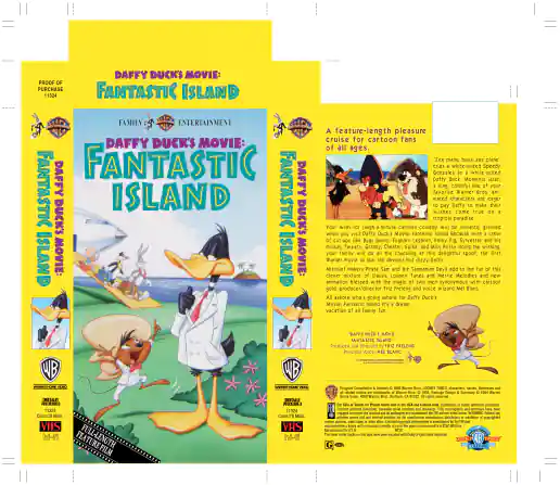
Warner Home Video Looney Tunes Daffy Duck’s Movie Fantastic Island VHS Jacket
Project Description: On this project I was primarily responsible for typesetting, finalizing the layout, and creating printer-ready artwork using QuarkXPress. Some illustrations were "for position only" (FPO) and scanned in seperately by the printer. Art Director: Scott MacPhee
Click for project detail view
-
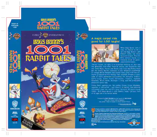
Warner Home Video Looney Tunes Bugs Bunny’s 1001 Rabbit Tales VHS Jacket
Project Description: On this project I was primarily responsible for typesetting, finalizing the layout, and creating printer-ready artwork using QuarkXPress. Some illustrations were "for position only" (FPO) and scanned in seperately by the printer. Art Director: Scott MacPhee
Click for project detail view
-
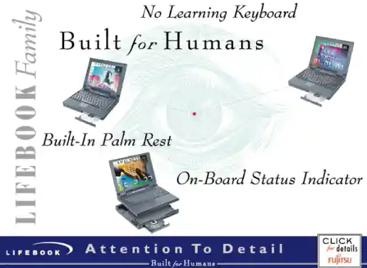
Fujitsu Lifebook In-Store Demo Presentation
Video Storyboard
Project Description: After reviewing the content outline, wireframing the flow, and designing individual screens I created a storyboard to explain the animation needed in written frame-by-frame form. Then I created a basic video slideshow storyboard to demonstrate some of the timing and effects we’re going for so the client and animator has a better understanding of what the final version should look like.
Click for project detail view
-
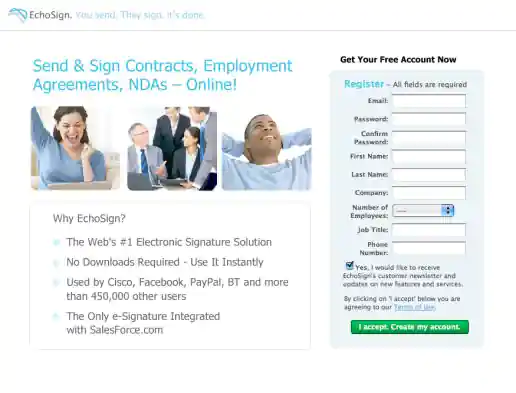
EchoSign Lead Capture Landing Pages
Version With Woman
Project Description:
Click for project detail view

-
EchoSign Lead Capture Landing Pages
Version With Happy People Photos
Project Description:
Click for project detail view
-
EchoSign Lead Capture Landing Pages
Version With Guy
Project Description:
Click for project detail view

-
FYI Living Newsletter Sign-Up Landing Page Design
Version 4
Project Description: FYI Living was looking to improve their newsletter sign-up conversion rates for different subject areas such as fitness, nutrition, depression, pregnancy and others and needed an alternate look to test. After researching similar sites I noticed many where overly marketing oriented and tended to look kinda cheesy. I developed a few directions to avoid the typical look then narrowed down to these four initial designs to gather feedback on and potential test. These try to look more clinical news oriented and reserved in nature. They intentionally don't include photos since visitors sometimes get distracted by photos (especially of people) on landing pages and study them rather than focusing on the informational content being offered. “Clarity trumps persuasion” is a tactic worth testing in my experience, even though the simpler style doesn't necessarily look as punchy as landing page designs which include big colorful photos.
Click for project detail view
-
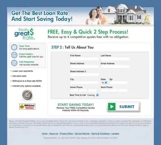
ReallyGreatRate Home Loan Landing Page
Version 3, Step 2
Project Description:
Click for project detail view
-
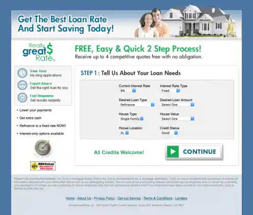
ReallyGreatRate Home Loan Landing Page
Version 3, Step 1
Project Description:
Click for project detail view
-
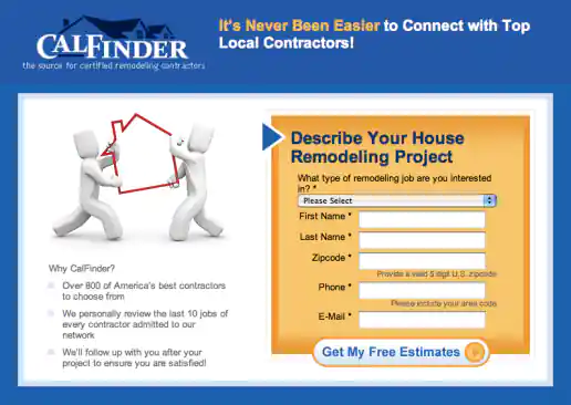
CalFinder House Remodeling “Top Local Contractors” Landing Page
Version 3
Project Description: Three alternate images presented for the client to consider testing and see which resonates more with the target audience.
Click for project detail view
-
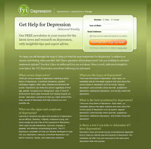
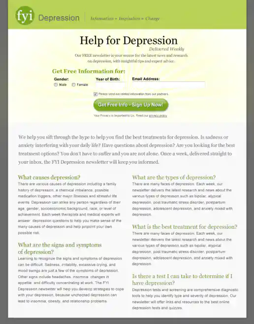
FYI Living Newsletter Sign-Up Landing Page Design
Version 3
Project Description: FYI Living was looking to improve their newsletter sign-up conversion rates for different subject areas such as fitness, nutrition, depression, pregnancy and others and needed an alternate look to test. After researching similar sites I noticed many where overly marketing oriented and tended to look kinda cheesy. I developed a few directions to avoid the typical look then narrowed down to these four initial designs to gather feedback on and potential test. These try to look more clinical news oriented and reserved in nature. They intentionally don't include photos since visitors sometimes get distracted by photos (especially of people) on landing pages and study them rather than focusing on the informational content being offered. “Clarity trumps persuasion” is a tactic worth testing in my experience, even though the simpler style doesn't necessarily look as punchy as landing page designs which include big colorful photos.
Click for project detail view
-
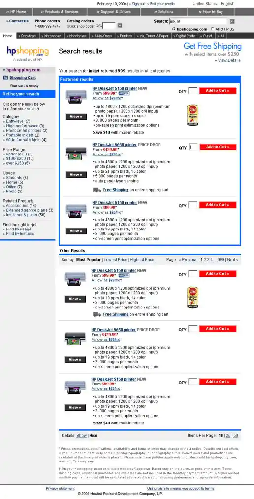
HPShopping.com Search Results Alternate Layout Mockups
Version 2: Showing Product Details
Project Description:
Click for project detail view