-
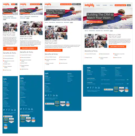
Insightly.com Responsive Website Design
Careers Page
Project Description: Initial layouts were created by another designer for the desktop screen width then handed-off for me to develop the alternate layouts for mobile devices. I coded layouts to be flexible so they worked on as many devices as possible. With only a couple exceptions, all pages were coded with four primary target sizes in mind beginning with the "mobile first" methodology. Additional media-query breakpoints were created when content areas within the layouts did not degrade gracefully when being resized. Standard sizes I would test and create media-queries for where 480x320 for iPhone landscape mode, 320x480 for iPhone portrait mode, 768x1024 for iPad portrait mode, and 1024x768 for iPad landscape mode and desktop use cases.
Click for project detail view
-
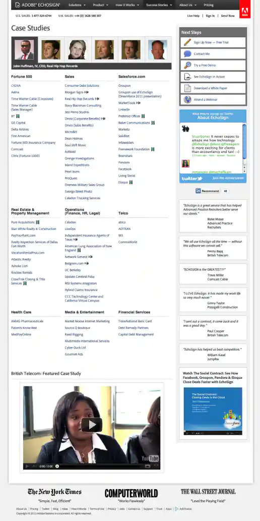
Adobe EchoSign Website Redesign Phase 2 Examples
Case Studies Page – Before and After
Project Description:
Click for project detail view
-
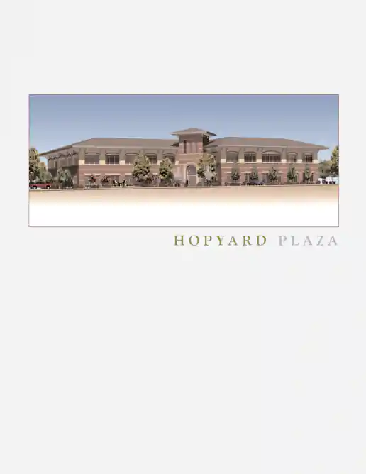
Chamberlin Associates Hopyard Plaza Office Space Real Estate Brochure
Project Description:
Click for project detail view
-
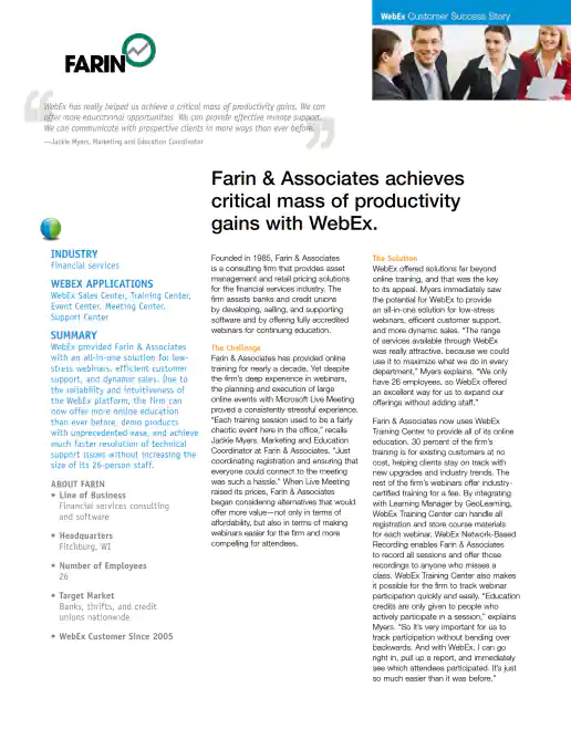
Cisco WebEx Customer Success Story Case Study Example
Project Description: InDesign template was originally created by another designer. Occasionally I created new versions when needed by replacing text, images, and links while working with the product manager (such as to request a better customer logo sometimes), the copywriter, and then gathered feedback/sign-offs from the art director before creating the final interactive PDF for distribution.
Click for project detail view
-
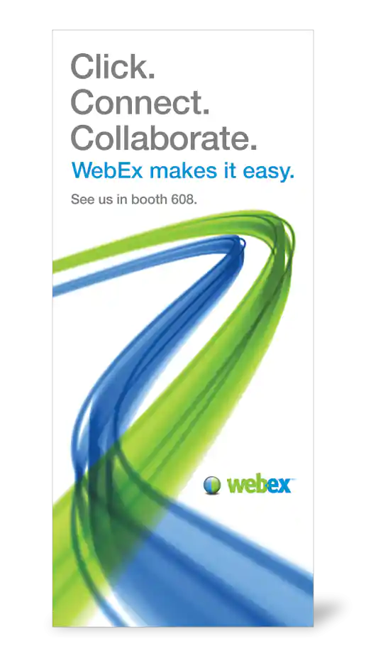
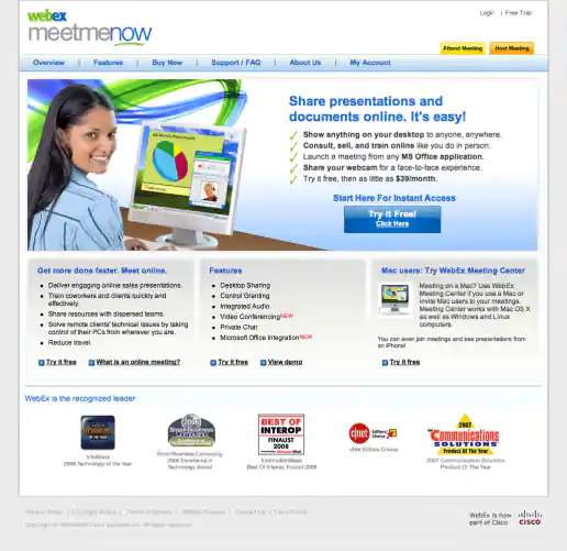
Cisco WebEx Floor Display Banner for Conference Event
Project Description: Design created in-house based on brand guidelines.
Click for project detail view
-
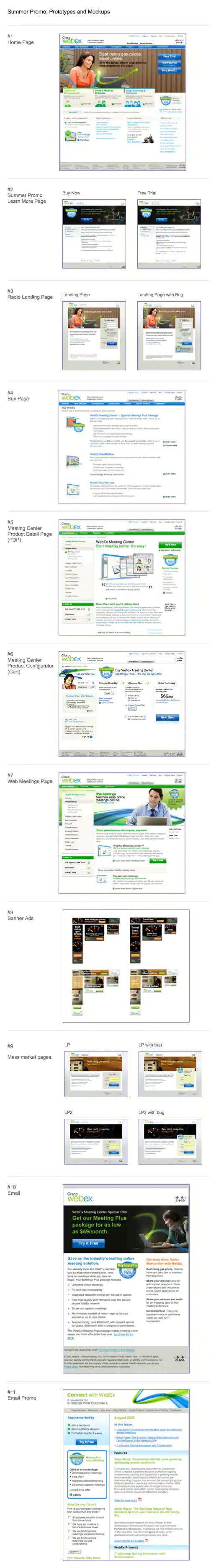
Cisco WebEx Meetings Plus Summer Campaign Prototypes and Mockups Presentation
Project Description: Shows placement of “Meetings Plus $59 Special Package” promo graphic on the homepage, product pages, emails and associated landing pages, emails, and banner ads used to generate new subscribers. This presentation format worked well for capturing feedback in meetings when printed in landscape format since just one section printed per page and left room on the side to write notes about any changes discussed.
Click for project detail view
-
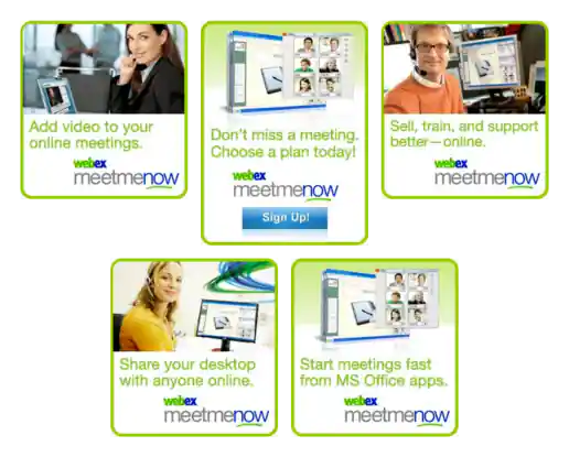
Cisco WebEx MeetMeNow Banner Ads
Project Description: A few of the various banners I created based on the brand guidelines for use on the company website.
Click for project detail view
-
Cisco WebEx MeetMeNow Co-branded Product Page Design
Project Description:
Click for project detail view
-
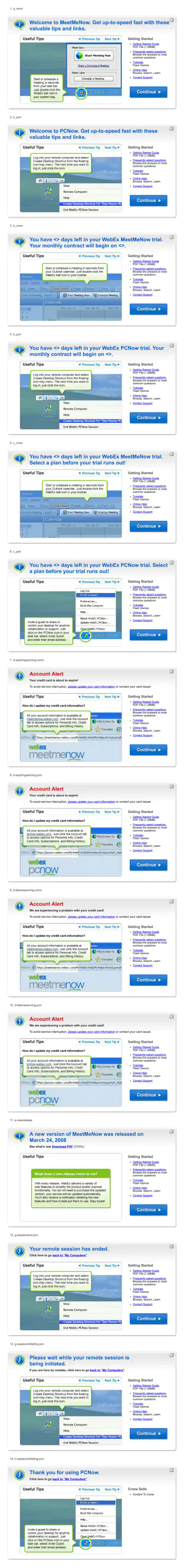
Cisco WebEx Modal Dialogs with “Useful Tips” Tutorials
Project Description: These dialogs would appear in MeetMeNow and PCNow web based application portals to assist and educate users. The modals would appear during events such as during the new user on-boarding process, when a new session is initiating, when the free trial is about to expire, when the credit card is about to expire, when there's a browser plugin update available, and after a session has ended. I created the look of the dialogs based on the visual gradient of some other areas in the products then created and stylized the icons indicating info, alert, and timely message topics. The “Useful Tips” area presented a Flash based slideshow I created by assembling screenshots from the products and adding text explanations in the overlayed green speech bubbles which animated in along with indicators pointing to the different subject areas of the users screen, such as where users can create a desktop shortcut.
Click for project detail view
-
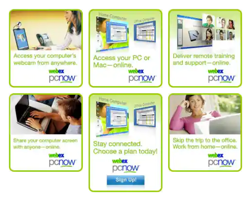
Cisco WebEx PCNow Banner Ads
Project Description: A few of the various banners I created based on the brand guidelines for use on the company website.
Click for project detail view
-
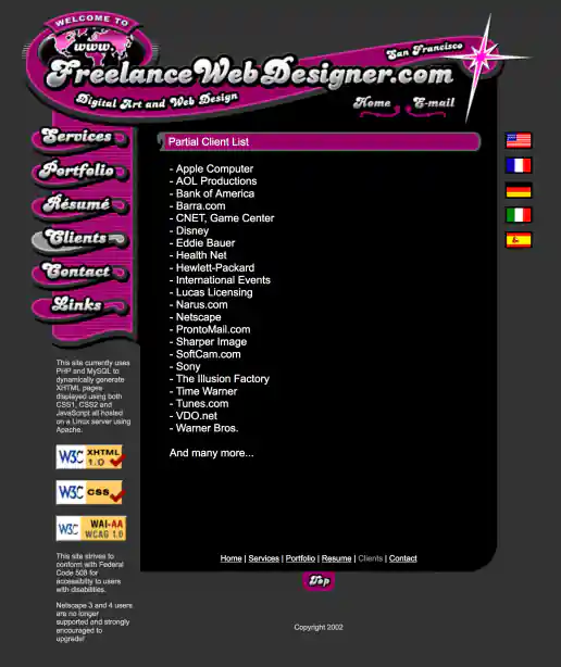
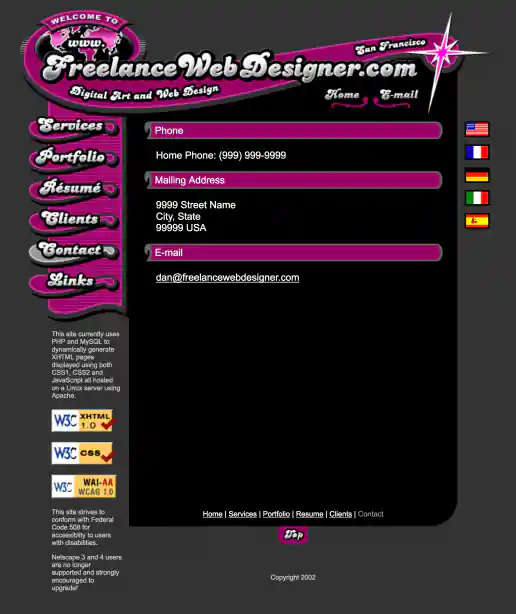
FreelanceWebDesigner.com Website Design
Clients Page
Project Description: My old site promoting freelance services. The initial idea was to create a look that was inviting and fun to interact with but also futuristic and indicated a technical savviness, perhaps like an interface you'd see in a the Jetsons TV cartoon. This is the result of that direction which combines French curve shapes (a traditional design element) with an electric spark (signifying the electronic age or futuristic direction) to give the design element some life and make ot ‘pop’.
Click for project detail view
-
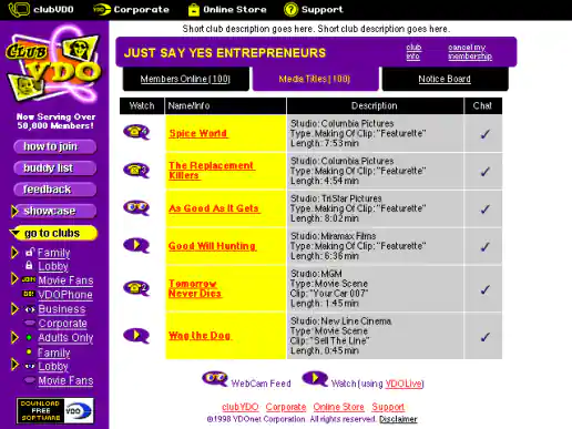
ClubVDO Website Redesign
Club Page
Project Description:
Click for project detail view
-
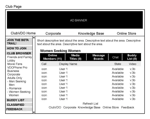
ClubVDO Website Wireframes
Club Page
Project Description:
Click for project detail view
-
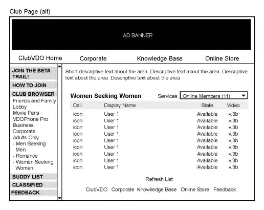
ClubVDO Website Wireframes
Club Page Alternate
Project Description:
Click for project detail view
-
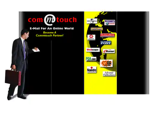
Commtouch Conference Booth Graphics
Project Description:
Click for project detail view
-
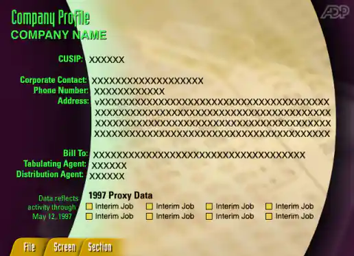
ADP Shareholder Communication Trends Demo
Company Profile Screen
Project Description: This app demonstrated the kinds of insights ADP could provide based on their data at a conference. The project was managed through a small agency named Printz in San Francisco and developed in Java. Creating the x, y coordinates for each line of text took some time but helped the developer get things in the right place without having to just eye the positions.
Click for project detail view
-
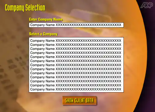
ADP Shareholder Communication Trends Demo
Company Selection Screen
Project Description: This app demonstrated the kinds of insights ADP could provide based on their data at a conference. The project was managed through a small agency named Printz in San Francisco and developed in Java. Creating the x, y coordinates for each line of text took some time but helped the developer get things in the right place without having to just eye the positions.
Click for project detail view
-
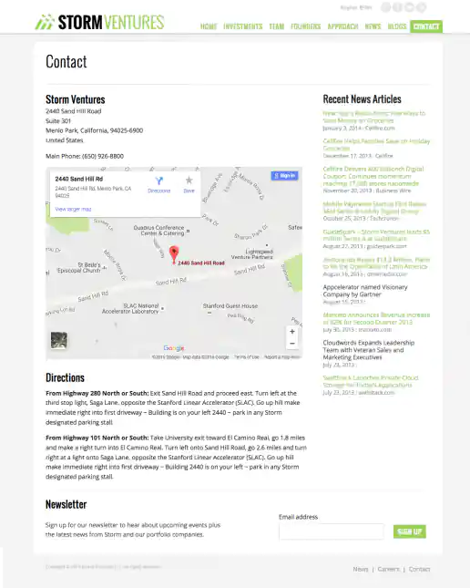
StormVentures.com Website Redesign
Contact Information Page
Project Description:
Click for project detail view
-
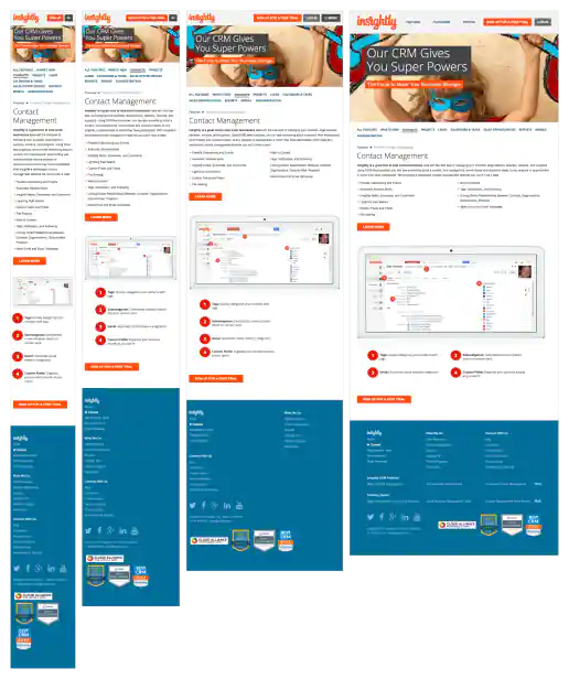
Insightly.com Responsive Website Design
Contact Management Page
Project Description: Initial layouts were created by another designer for the desktop screen width then handed-off for me to develop the alternate layouts for mobile devices. I coded layouts to be flexible so they worked on as many devices as possible. With only a couple exceptions, all pages were coded with four primary target sizes in mind beginning with the "mobile first" methodology. Additional media-query breakpoints were created when content areas within the layouts did not degrade gracefully when being resized. Standard sizes I would test and create media-queries for where 480x320 for iPhone landscape mode, 320x480 for iPhone portrait mode, 768x1024 for iPad portrait mode, and 1024x768 for iPad landscape mode and desktop use cases.
Click for project detail view
-
FreelanceWebDesigner.com Website Design
Contact Page
Project Description: My old site promoting freelance services. The initial idea was to create a look that was inviting and fun to interact with but also futuristic and indicated a technical savviness, perhaps like an interface you'd see in a the Jetsons TV cartoon. This is the result of that direction which combines French curve shapes (a traditional design element) with an electric spark (signifying the electronic age or futuristic direction) to give the design element some life and make ot ‘pop’.
Click for project detail view
-
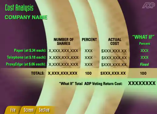
ADP Shareholder Communication Trends Demo
Cost Analysis Screen
Project Description: This app demonstrated the kinds of insights ADP could provide based on their data at a conference. The project was managed through a small agency named Printz in San Francisco and developed in Java. Creating the x, y coordinates for each line of text took some time but helped the developer get things in the right place without having to just eye the positions.
Click for project detail view
-
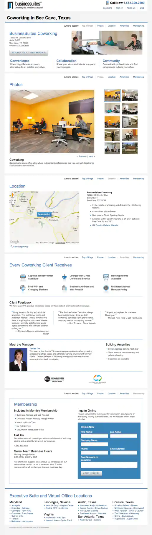
BusinesSuites Website Redesign
Coworking Page - Example 1
Project Description:
Click for project detail view
-
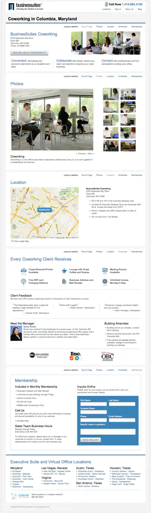
BusinesSuites Website Redesign
Coworking Page - Example 2
Project Description:
Click for project detail view
-
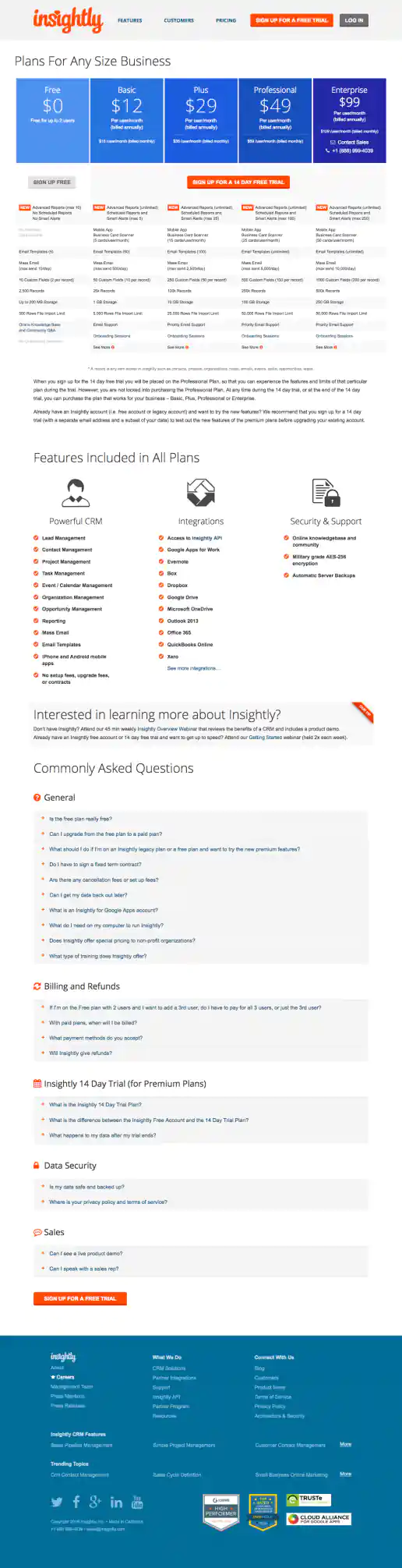
Insightly.com Pricing Page Test Variations
CTA Buttons Moved Above Features Chart And Directly Below Pricing
Project Description: Presented here are several iterations of the Pricing page I coded or co-designed/developed and maintained 3013 through 1016 while working with the Insightly marketing team, internal designers, and external vendors. Variations were tested using Optimizely and services such as Experiment Engine for A/B testing and conversion optimization along with KissMetrics and Google Analytics for click path tracking. Occasionally I contributed to the visual design while staying true to the look and feel of the Insightly brand. Additionally I occasionally contributed test suggestions based on best practices research, reviewing reported successes on other sites and competitive analysis. Several other versions were created as well, such as using different visual treatments for the title area and plan blurbs. etcetera.
Click for project detail view