Portfolio / Industries / Technology
-
ClubVDO Website Redesign
Logo Design
Project Description:
Click for project detail view

-
Luminositi Logo
Project Description:
Click for project detail view

-
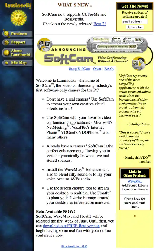
Luminositi SoftCam “The First Virtual Camera for the PC!” Banner Ad
Project Description: Is it weird that I show old design examples? Some of it I actually still kinda like, such as this banner direction.
Click for project detail view

-
Luminositi Website Design
Project Description:
Click for project detail view
-
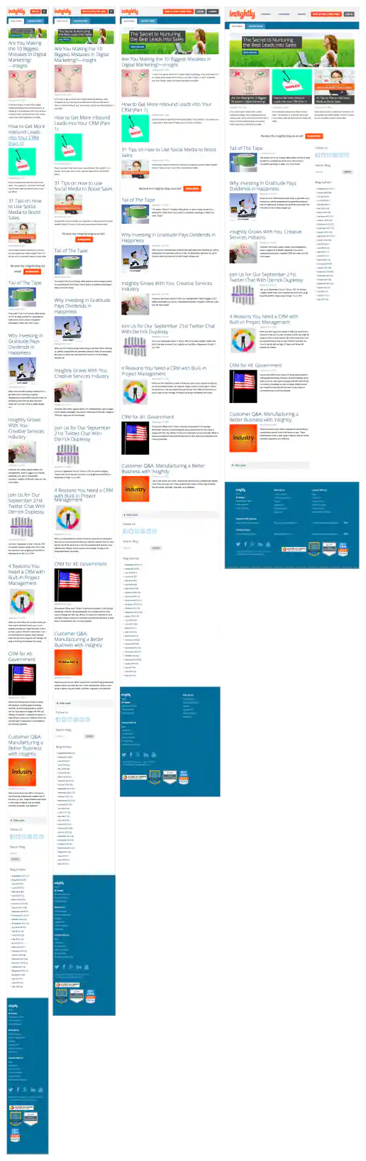
Insightly.com Responsive Website Design
Main Blog Page
Project Description: Initial layouts were created by another designer for the desktop screen width then handed-off for me to develop the alternate layouts for mobile devices. I coded layouts to be flexible so they worked on as many devices as possible. With only a couple exceptions, all pages were coded with four primary target sizes in mind beginning with the "mobile first" methodology. Additional media-query breakpoints were created when content areas within the layouts did not degrade gracefully when being resized. Standard sizes I would test and create media-queries for where 480x320 for iPhone landscape mode, 320x480 for iPhone portrait mode, 768x1024 for iPad portrait mode, and 1024x768 for iPad landscape mode and desktop use cases.
Click for project detail view
-
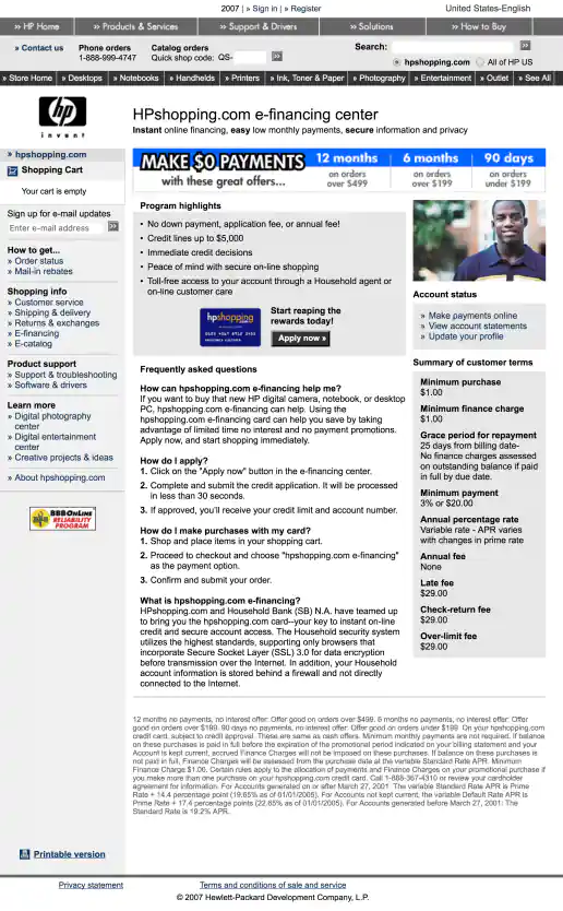
HPShopping.com e-Financing Center 2 Offers
Make $0 Payments Up To 12 Months
Project Description:
Click for project detail view
-
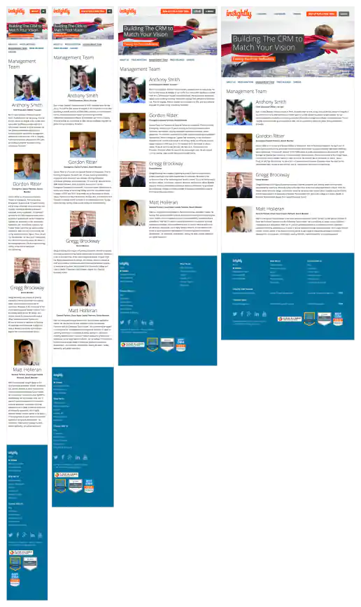
Insightly.com Responsive Website Design
Management Team Page
Project Description: Initial layouts were created by another designer for the desktop screen width then handed-off for me to develop the alternate layouts for mobile devices. I coded layouts to be flexible so they worked on as many devices as possible. With only a couple exceptions, all pages were coded with four primary target sizes in mind beginning with the "mobile first" methodology. Additional media-query breakpoints were created when content areas within the layouts did not degrade gracefully when being resized. Standard sizes I would test and create media-queries for where 480x320 for iPhone landscape mode, 320x480 for iPhone portrait mode, 768x1024 for iPad portrait mode, and 1024x768 for iPad landscape mode and desktop use cases.
Click for project detail view
-
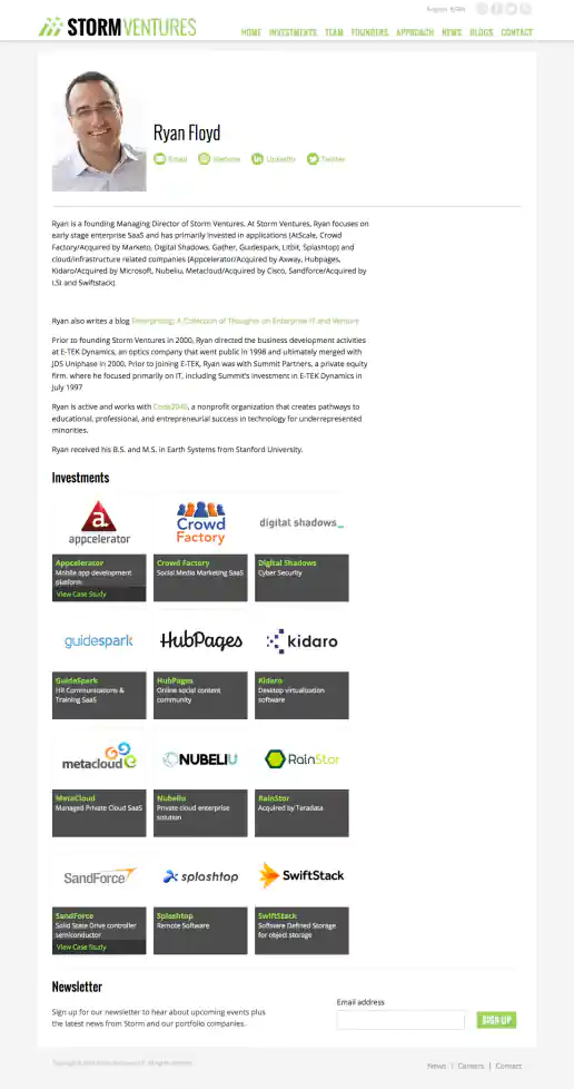
StormVentures.com Website Redesign
Managing Director Investor Profile
Project Description:
Click for project detail view
-
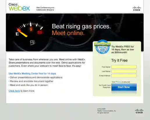
Cisco WebEx Meetings Plus Summer Campaign
Mass Market Landing Page
Project Description:
Click for project detail view
-
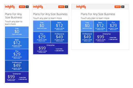
Insightly.com Responsive Website Design
Mobile Only Pricing Page
Project Description: Initial layouts were created by another designer for the desktop screen width then handed-off for me to develop the alternate layouts for mobile devices. I coded layouts to be flexible so they worked on as many devices as possible. With only a couple exceptions, all pages were coded with four primary target sizes in mind beginning with the "mobile first" methodology. Additional media-query breakpoints were created when content areas within the layouts did not degrade gracefully when being resized. Standard sizes I would test and create media-queries for where 480x320 for iPhone landscape mode, 320x480 for iPhone portrait mode, 768x1024 for iPad portrait mode, and 1024x768 for iPad landscape mode and desktop use cases.
Click for project detail view
-
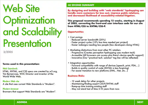
HPShopping.com Website Optimization and Scalability Presentation
Modern Web Design / CSS Pitch
Project Description: Around 2005 as web standards emerged and CSS was becoming the standard for creating and styling web page layouts, I championed the cause within HP in my department. Designers who started in print design were already familiar with using stylesheets and aware of their benefits from using programs such as Quark Express and Adobe PageMaker (similar to Adobe InDesign) when creating brochures, newsletters, catalogs, and magazines, or other types of publication designs. Business stakeholders, managers, and developers were generally less familiar with the concept of stylesheets though and this presentation aimed at informing and educating on the benefits of switching from HTML table based layouts to using CSS (or CSS-P) for positioning elements on web pages. It highlights specific benefits to the user experience (UX) (or customer experience (CX) in this case), benefits to how the brand would be perceived, plus how designers and developers workflow could be organized and optimized to reduce time spent on projects.
Click for project detail view
-
Mood Boards
Project Description: These where created after doing an informational interview gathering initial thoughts on potential needs that would appeal to both the client and their audience. Created as part of the Web Contracts 2012 conference project I keep old mood boards around just in case I ever need them again on another project.
Click for project detail view
-
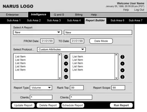
Narus Intelligence Product UX Wireframes
Project Description:
Click for project detail view
-
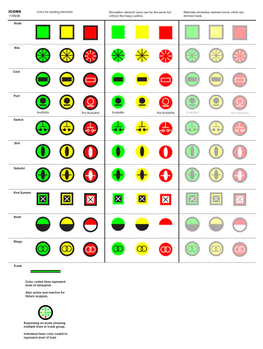
Narus Network Monitoring Icon Organization
Project Description:
Click for project detail view
-
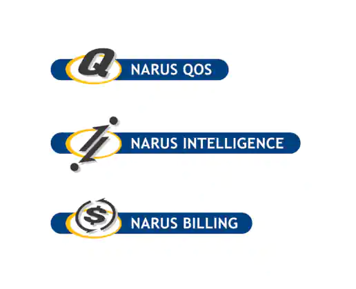
Narus Product Logo Buttons
Project Description:
Click for project detail view
-
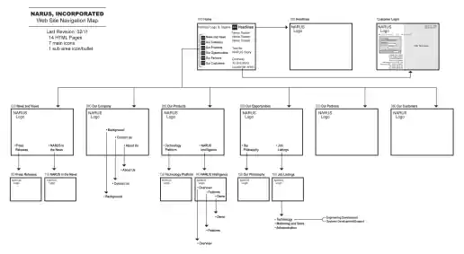
Narus.com Corporate Website Navigation Map
Project Description:
Click for project detail view
-
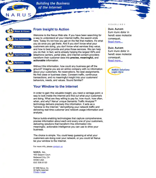
Narus.com Website Design
Project Description:
Click for project detail view
-
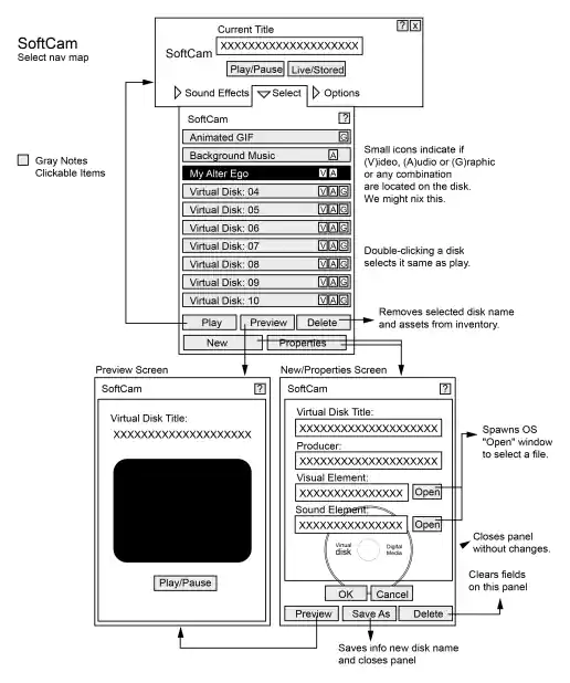
SoftCam Interface Design
Navigation Map
Project Description:
Click for project detail view
-
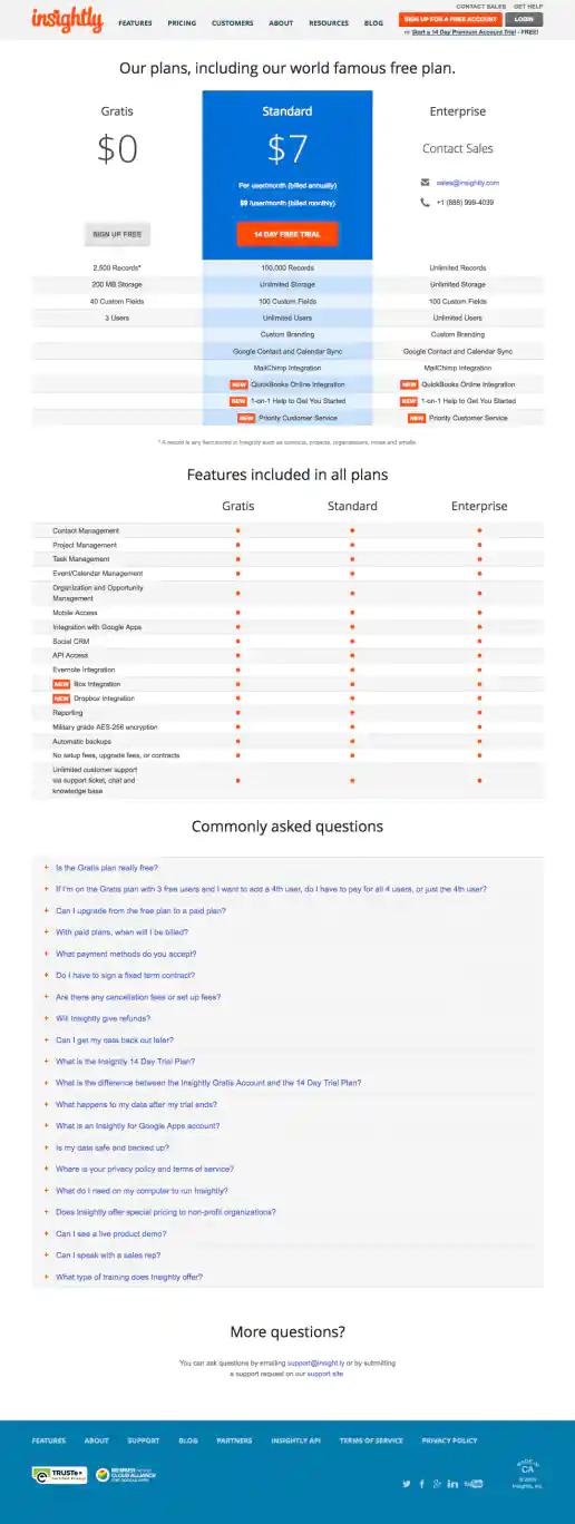
Insightly.com Pricing Page Test Variations
New Features Highlighted and Header Updated
Project Description: Presented here are several iterations of the Pricing page I coded or co-designed/developed and maintained 3013 through 1016 while working with the Insightly marketing team, internal designers, and external vendors. Variations were tested using Optimizely and services such as Experiment Engine for A/B testing and conversion optimization along with KissMetrics and Google Analytics for click path tracking. Occasionally I contributed to the visual design while staying true to the look and feel of the Insightly brand. Additionally I occasionally contributed test suggestions based on best practices research, reviewing reported successes on other sites and competitive analysis. Several other versions were created as well, such as using different visual treatments for the title area and plan blurbs. etcetera.
Click for project detail view
-
MyOfferPal: WebRoot, Spy Sweeper Campaign
New Prospect HTML Email
Project Description:
Click for project detail view

-
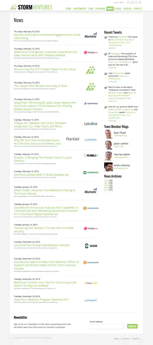
StormVentures.com Website Redesign
News Page
Project Description:
Click for project detail view
-
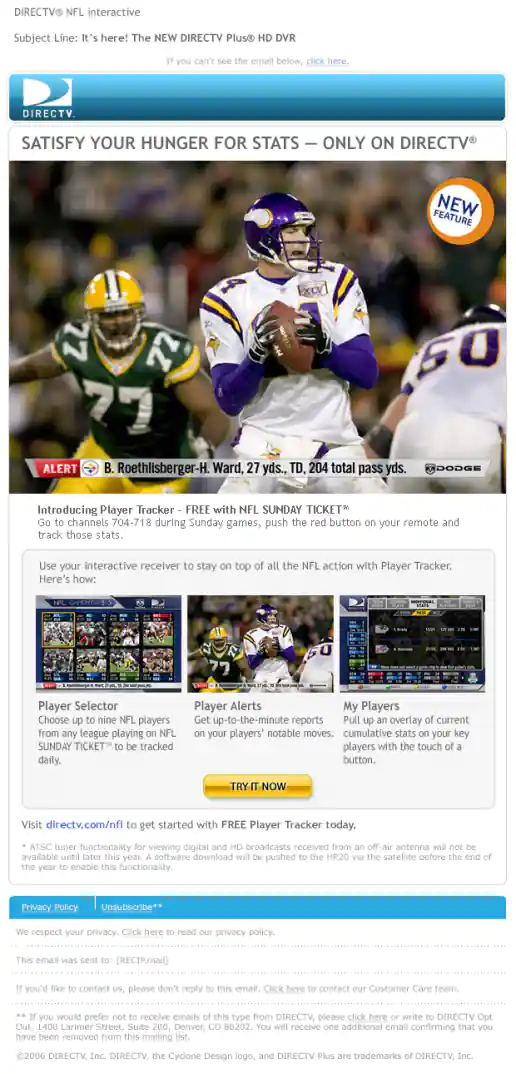
DIRECTV Email Campaigns
NFL Sunday Ticket Interactive Box Email
Project Description:
Click for project detail view
-
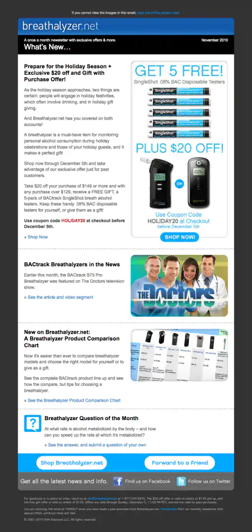
Breathalyzer.net Email Newsletter Template Design
November Issue
Project Description:
Click for project detail view
-
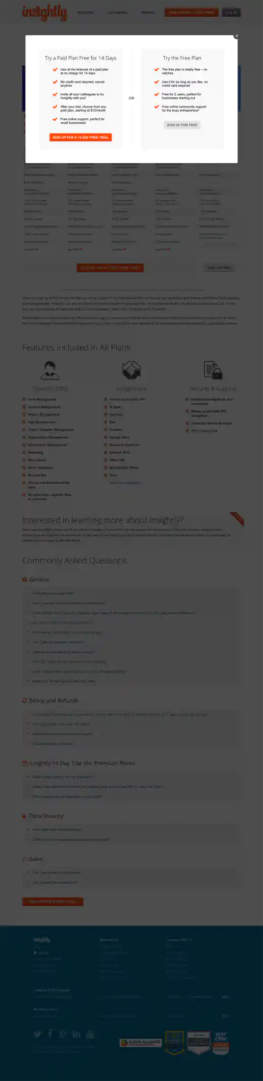
Insightly.com Pricing Page Test Variations
Overlay Used To Emphasize Difference Between The Two Signup Paths
Project Description: Presented here are several iterations of the Pricing page I coded or co-designed/developed and maintained 3013 through 1016 while working with the Insightly marketing team, internal designers, and external vendors. Variations were tested using Optimizely and services such as Experiment Engine for A/B testing and conversion optimization along with KissMetrics and Google Analytics for click path tracking. Occasionally I contributed to the visual design while staying true to the look and feel of the Insightly brand. Additionally I occasionally contributed test suggestions based on best practices research, reviewing reported successes on other sites and competitive analysis. Several other versions were created as well, such as using different visual treatments for the title area and plan blurbs. etcetera.
Click for project detail view