Portfolio / Industries / Technology
-
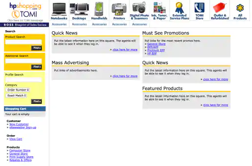
HPShopping.com Telephone Order Management Interface (TOMI) Call Center Interface
Project Description: Created as part of HPShopping’s Customer Contact Management Tool, TOMI was used by telephone operators when customers called in to place or change orders. The portal provided a central area where associates can find current promotions, see featured products to promote, along with managing customer order information. This was a quick design refresh to make the interface friendlier and more usable. Because of budget and time restraints, some screens, such as the New Customer form, were not fully designed but were at least coded with semantic HTML elements. You should have seen what at looked like back in 2004 before this refresh.
Click for project detail view
-
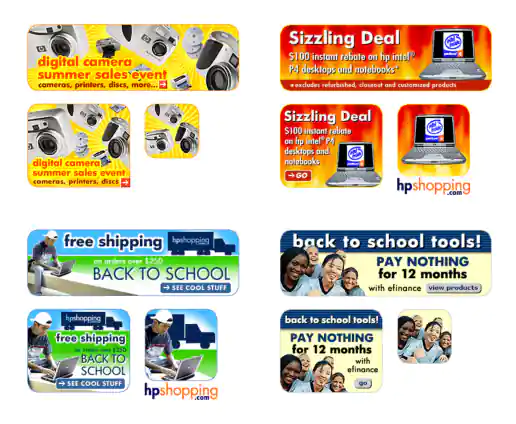
HPShopping.com Static Banner Ads – 18 Examples
Project Description: Examples of promotional banners shown throughout the year on HPshopping.com.
Click for project detail view

-
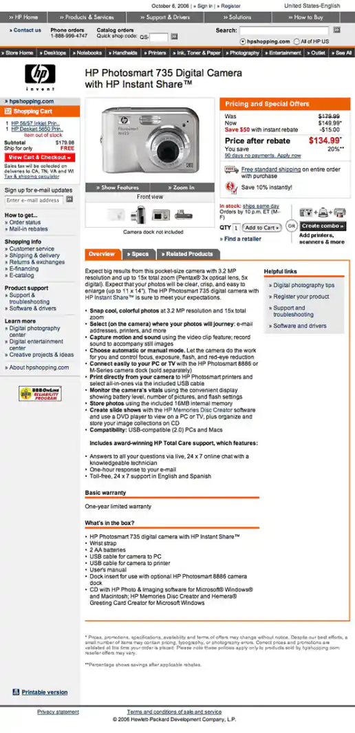
HPShopping.com Product Detail Page Design
Project Description:
Click for project detail view
-
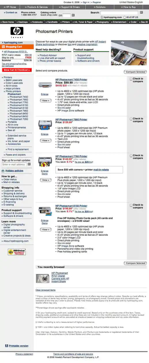
HPShopping.com Printer Series Detail Page Design
Project Description:
Click for project detail view
-
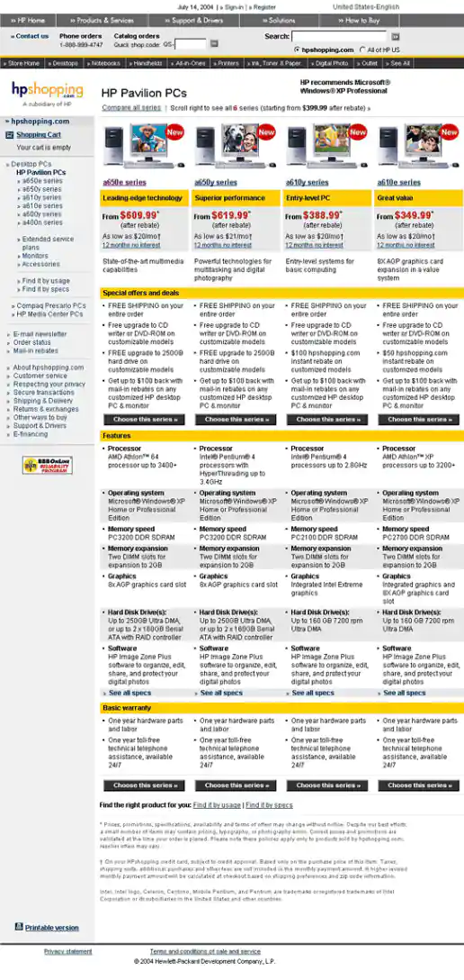
HPShopping.com PC Series Matrix Page Design
Project Description:
Click for project detail view
-
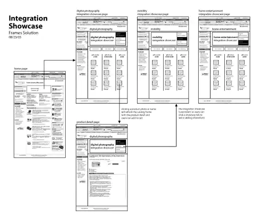
HPShopping.com Integration Showcase Solution Wireframes
Project Description: Remember html iframes and popup browser windows? These wireframes presented each as an option for the Digital Photography, Mobility, and Home Entertainment product showcases back in 2003. We didn't want to just link to showcase pages for some reason but we did want to keep the standard c-frame persistent.
Click for project detail view
-
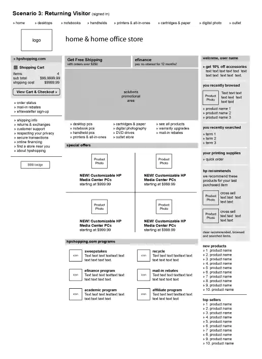
HPShopping.com Homepage Visitor Scenario Wireframes
Project Description: Wireframes showing content scenarios that would be presented depending if a visitor was new, returning, and signed-in to the ecommerce website. Each scenario wireframe indicates content that we wanted to present along with general layout where the content would appear. This helped engineers understand what database and code development updates would be needed. Eventually scenarios were also created for customers who had previously purchased from the site and recommended products based on their previous purchases along with other user types.
Click for project detail view
-
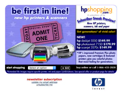
HPShopping.com Email Postcard “Be First In Line”
Project Description:
Click for project detail view
-
HPShopping.com Banner Ad Creative Sets – 4 Themes
Project Description:
Click for project detail view
-
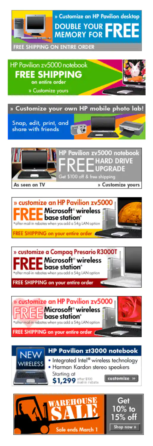
HPShopping.com Animated Gif Banner Ads – 8 Examples
Project Description: Examples of animated promotional banners shown throughout the year on HPshopping.com.
Click for project detail view
-
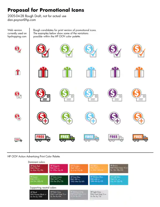
HP Promotional Icons Proposal
Project Description: A brief proposal created for expanding a brands visual language across interactive and print mediums by leveraging existing assets and making them available in more formats. By using a consistent look customers can more quickly identify promotions across mediums. Using different icon systems for web and print creates a more fragmented, disorganized user experience.
Click for project detail view
-
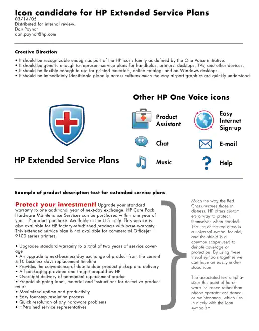
HP Extended Service Plans (ESP) Icon Candidate Proposal
Project Description:
Click for project detail view
-
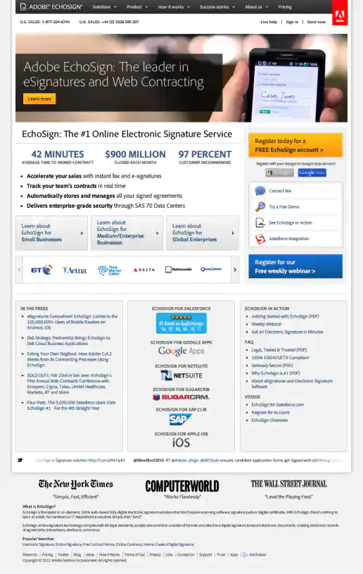
Adobe EchoSign Website Redesign Phase 2 Examples
Homepage – Before and After
Project Description:
Click for project detail view
-
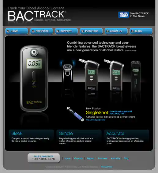
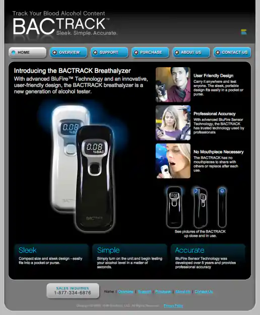
BACtrack Breathalyzers Website Redesign
Homepage – 2010
Project Description:
Click for project detail view
-
HPShopping.com Fall Theme
Homepage Promotions
Project Description:
Click for project detail view
-
HPShopping.com Fathers Day Campaign
Homepage Promotions
Project Description:
Click for project detail view
-
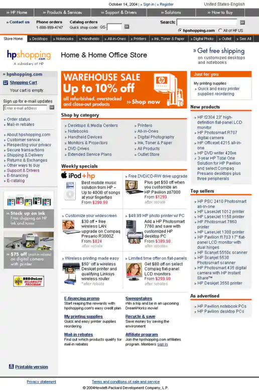
HPShopping.com Warehouse Sale Campaign
Homepage Promotion
Project Description:
Click for project detail view
-
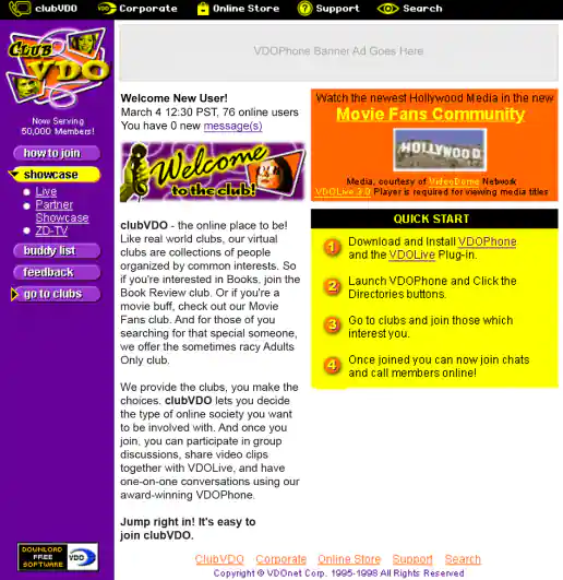
ClubVDO Website Redesign
Homepage New User Experience
Project Description:
Click for project detail view
-
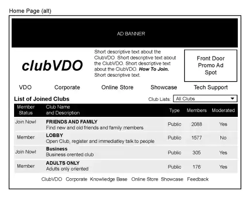
ClubVDO Website Wireframes
Homepage Alternate
Project Description:
Click for project detail view
-
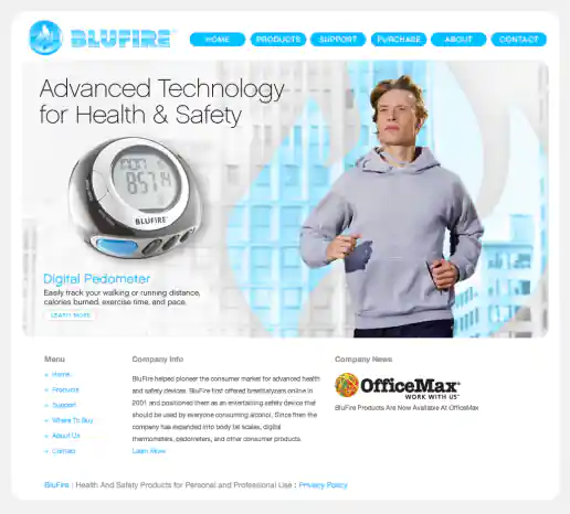
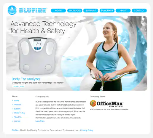
BluFire Website Design
Homepage - Animation Frame 3
Project Description: Ecommerce website created after logo and packaging treatments where designed. I decided to use rounded shapes so the site feels more friendly than technical and I used flat shapes with no shading or shadows to create a clean, flat, uncomplicated look.
Click for project detail view
-
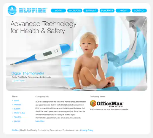
BluFire Website Design
Homepage - Animation Frame 2
Project Description: Ecommerce website created after logo and packaging treatments where designed. I decided to use rounded shapes so the site feels more friendly than technical and I used flat shapes with no shading or shadows to create a clean, flat, uncomplicated look.
Click for project detail view
-
BluFire Website Design
Homepage - Animation Frame 1
Project Description: Ecommerce website created after logo and packaging treatments where designed. I decided to use rounded shapes so the site feels more friendly than technical and I used flat shapes with no shading or shadows to create a clean, flat, uncomplicated look.
Click for project detail view
-
BACtrack Breathalyzers Website Redesign
Homepage - 2006
Project Description:
Click for project detail view
-
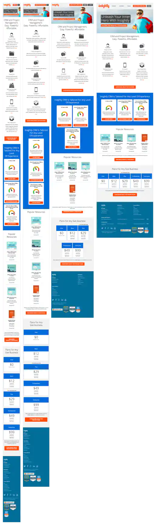
Insightly.com Responsive Website Design
Homepage
Project Description: Initial layouts were created by another designer for the desktop screen width then handed-off for me to develop the alternate layouts for mobile devices. I coded layouts to be flexible so they worked on as many devices as possible. With only a couple exceptions, all pages were coded with four primary target sizes in mind beginning with the "mobile first" methodology. Additional media-query breakpoints were created when content areas within the layouts did not degrade gracefully when being resized. Standard sizes I would test and create media-queries for where 480x320 for iPhone landscape mode, 320x480 for iPhone portrait mode, 768x1024 for iPad portrait mode, and 1024x768 for iPad landscape mode and desktop use cases.
Click for project detail view