Portfolio / Industries / Lead Generation
-
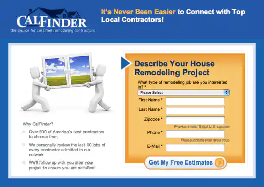
CalFinder House Remodeling “Top Local Contractors” Landing Page
Version 2
Project Description: Three alternate images presented for the client to consider testing and see which resonates more with the target audience.
Click for project detail view
-
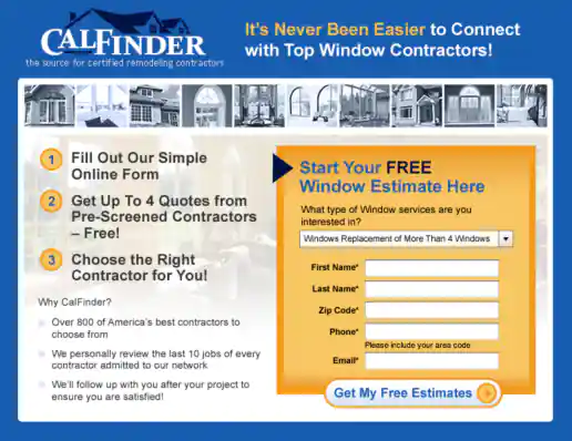
CalFinder One-Step Signup Landing Page Design
Version 2
Project Description:
Click for project detail view
-
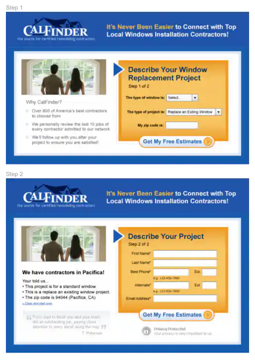
CalFinder Two-Step Signup Landing Page Design
Version 2
Project Description:
Click for project detail view
-
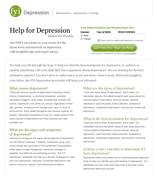
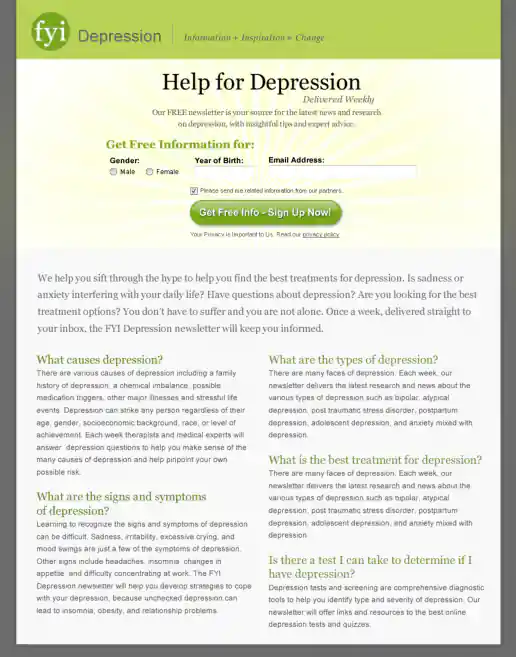
FYI Living Newsletter Sign-Up Landing Page Design
Version 2
Project Description: FYI Living was looking to improve their newsletter sign-up conversion rates for different subject areas such as fitness, nutrition, depression, pregnancy and others and needed an alternate look to test. After researching similar sites I noticed many where overly marketing oriented and tended to look kinda cheesy. I developed a few directions to avoid the typical look then narrowed down to these four initial designs to gather feedback on and potential test. These try to look more clinical news oriented and reserved in nature. They intentionally don't include photos since visitors sometimes get distracted by photos (especially of people) on landing pages and study them rather than focusing on the informational content being offered. “Clarity trumps persuasion” is a tactic worth testing in my experience, even though the simpler style doesn't necessarily look as punchy as landing page designs which include big colorful photos.
Click for project detail view
-
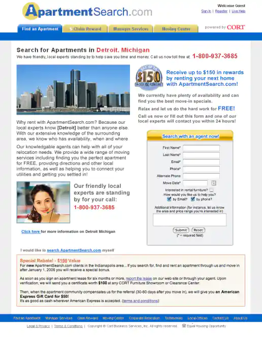
ApartmentSearch.com Region Based A/B Landing Page Test Variations
Version 2
Project Description:
Click for project detail view
-
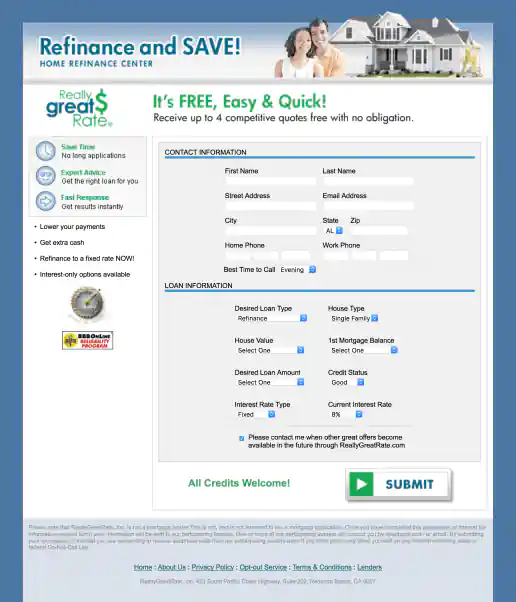
ReallyGreatRate Home Loan Landing Page
Version 2
Project Description:
Click for project detail view
-
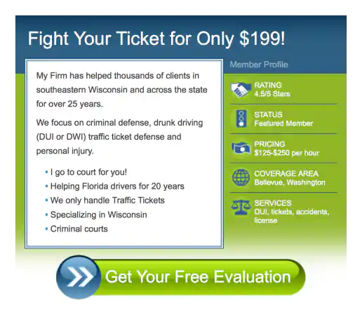
TixNix Free Attorney Consultation Promo for Ning
Version 2
Project Description:
Click for project detail view
-
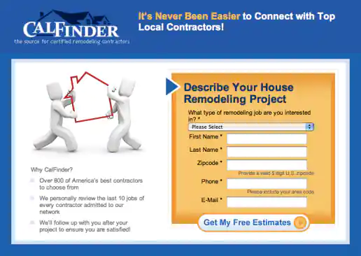
CalFinder House Remodeling “Top Local Contractors” Landing Page
Version 3
Project Description: Three alternate images presented for the client to consider testing and see which resonates more with the target audience.
Click for project detail view
-
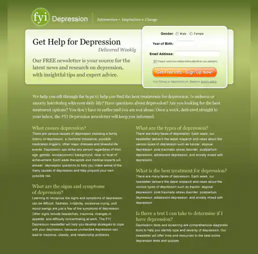
FYI Living Newsletter Sign-Up Landing Page Design
Version 3
Project Description: FYI Living was looking to improve their newsletter sign-up conversion rates for different subject areas such as fitness, nutrition, depression, pregnancy and others and needed an alternate look to test. After researching similar sites I noticed many where overly marketing oriented and tended to look kinda cheesy. I developed a few directions to avoid the typical look then narrowed down to these four initial designs to gather feedback on and potential test. These try to look more clinical news oriented and reserved in nature. They intentionally don't include photos since visitors sometimes get distracted by photos (especially of people) on landing pages and study them rather than focusing on the informational content being offered. “Clarity trumps persuasion” is a tactic worth testing in my experience, even though the simpler style doesn't necessarily look as punchy as landing page designs which include big colorful photos.
Click for project detail view
-
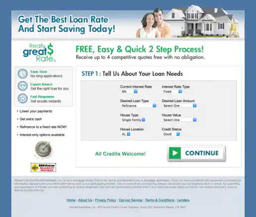
ReallyGreatRate Home Loan Landing Page
Version 3, Step 1
Project Description:
Click for project detail view
-
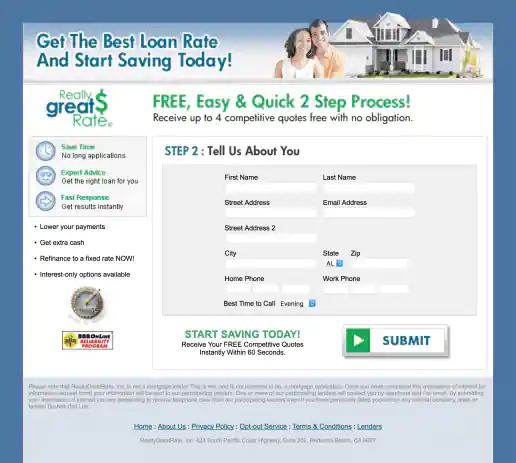
ReallyGreatRate Home Loan Landing Page
Version 3, Step 2
Project Description:
Click for project detail view
-
FYI Living Newsletter Sign-Up Landing Page Design
Version 4
Project Description: FYI Living was looking to improve their newsletter sign-up conversion rates for different subject areas such as fitness, nutrition, depression, pregnancy and others and needed an alternate look to test. After researching similar sites I noticed many where overly marketing oriented and tended to look kinda cheesy. I developed a few directions to avoid the typical look then narrowed down to these four initial designs to gather feedback on and potential test. These try to look more clinical news oriented and reserved in nature. They intentionally don't include photos since visitors sometimes get distracted by photos (especially of people) on landing pages and study them rather than focusing on the informational content being offered. “Clarity trumps persuasion” is a tactic worth testing in my experience, even though the simpler style doesn't necessarily look as punchy as landing page designs which include big colorful photos.
Click for project detail view
-
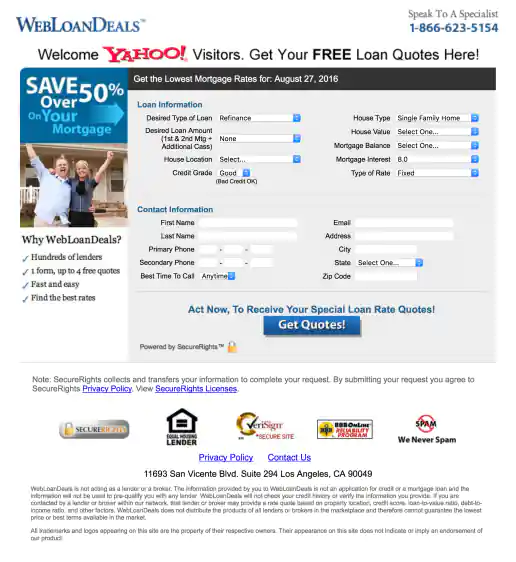
Yahoo! WebLoanDeals.com Landing Page
Wide Version 1
Project Description: A few of the initial layouts created for testing.
Click for project detail view
-
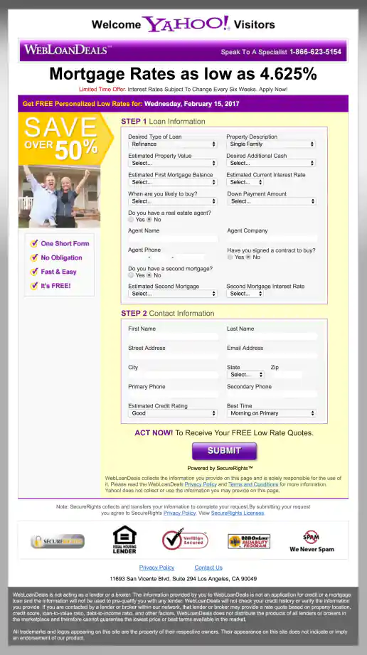
Yahoo! WebLoanDeals.com Landing Page
Wide Version 2
Project Description: A few of the initial layouts created for testing.
Click for project detail view

-
Yahoo! WebLoanDeals.com Landing Page
Wide Version 3
Project Description: A few of the initial layouts created for testing.
Click for project detail view
-
DMconfidential.com Newsletter Subscriber Signup
Wireframes for 6 Initial Directions
Project Description:
Click for project detail view
-
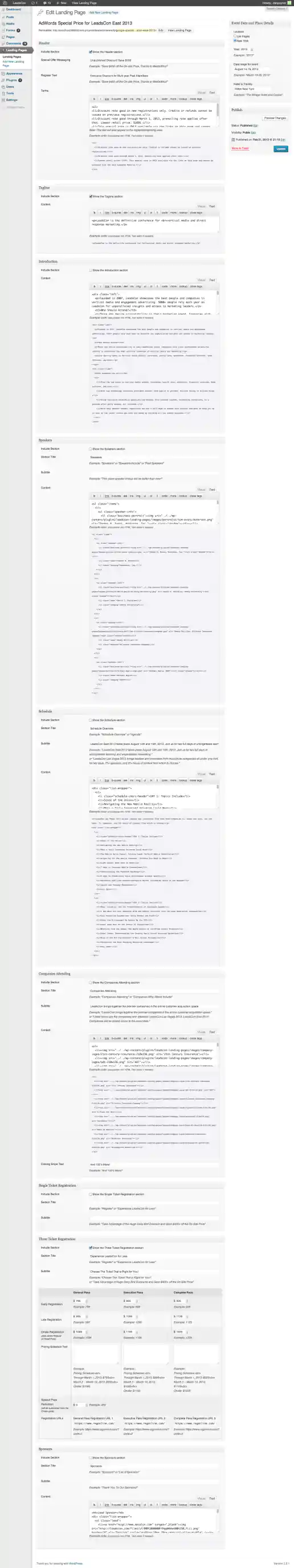
LeadsCon.com Landing Page Creator
WordPress Backend
Project Description: Event organizer needed an easy way to create individual landing pages for several targeted offers geared towards partners, vendors, past attendees, for speaker promotions, trade groups, magazine audiences, and the general public. Each landing page offered special discounts and was only accessible at a special link which potential customers would receive via email campaigns or see in an ad somewhere. By creating templates for the East Coast and West Coast events that could easily be updated on the backend, dozens of landing pages were created by the event manager without needing additional coding or design cycles each time.
Click for project detail view
-
Yahoo! Form Ad Created for ED Educational Direct
Project Description:
Click for project detail view

-
Yahoo! Lender Direct “Apply With Confidence” Banner Ads
Project Description: “Lender Direct” was one of the early names we tried as part of the partnership between Yahoo! and the lender matching service Root Markets. I intentionally designed these to look more understated, established, formal/stoic (less emotional or flashy than most banner ads) to help signal the ads were for a stable institution and not a fly-by-night mortgage loan brokerage service.
Click for project detail view

-
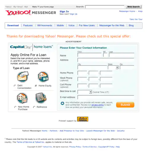
Yahoo! Messenger Form Ad Mockup for CaptialOne Home Loans
Project Description:
Click for project detail view
-
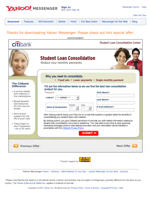
Yahoo! Messenger Form Ad Mockup for Citibank Student Loan Consolidation
Project Description:
Click for project detail view
-
Yahoo! Messenger Form Ad Mockup for EarnMyDegree.com
Project Description:
Click for project detail view

-
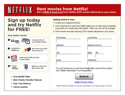
Yahoo! Messenger Form Ad Mockup for Netflix
Project Description:
Click for project detail view
-
Yahoo! Messenger Form Ad Mockup for TravelZoo
Project Description:
Click for project detail view