Portfolio / Industries / Lead Generation
-
Yahoo! WebLoanDeals.com Landing Page
Wide Version 2
Project Description: A few of the initial layouts created for testing.
Click for project detail view

-
Yahoo! WebLoanDeals.com Landing Page
Wide Version 1
Project Description: A few of the initial layouts created for testing.
Click for project detail view

-
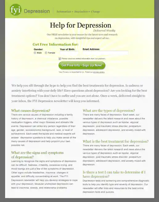
FYI Living Newsletter Sign-Up Landing Page Design
Version 4
Project Description: FYI Living was looking to improve their newsletter sign-up conversion rates for different subject areas such as fitness, nutrition, depression, pregnancy and others and needed an alternate look to test. After researching similar sites I noticed many where overly marketing oriented and tended to look kinda cheesy. I developed a few directions to avoid the typical look then narrowed down to these four initial designs to gather feedback on and potential test. These try to look more clinical news oriented and reserved in nature. They intentionally don't include photos since visitors sometimes get distracted by photos (especially of people) on landing pages and study them rather than focusing on the informational content being offered. “Clarity trumps persuasion” is a tactic worth testing in my experience, even though the simpler style doesn't necessarily look as punchy as landing page designs which include big colorful photos.
Click for project detail view
-
ReallyGreatRate Home Loan Landing Page
Version 3, Step 2
Project Description:
Click for project detail view
-
ReallyGreatRate Home Loan Landing Page
Version 3, Step 1
Project Description:
Click for project detail view
-
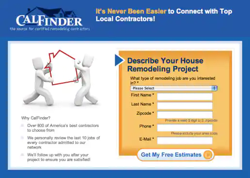
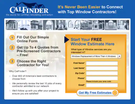
CalFinder House Remodeling “Top Local Contractors” Landing Page
Version 3
Project Description: Three alternate images presented for the client to consider testing and see which resonates more with the target audience.
Click for project detail view
-
FYI Living Newsletter Sign-Up Landing Page Design
Version 3
Project Description: FYI Living was looking to improve their newsletter sign-up conversion rates for different subject areas such as fitness, nutrition, depression, pregnancy and others and needed an alternate look to test. After researching similar sites I noticed many where overly marketing oriented and tended to look kinda cheesy. I developed a few directions to avoid the typical look then narrowed down to these four initial designs to gather feedback on and potential test. These try to look more clinical news oriented and reserved in nature. They intentionally don't include photos since visitors sometimes get distracted by photos (especially of people) on landing pages and study them rather than focusing on the informational content being offered. “Clarity trumps persuasion” is a tactic worth testing in my experience, even though the simpler style doesn't necessarily look as punchy as landing page designs which include big colorful photos.
Click for project detail view
-
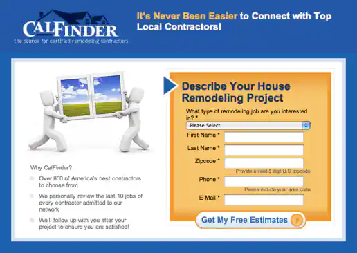
CalFinder House Remodeling “Top Local Contractors” Landing Page
Version 2
Project Description: Three alternate images presented for the client to consider testing and see which resonates more with the target audience.
Click for project detail view
-
CalFinder One-Step Signup Landing Page Design
Version 2
Project Description:
Click for project detail view
-
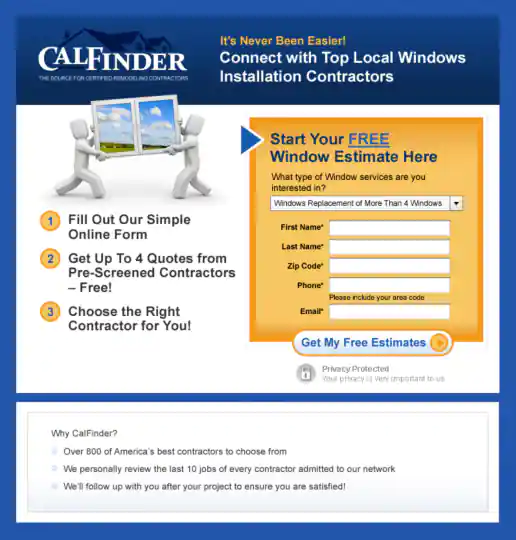
CalFinder Two-Step Signup Landing Page Design
Version 2
Project Description:
Click for project detail view
-
FYI Living Newsletter Sign-Up Landing Page Design
Version 2
Project Description: FYI Living was looking to improve their newsletter sign-up conversion rates for different subject areas such as fitness, nutrition, depression, pregnancy and others and needed an alternate look to test. After researching similar sites I noticed many where overly marketing oriented and tended to look kinda cheesy. I developed a few directions to avoid the typical look then narrowed down to these four initial designs to gather feedback on and potential test. These try to look more clinical news oriented and reserved in nature. They intentionally don't include photos since visitors sometimes get distracted by photos (especially of people) on landing pages and study them rather than focusing on the informational content being offered. “Clarity trumps persuasion” is a tactic worth testing in my experience, even though the simpler style doesn't necessarily look as punchy as landing page designs which include big colorful photos.
Click for project detail view
-
ApartmentSearch.com Region Based A/B Landing Page Test Variations
Version 2
Project Description:
Click for project detail view
-
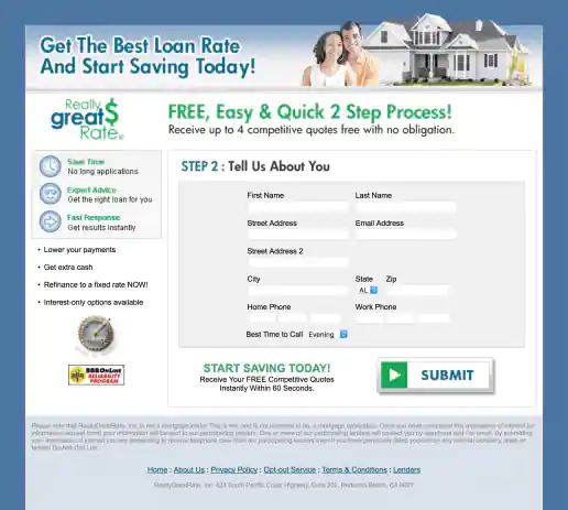
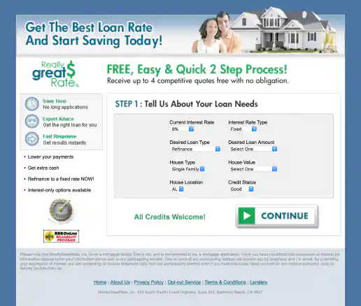
ReallyGreatRate Home Loan Landing Page
Version 2
Project Description:
Click for project detail view
-
TixNix Free Attorney Consultation Promo for Ning
Version 2
Project Description:
Click for project detail view
-
CalFinder House Remodeling “Top Local Contractors” Landing Page
Version 1
Project Description: Three alternate images presented for the client to consider testing and see which resonates more with the target audience.
Click for project detail view
-
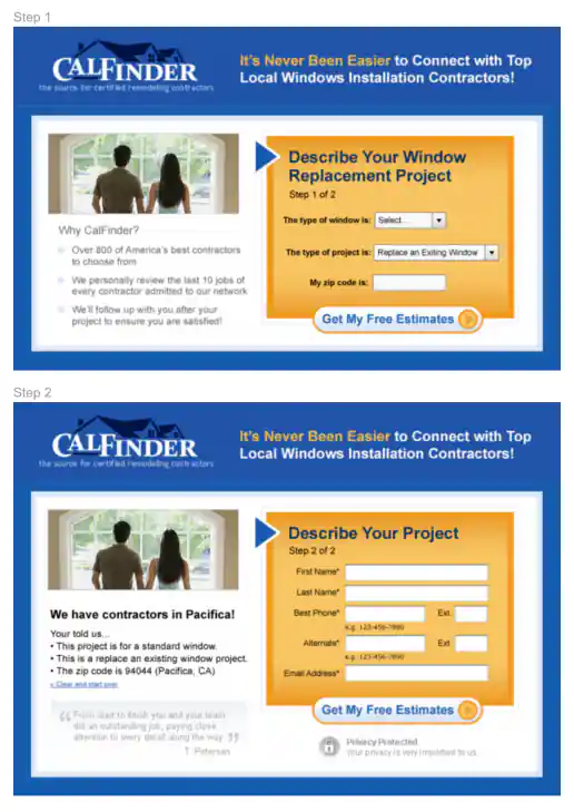
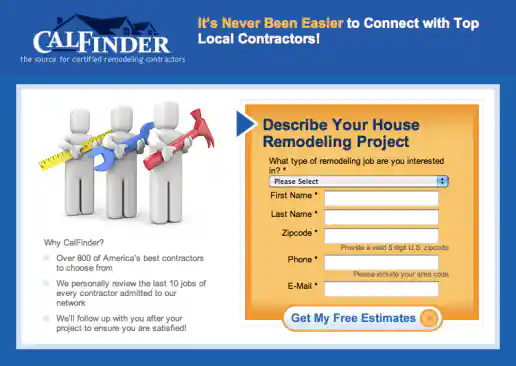
CalFinder One-Step Signup Landing Page Design
Version 1
Project Description:
Click for project detail view
-
CalFinder Two-Step Signup Landing Page Design
Version 1
Project Description:
Click for project detail view

-
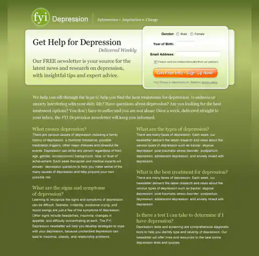
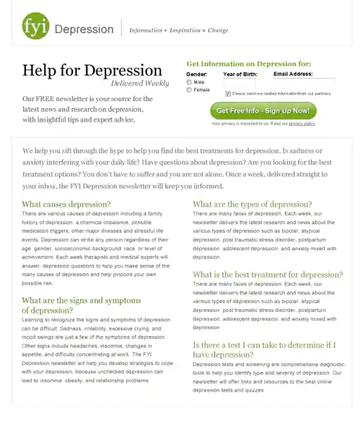
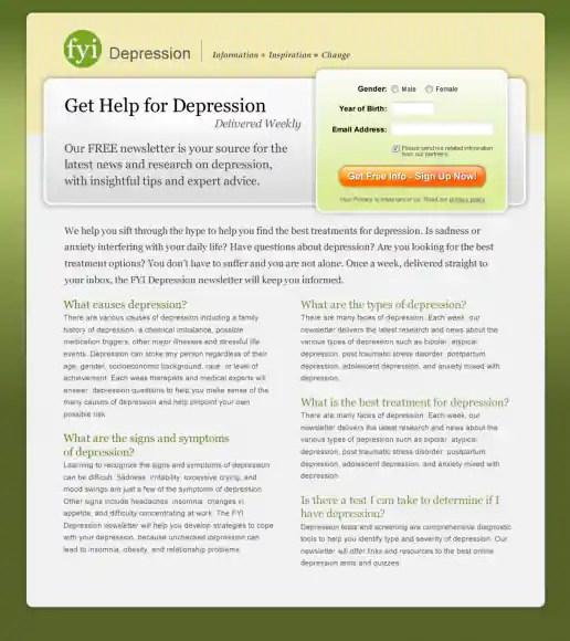
FYI Living Newsletter Sign-Up Landing Page Design
Version 1
Project Description: FYI Living was looking to improve their newsletter sign-up conversion rates for different subject areas such as fitness, nutrition, depression, pregnancy and others and needed an alternate look to test. After researching similar sites I noticed many where overly marketing oriented and tended to look kinda cheesy. I developed a few directions to avoid the typical look then narrowed down to these four initial designs to gather feedback on and potential test. These try to look more clinical news oriented and reserved in nature. They intentionally don't include photos since visitors sometimes get distracted by photos (especially of people) on landing pages and study them rather than focusing on the informational content being offered. “Clarity trumps persuasion” is a tactic worth testing in my experience, even though the simpler style doesn't necessarily look as punchy as landing page designs which include big colorful photos.
Click for project detail view
-
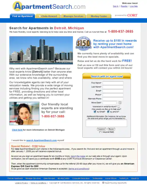
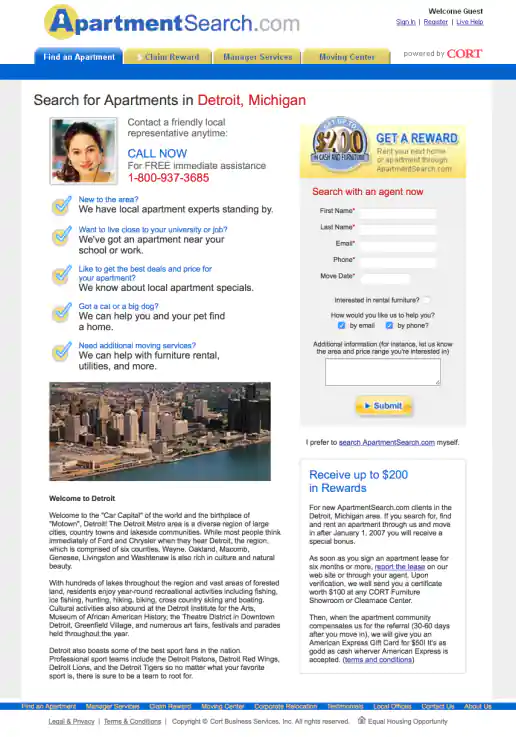
ApartmentSearch.com Region Based A/B Landing Page Test Variations
Version 1
Project Description:
Click for project detail view
-
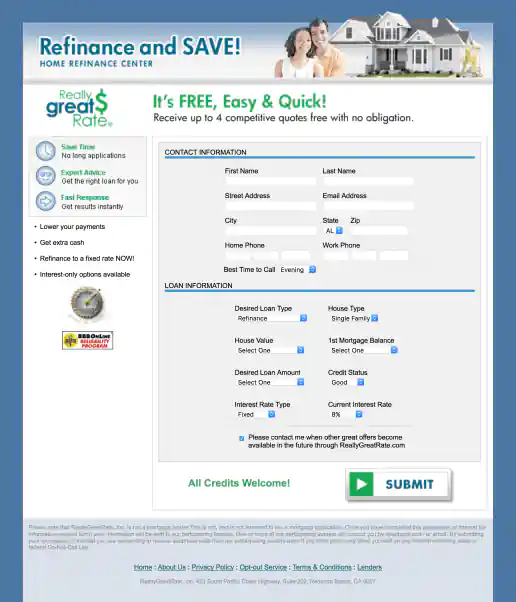
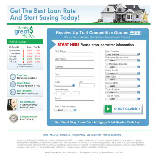
ReallyGreatRate Home Loan Landing Page
Version 1
Project Description:
Click for project detail view
-
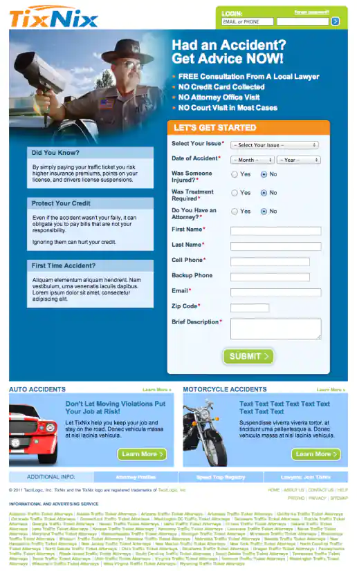
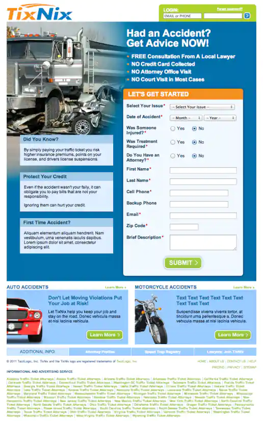
TixNix Free Attorney Consultation Promo for Ning
Version 1
Project Description:
Click for project detail view
-
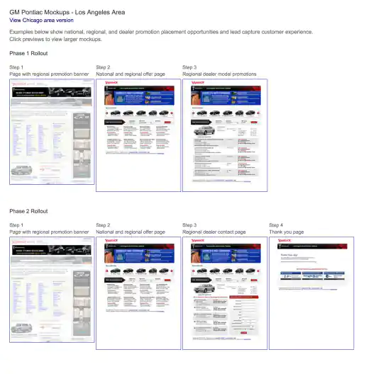
Yahoo! GM National, Regional, Dealer Promotion Opportunities and Lead Capture UX Design Strategy
UX Mockups Presentation
Project Description: This presentation shows national, regional, and dealer promotion placement opportunities plus the lead capture experience (or customer user flow) steps.
Click for project detail view
-
TixNix Landing Pages Based on Accident Type
Trucking Accident
Project Description:
Click for project detail view
-
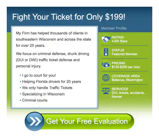
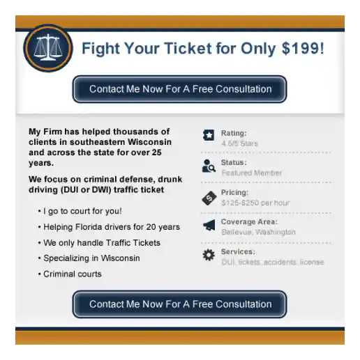
TixNix Landing Pages Based on Accident Type
Traffic Ticket
Project Description:
Click for project detail view